Roofing and Siding
FTC Oury Group LLC
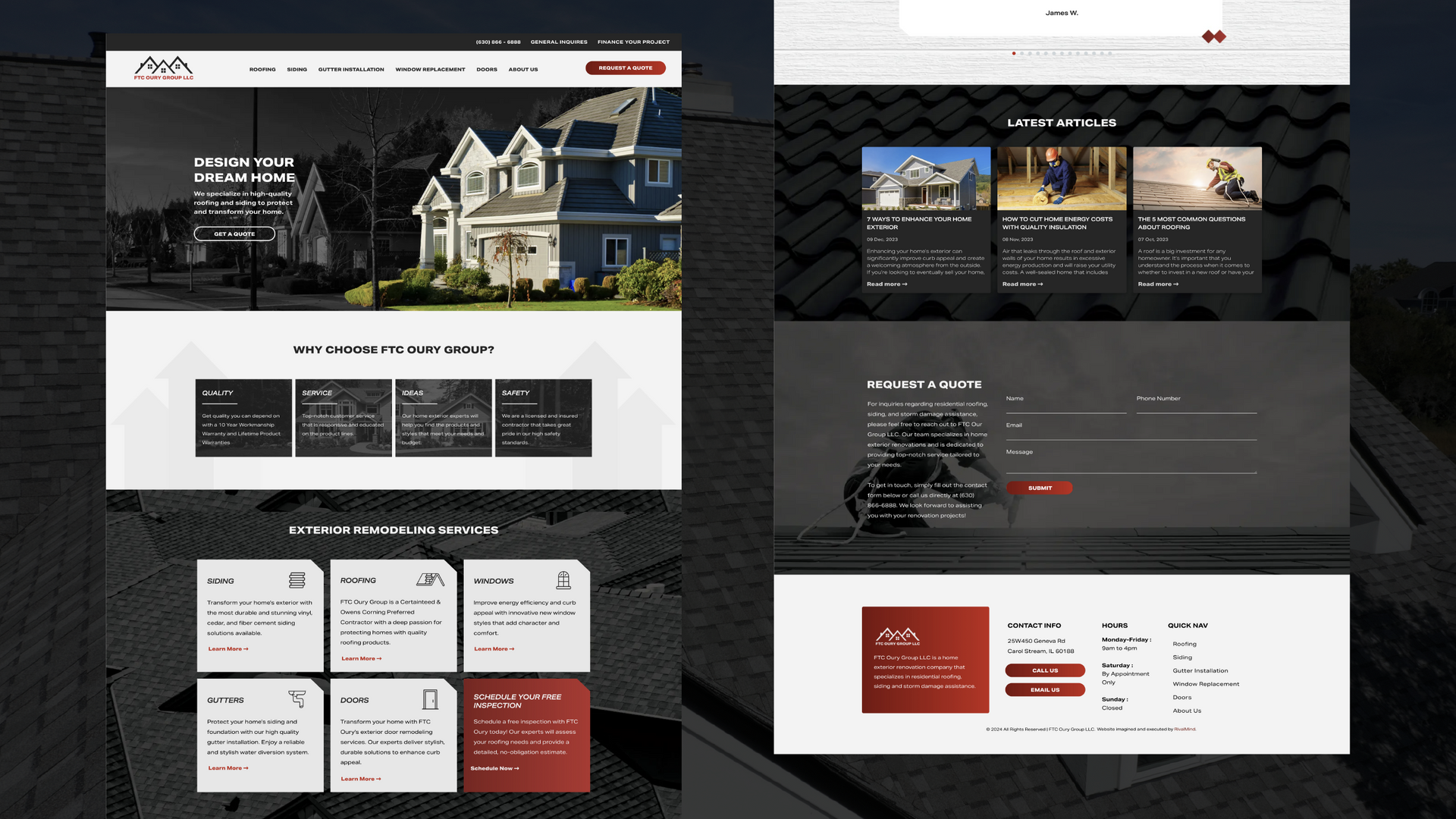
This client goes beyond functional roofing and siding; they are in the business of designing dreams, facilitating transformations, and protecting homes. Not only did they need a website to visually represented their high-quality work, they were looking for a way to present information concisely and have a website that performed as well as their crews.
Top goal? A fully strategized site that would build organic ranking and generate leads.
Built & Hosted using
Dynamic, Professional, Bold
SEO/ Website Development / Social Media
Our Approach
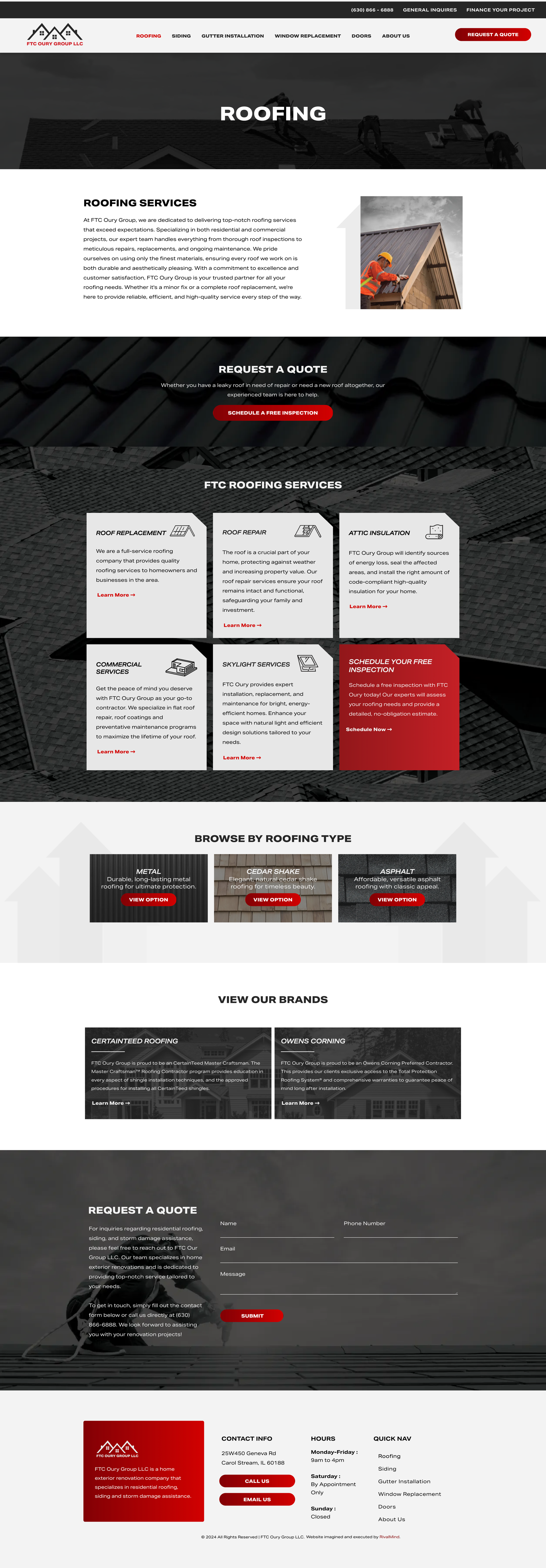
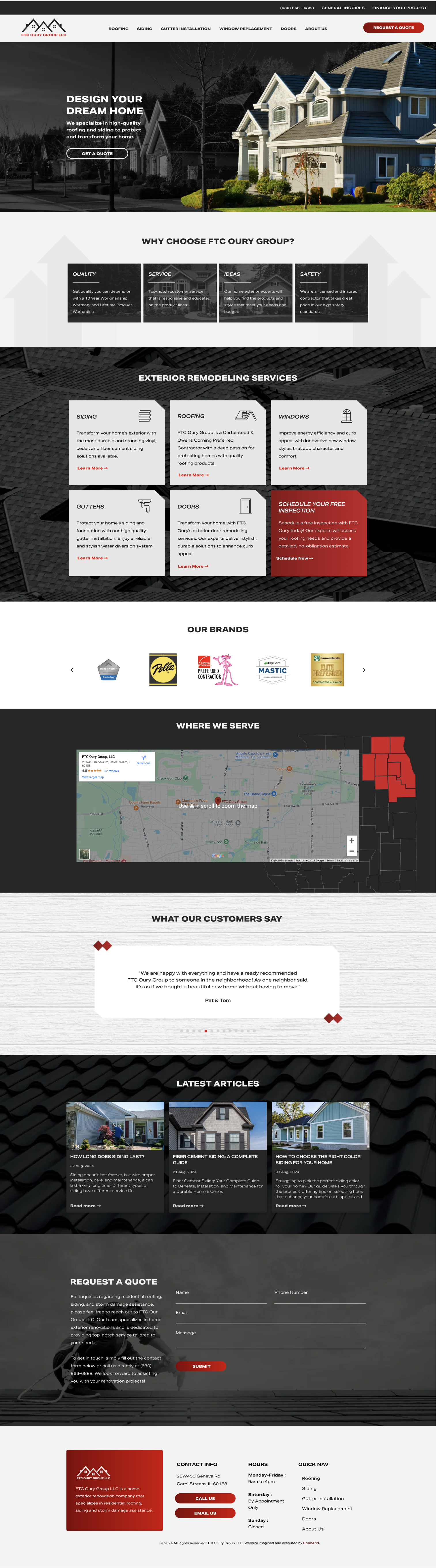
Presenting a clear and cohesive brand
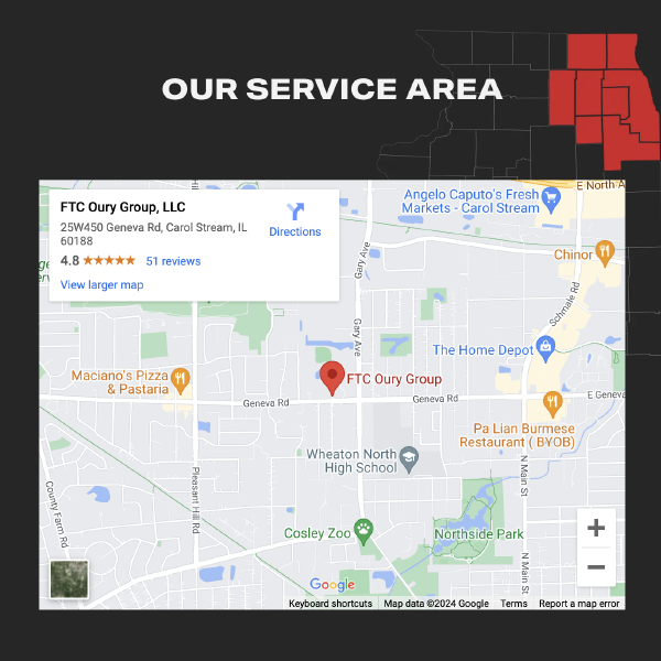
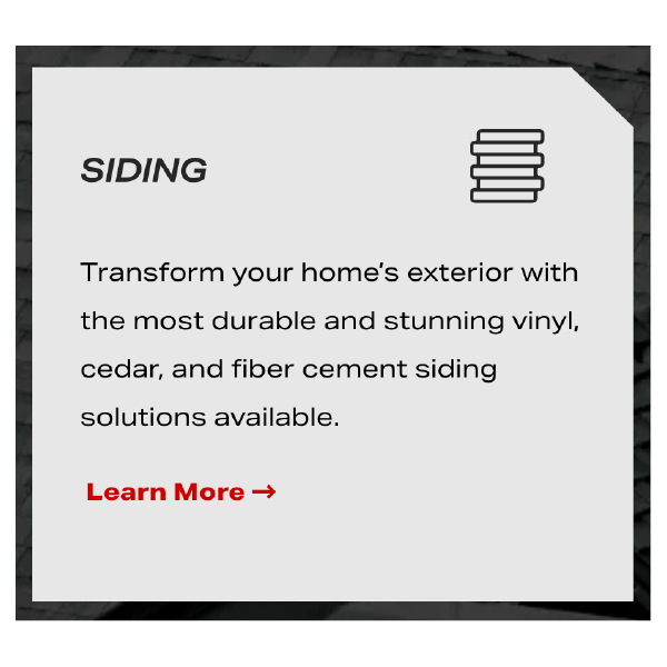
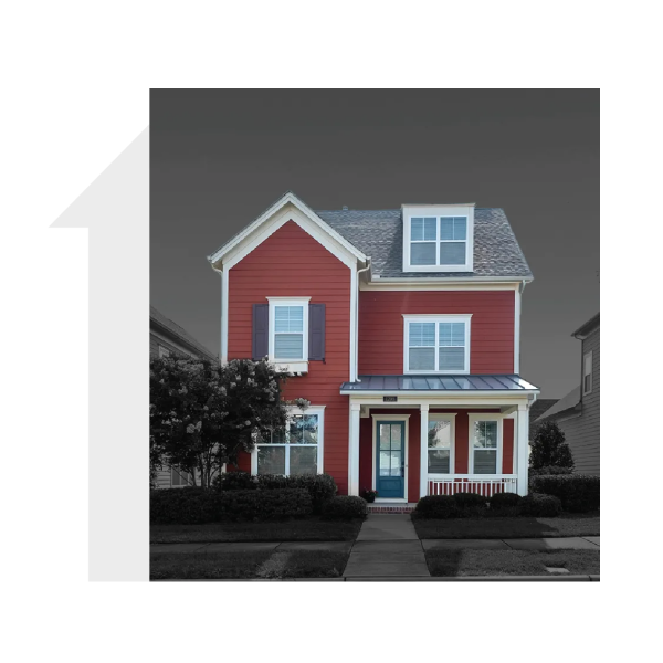
We enhanced the brand by refining the color palette and integrating impactful imagery and background elements. We crafted an image style that involves desaturating backgrounds to grayscale, thereby highlighting the subject of the image.
By designing graphics for icons and images that complement the site's bold, contemporary aesthetic, the overall effect is a sleek, cohesive visual brand. Now every facet contributes to a modern, bold, and masculine presence that is solidly upscale, professional, and exactly what our client wanted.
The Results
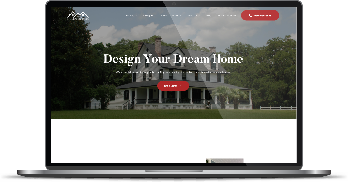
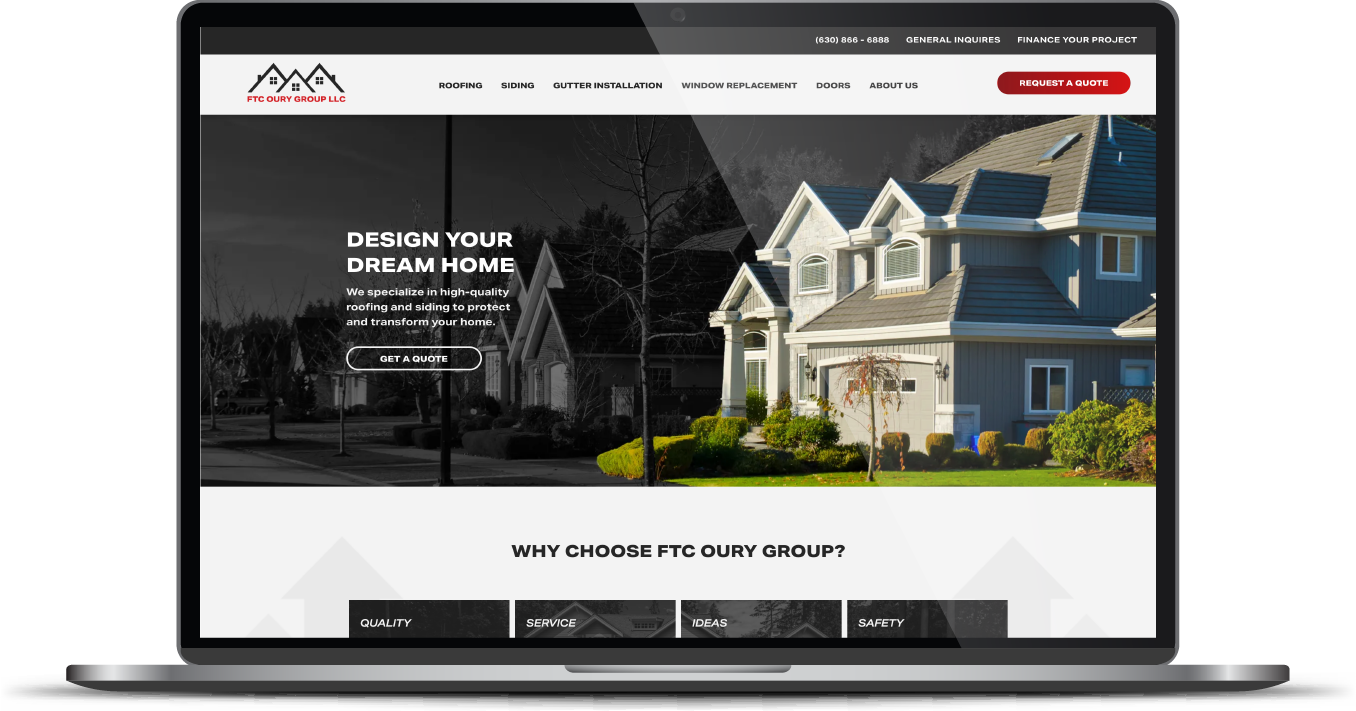
Talk about a high-quality transformation! Whereas the old website had broken links and an unclear layout, we delivered a strategized website built for user functionality. This newly designed website has a clear message and a clear path for users to navigate, learn more, and make contact. The client was extremely pleased with the process and the end result.
Before & After
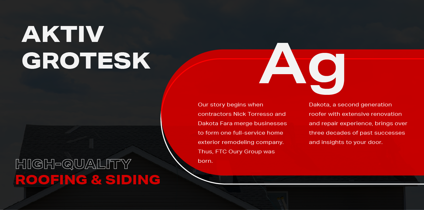
Sleek, modern font.
Aktiv Grotesk, a bold sans-serif font, was chosen for use throughout the website for its ability to provides a clarity and modernity that aligns with the overall sleek and professional feel of the brand. Additionally, its use on a larger scale for headlines had a steady and reliable presence that supported the solid look need in this industry.
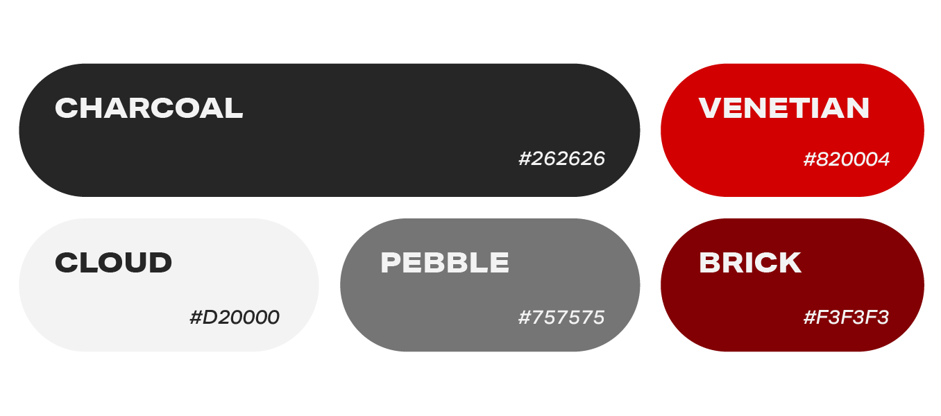
Colors that support
strength and clarity
Red, white and black were chosen to dominate the color palette to provide a clean look with contrast and clarity. Red was used sparingly to highlight key elements and calls to action, adding a dynamic and energetic flair to the overall design. Overall, the site looks bold, clean, and strong.
More Case Studies
We love to share our clients’ successes! A quick review shows our extensive experience across diverse industries and our talent for aligning with a multitude of styles and branding guides. The one commonality you’ll see? Our ability to bridge the gap between marketing and business growth through innovative and custom design. This is why companies come to us.