Secure Storage Solutions
Open City
Self Storage
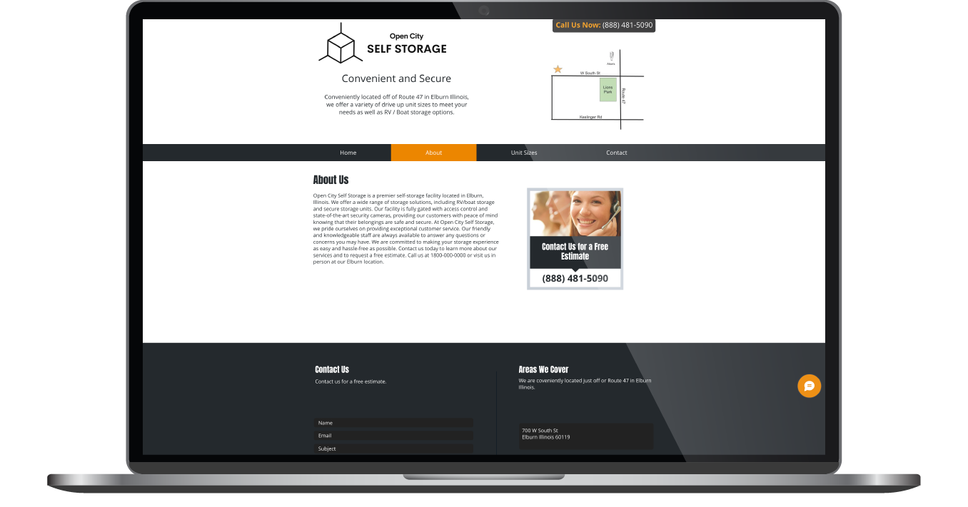
Recognizing the limitations of their current self-built Wix website, the leadership of Open City Storage came to us ready for something better. Their old site was functional but far from optimized. It struggled with visibility and lacked the engaging design needed to convert curious visitors into paying customers. With our partnership and expertise, Open City Self Storage now has a website that is far more polished, professional, and able to generate leads, hitting every goal on their list.
Built & Hosted using

Professional, Bold, Reliable
Website Design

Our Approach
Elevating an existing brand through striking design
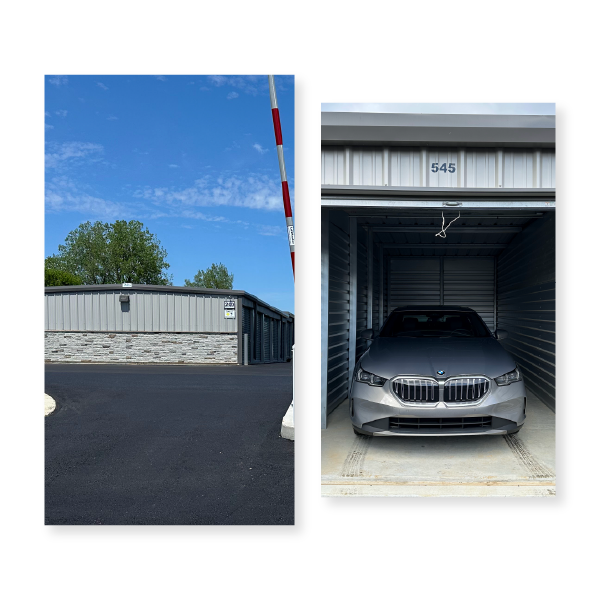
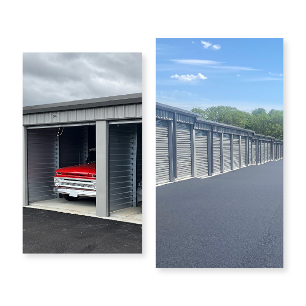
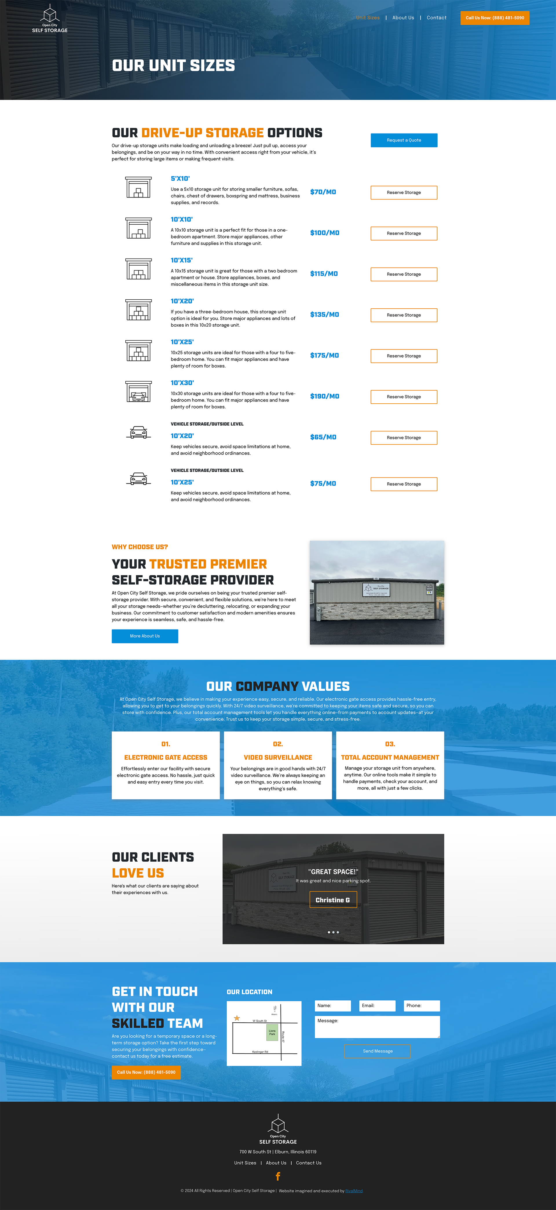
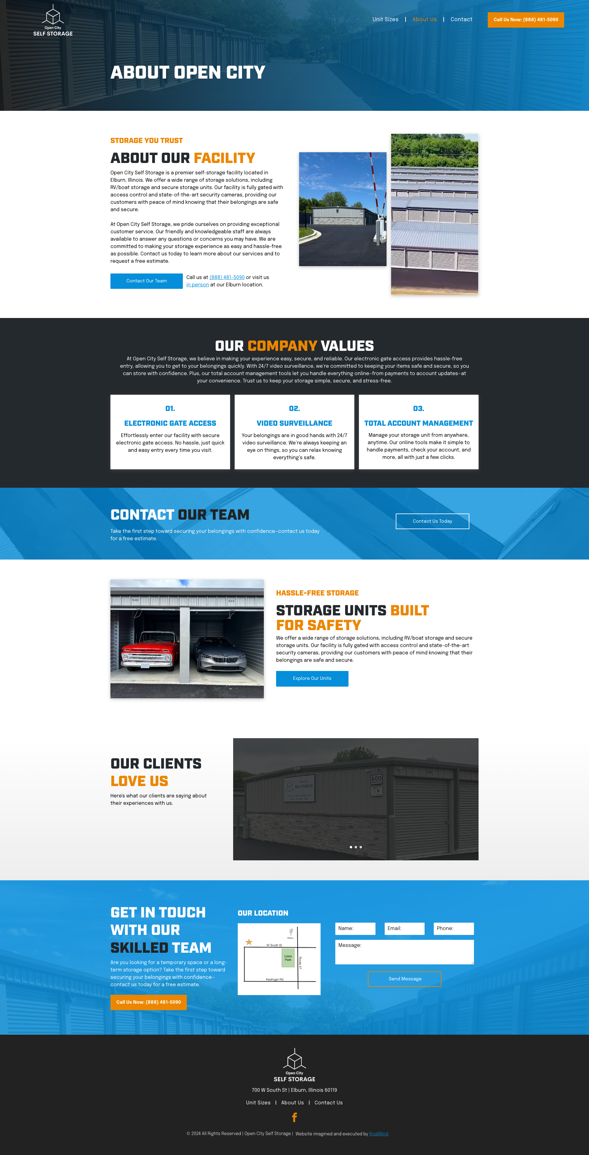
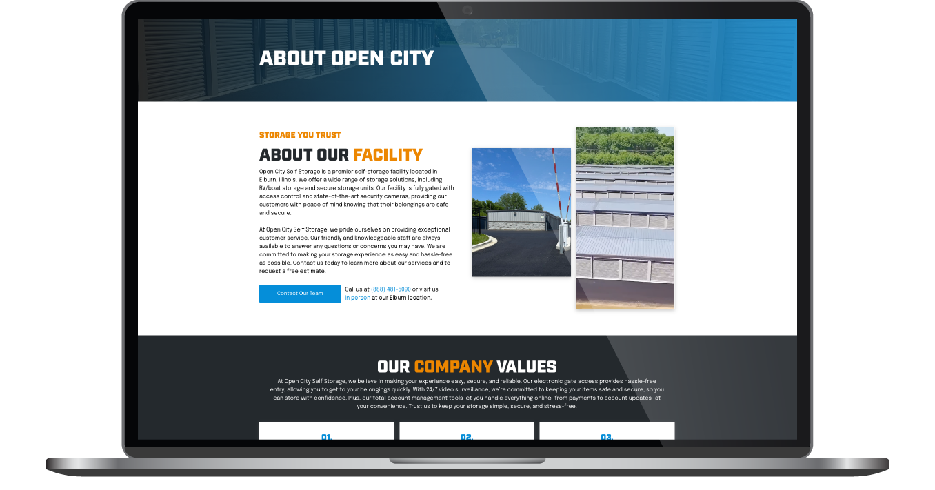
Our first priority was to reimagine and expand Open City’s brand identity. The client didn’t have a fully developed style guide, but they did have stunning visuals and video content—perfect assets to build around. Making these strong elements a central focus, we choose to highlight Open City’s impressive facilities to immediately build trust and credibility. We also modernized their color palette, keeping their signature bold orange and off black, but adding a vibrant cerulean blue to give the site a dynamic edge.
From a user experience perspective, the website followed a streamlined approach, which made the project simple yet effective. We added intuitive navigation buttons to help users easily reserve storage units or contact the team. By condensing the navigation menu and ensuring it was the first thing users saw, we made it effortless for visitors to engage with Open City’s services.

The Results
The new site is a knockout, both visually and functionally. Open City’s owner is thrilled with the bold color scheme and loves how the design seamlessly incorporates videos, making the brand feel even more engaging and trustworthy. The powerful imagery paired with the striking design elements creates a standout online presence for Open City’s digital footprint.
Before & After
Strong, standout fonts
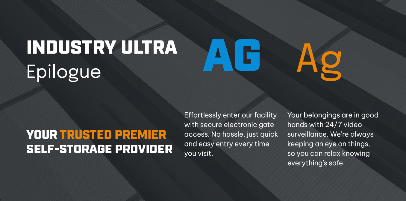
To convey strength and reliability, Industry was used for headings, bringing an industrial, commanding presence to the site. Epilogue was selected for body text, ensuring readability while still complementing the bold aesthetic. Together, these fonts perfectly capture Open City’s professional and confident brand.
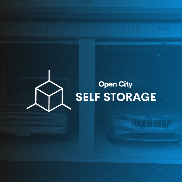
Refreshing, bold color palette
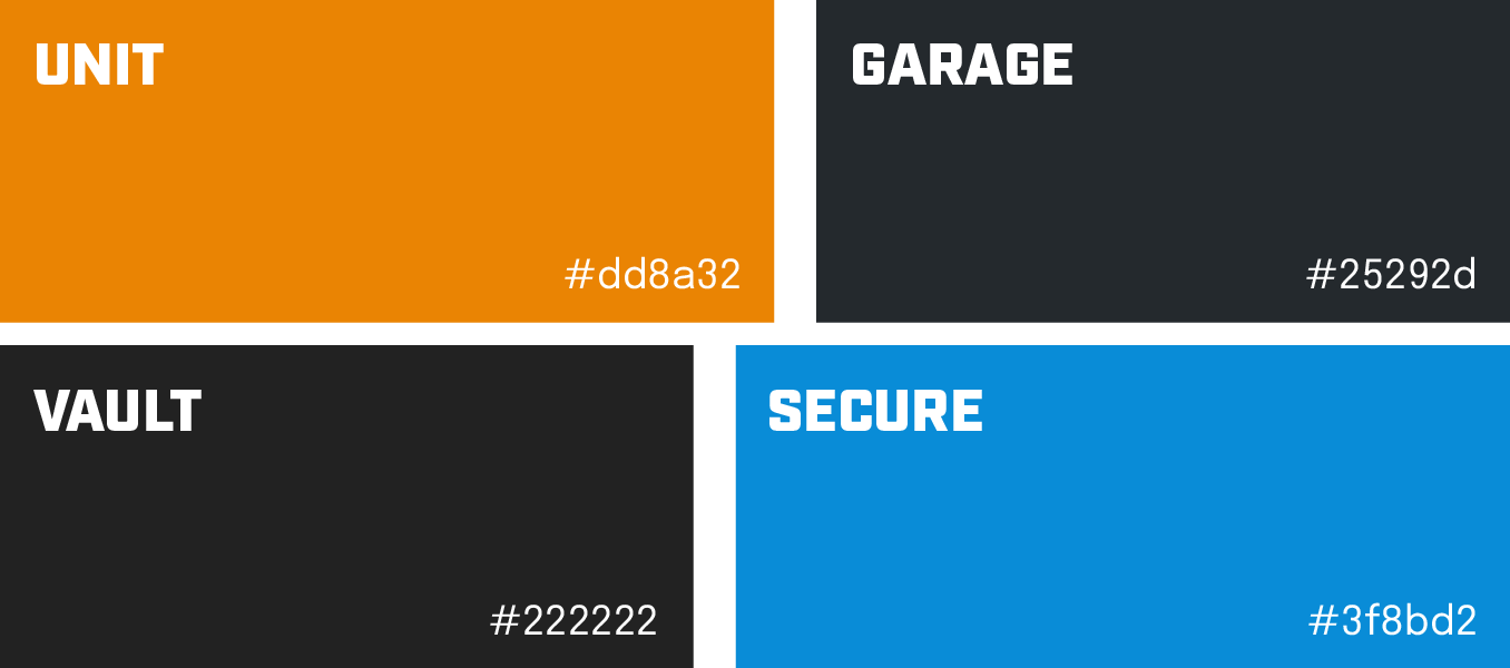
The refreshed color scheme featured bold orange, off black, and cerulean blue. The original orange stayed as a symbol of energy and reliability, while the cerulean blue adds a fresh pop that creates striking visual contrast. The off black kept things grounded and professional, creating a look that is eye-catching yet cohesive.

Staff Spotlight
Designed by Krystyanna Joseph
Krystyanna Joseph is the driving force behind groundbreaking website designs at RivalMind. Her approach is defined by a relentless pursuit of innovation, fueled by a deep commitment to research, boundless creativity, and an unwavering dedication to pushing the boundaries of her skills and perspectives. With every project, she sets the bar higher, ensuring that RivalMind remains at the forefront of cutting-edge design and client satisfaction.
Specialties: Duda Web Development, Animation/Motion Design


More Case Studies
We love to share our clients’ successes! A quick review shows our extensive experience across diverse industries and our talent for aligning with a multitude of styles and branding guides. The one commonality you’ll see? Our ability to bridge the gap between marketing and business growth through innovative and custom design. This is why companies come to us.
Dive into more of our favorite web design projects below!