Online Lending and Credit
Deinde Financial
A great website accomplishes many business goals. It establishes credibility, elevates branding, increases visibility, and the list goes one. Though rarely listed as a top benefit, leadership at Deinde Financials recognized that an on-brand website would greatly enhance their recruiting efforts.
As a current SEO client, Deinde came to us to build a new website specifically aimed at attracting the best and brightest candidates for the careers offered at their financial institution. It would require a new logo and compelling messaging that would clearly communicate who they are and the benefits they bring to employees. And of course it would also give interested readers the opportunity to apply.
Built & Hosted using

Straightforward, bold, collaborative
Website Design / SEO
Our Approach
Providing clear, attractive content that informs and inspires
Living up to their brand values of collaboration, sincerity, and integrity, the Deinde leadership team supported our creativity and expertise in a way that fueled a very efficient process and produced a very successful end product.
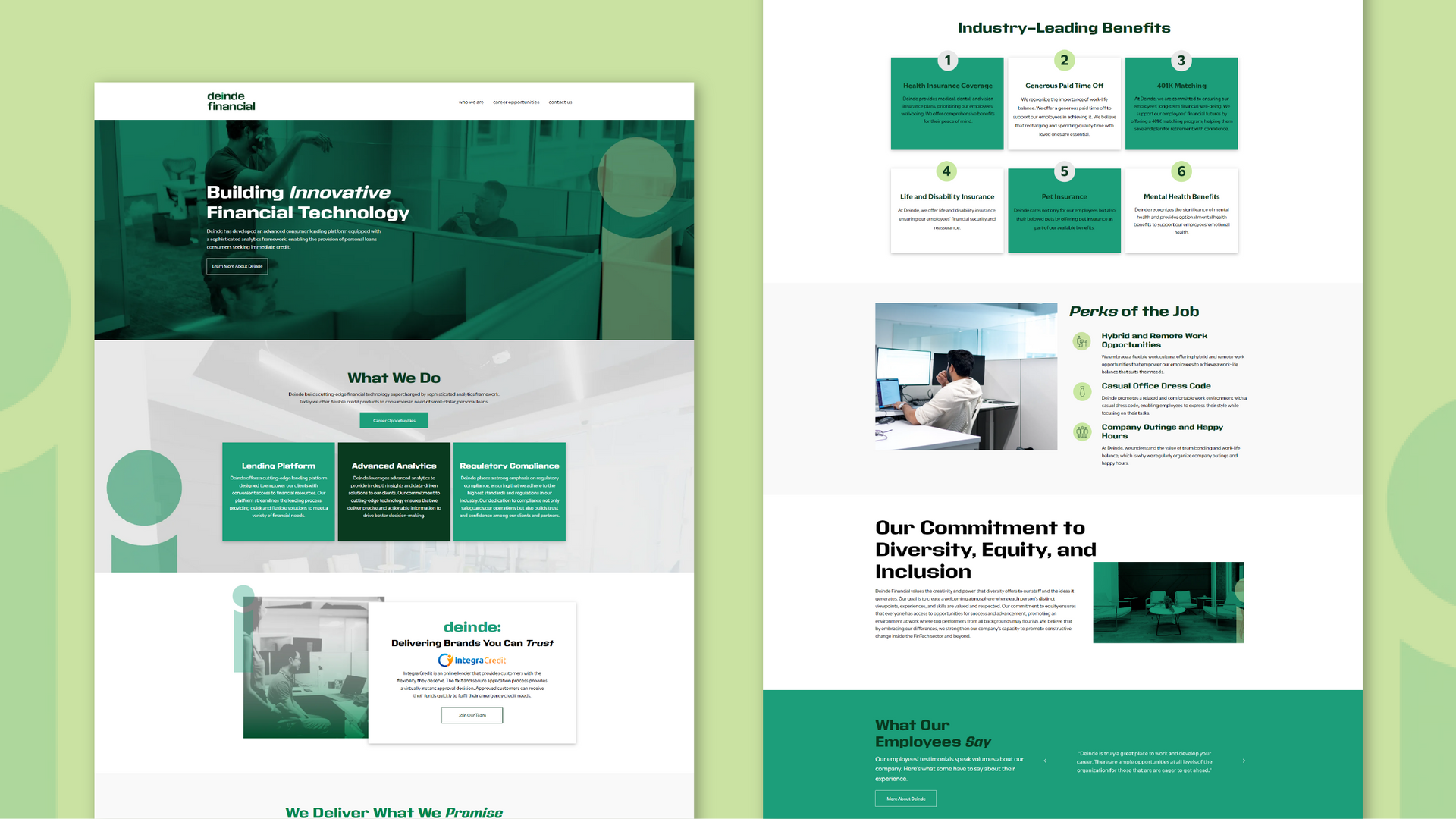
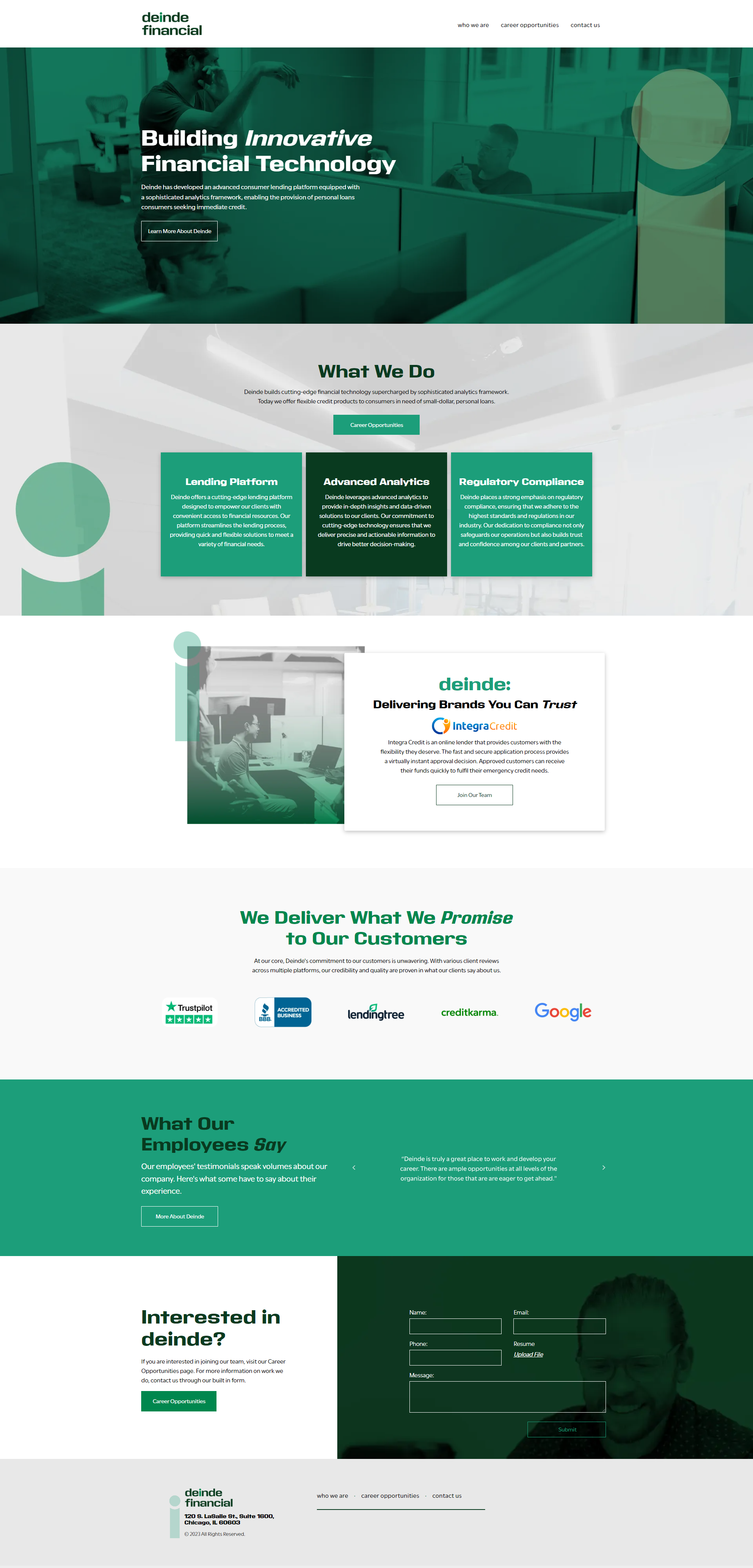
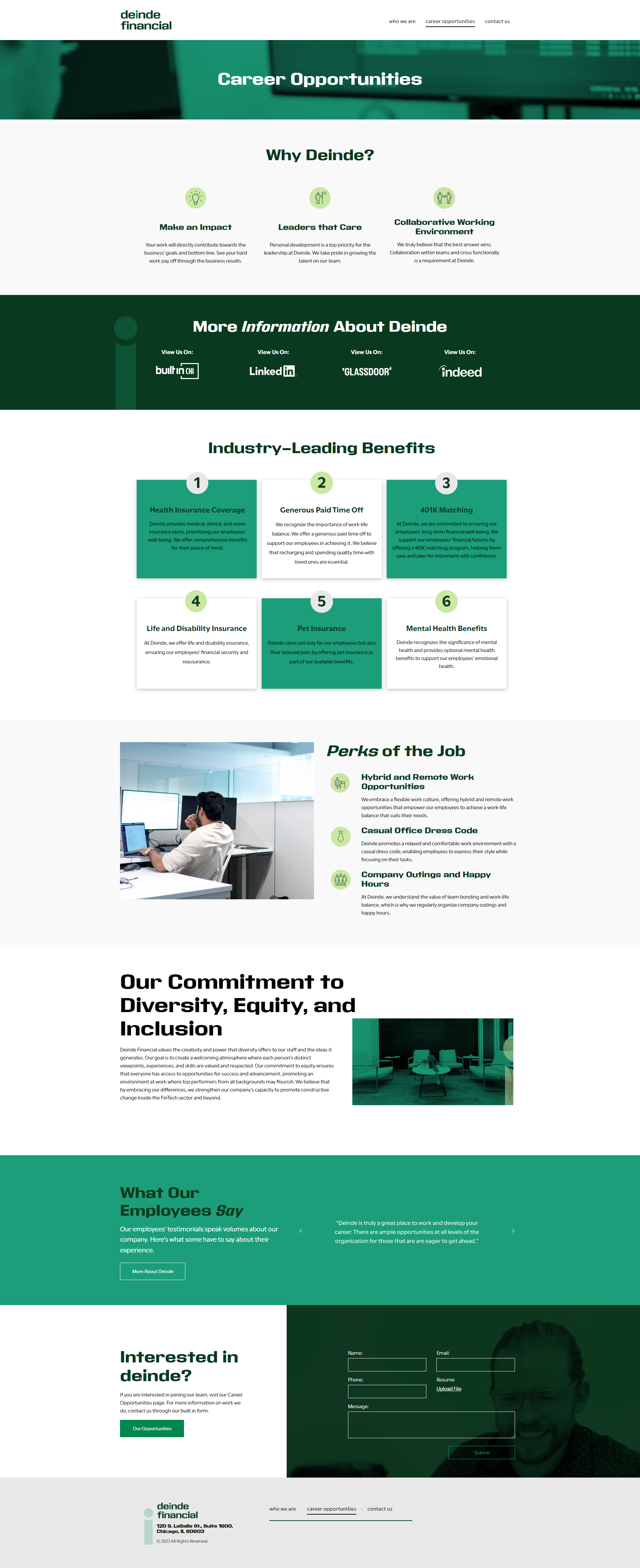
We started with designing a logo that wasn’t overcomplicated and fussy. After presenting options, we quickly landed on a masculine, straightforward version that stood out with intentionality. Communicating the strong and streamlined message that Deinde desired, an accented “i” in the logo also conveyed an inviting message: You can see yourself in Deinde. We also created a simple architecture and a flow of information designed to guide and stimulate attention.
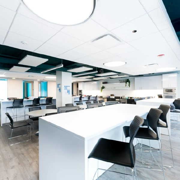
With approval on the logo, the brand was further clarified through color pallet, font, and background elements. The client opted to create and supply their own imagery featuring employees deeply engaged in their work or conversing with their peers. Imagery also included the breakroom and meeting rooms at Deinde/Integra Credit, providing prospective applicants with the opportunity to picture themselves on the job.

The Results
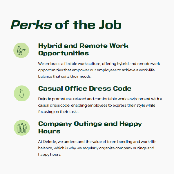
The client expressed a great appreciation for the thoughtful website design that functions as a powerful tool to attract potential candidates to the various positions they offer. Particularly thoughtful are the custom icons that clearly identify the content of each section. Overall, the website stands as a testimony to the superior results achieved when a client’s trust has been gained and a responsive relationship has been cultivated.
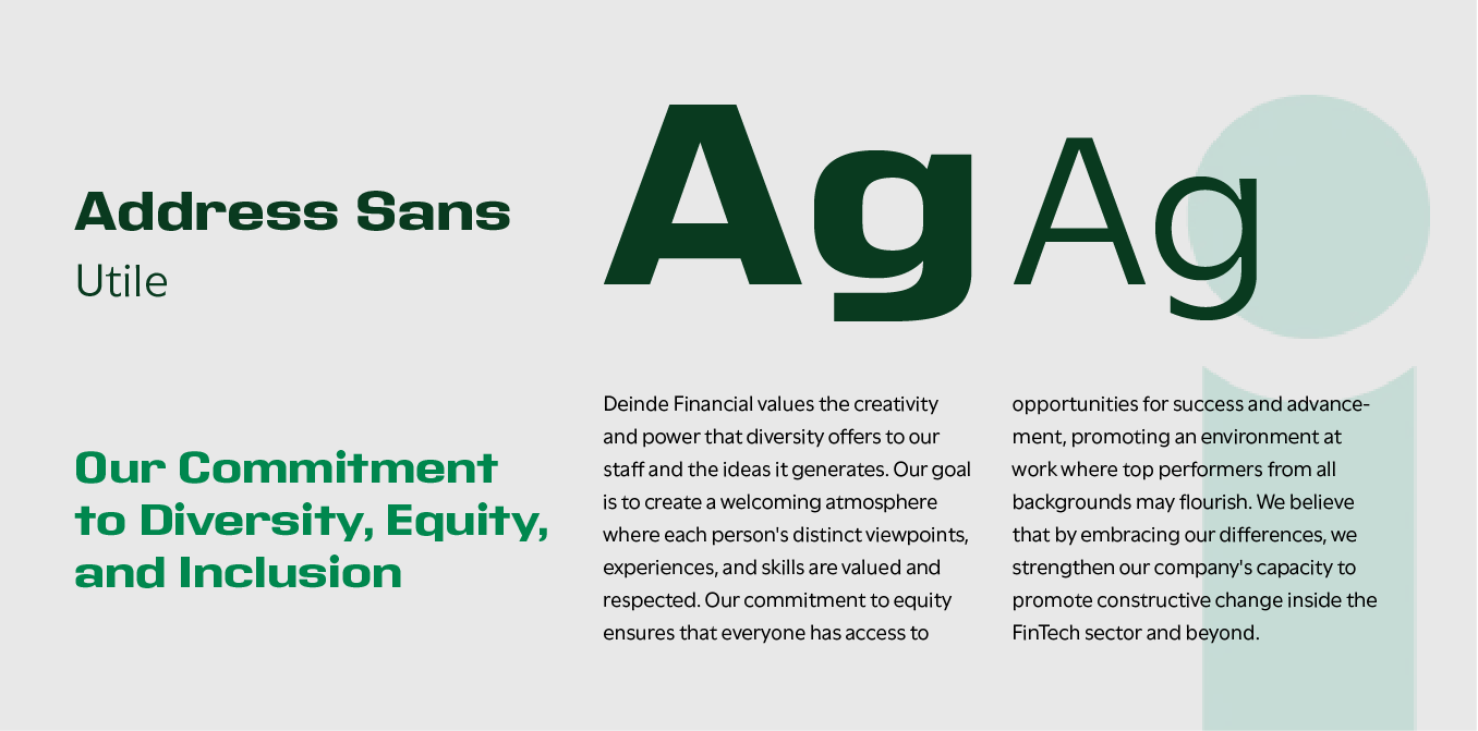
Strong and striking font
Font selection was carefully considered in order to correctly influence the reader. Address Sans Pro and Utile were selected, with Address Sans Pro being used throughout the website to echo the newly designed logo. Its bold, striking appearance, along with its geometric forms, perfectly aligns with Deinde's brand image of directness and sincerity.
For body paragraphs, Utile provides legibility and a rounded shape that exudes friendliness and modernity. In combination, Address Sans and Utile present Deinde as a brand that’s straightforward, intelligent, and impactful in the financial industry.
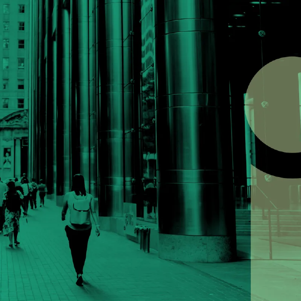
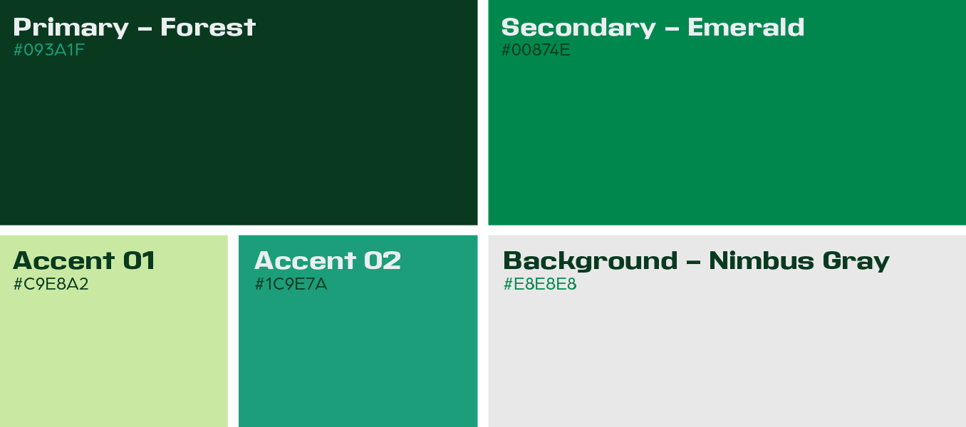
Lush green tones
The use of green was chosen, playing off of its prominence in the financial sector and its ability to convey the message of life and growth. Spring green and teal were incorporated in the palette to provide cool tones, easing reading for users scrolling through content. These shades also allow specific sections to stand apart from sections of deep and pine green.
More Case Studies
We love to share our clients’ successes! A quick review shows our extensive experience across diverse industries and our talent for aligning with a multitude of styles and branding guides. The one commonality you’ll see? Our ability to bridge the gap between marketing and business growth through innovative and custom design. This is why companies come to us.