UPS Systems Provider
Voltage Correction
This project was built on a well-established foundation of trust. After many years of working with this client and developing multiple websites and running SEO and PPC campaigns, we were asked to launch a new website to support a massive new line of FGC products.
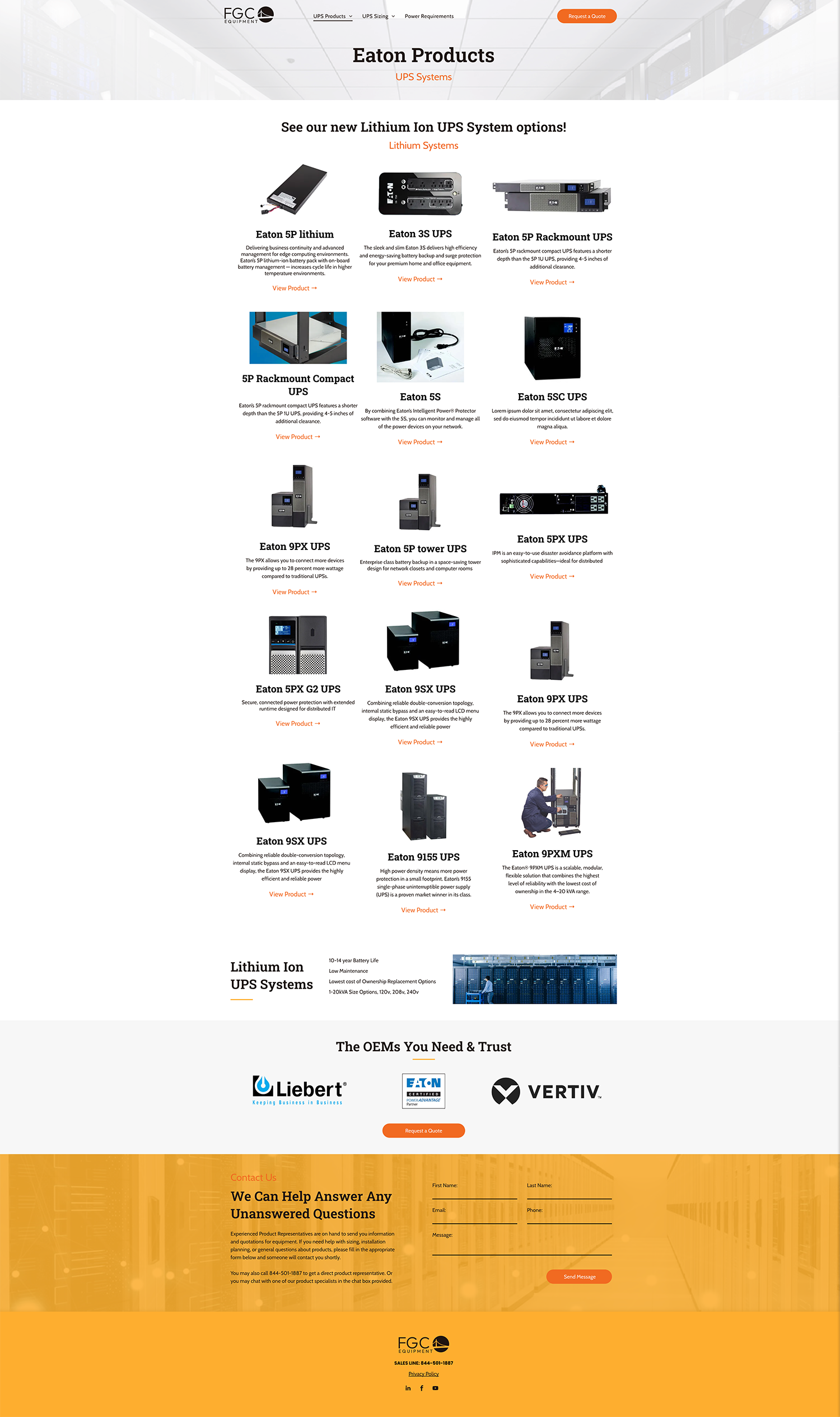
RivalMind’s team met the challenge of finding the best way to organize, display, and include detailed specs of a massive number of products.
Once the well-designed website was in place, this project also included a strategic PPC campaign drive traffic to the site.
Built & Hosted using
Clean, Crisp, Energetic
Website Design / PPC
Our Approach
Communicating service, expertise, and detail with vitality
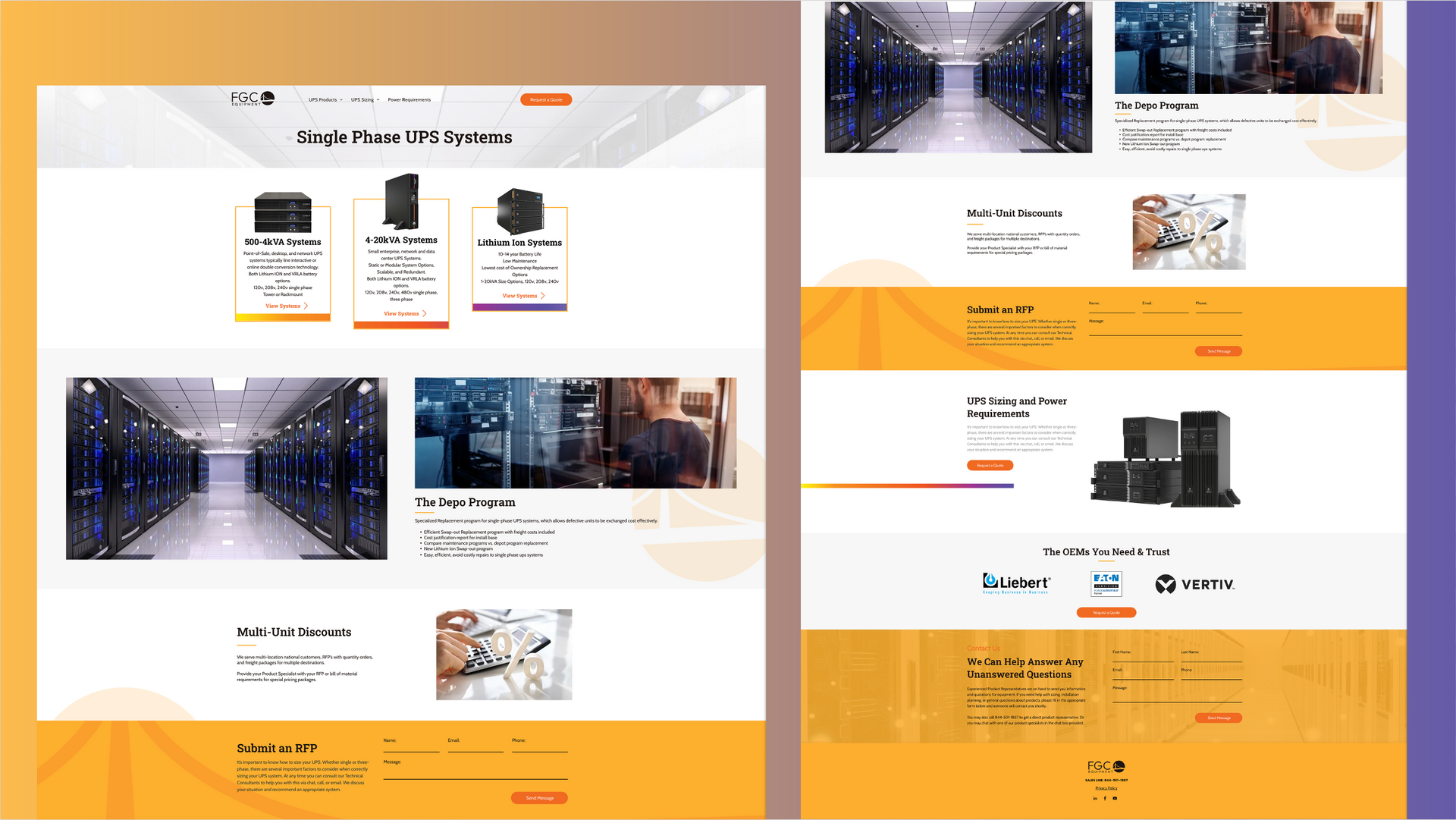
Uninterrupted power is a goal of vital importance. The RivalMind team researched this industry and presented two design options that: 1) elevated current design standards and 2) considered client preferences from past projects. The choice of design and ongoing collaboration resulted in a best-in-class website for both form and function.
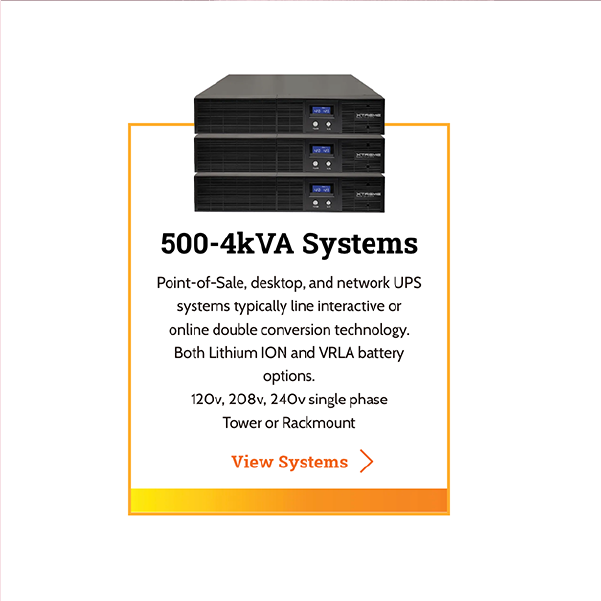
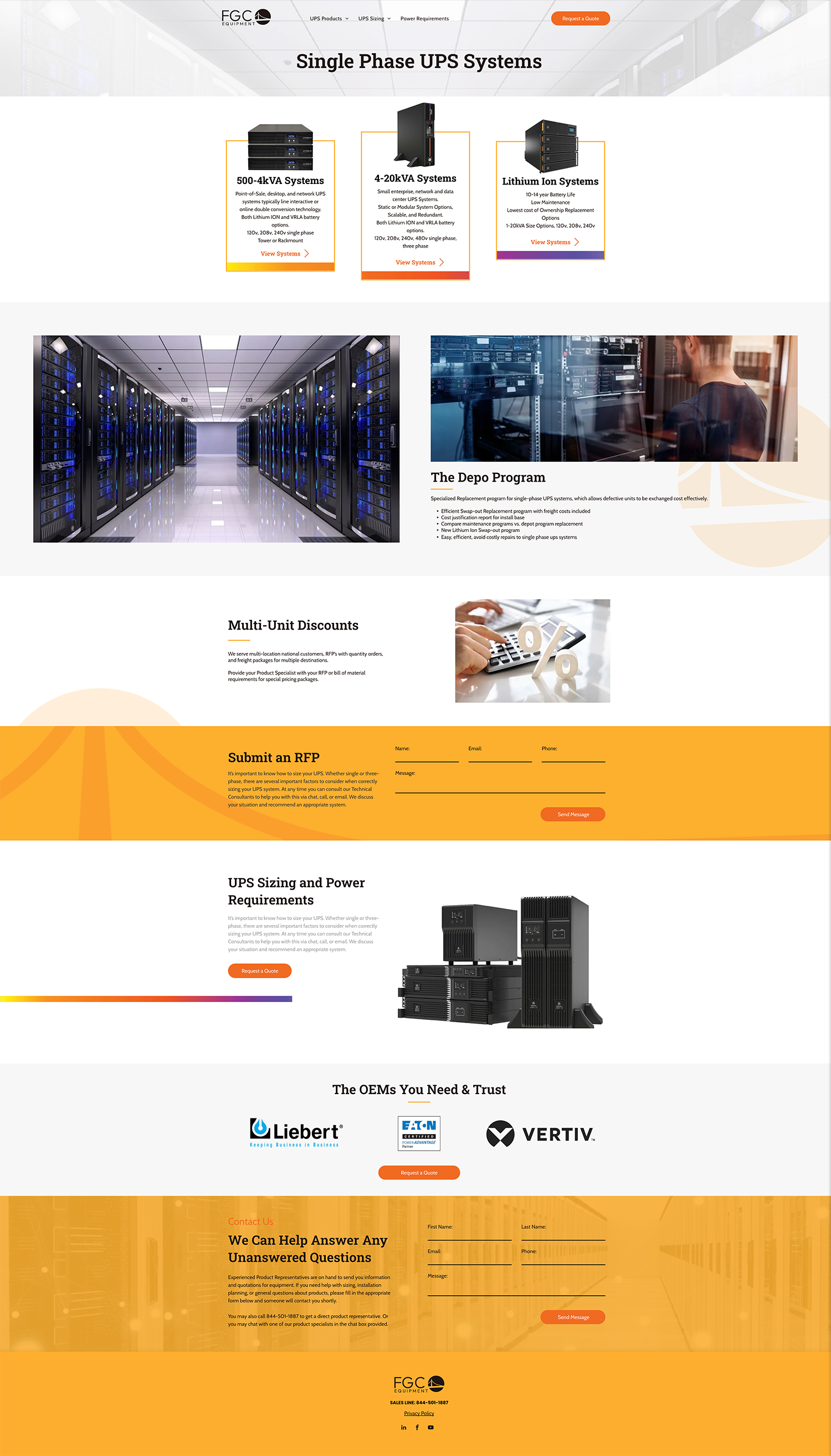
The look is clean without being stark, and the user experience is very inviting and approachable. Colorful callouts are used to break up the white pages, while the logo emblem in the background and opaque imagery in background create dimension.
In addition to the design, the client quickly saw the many benefits and ease of use available through the Duda platform.
The Results
Platforms, creative strategies, and the tools of technology are important but ever changing. And while we delighted our client with a website that is both fresh and new, the most significant result is the development of an even stronger relationship with the client. Increased trust—the true currency of business—is of highest value.
The longevity of good listening and mutual learning resulted in a website that checks all the boxes, elevates the industry, and makes our client stand out in the crowd.
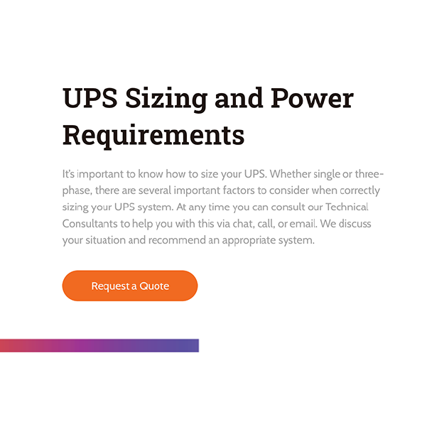
Simple, strong, stand-out fonts.
Roboto Slab was the font chosen for most headers. It’s a sans serif font that is both eye-catching and highly legible. Cabin was also used in some headers as an additional sans serif that adds variation.
Poppins, a geometric sans serif font, was chosen for the body copy. The font is a favorite because of its legibility and versatility, and its simplicity blended well with the design of the site.

Industrial oranges with a sharp violet.
The client ‘s logo contained black and orange which perfectly contributed to a crisp white-dominate color scheme with strong pops of color. Strong and industrial, the design visually supports the hardworking, reliable messaging of this company.

More Case Studies
We love to share our clients’ successes! A quick review shows our extensive experience across diverse industries and our talent for aligning with a multitude of styles and branding guides. The one commonality you’ll see? Our ability to bridge the gap between marketing and business growth through innovative and custom design. This is why companies come to us.


