Therapy and Counseling Services
Fox Valley Institute
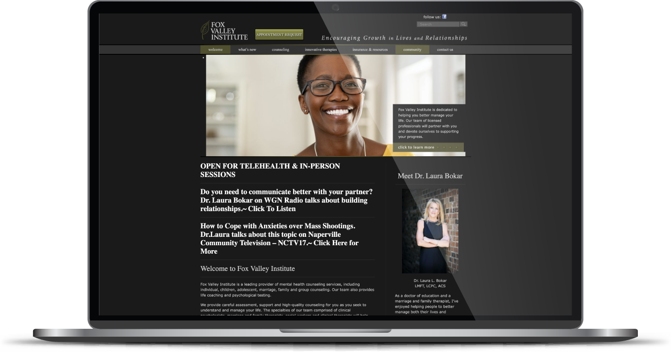
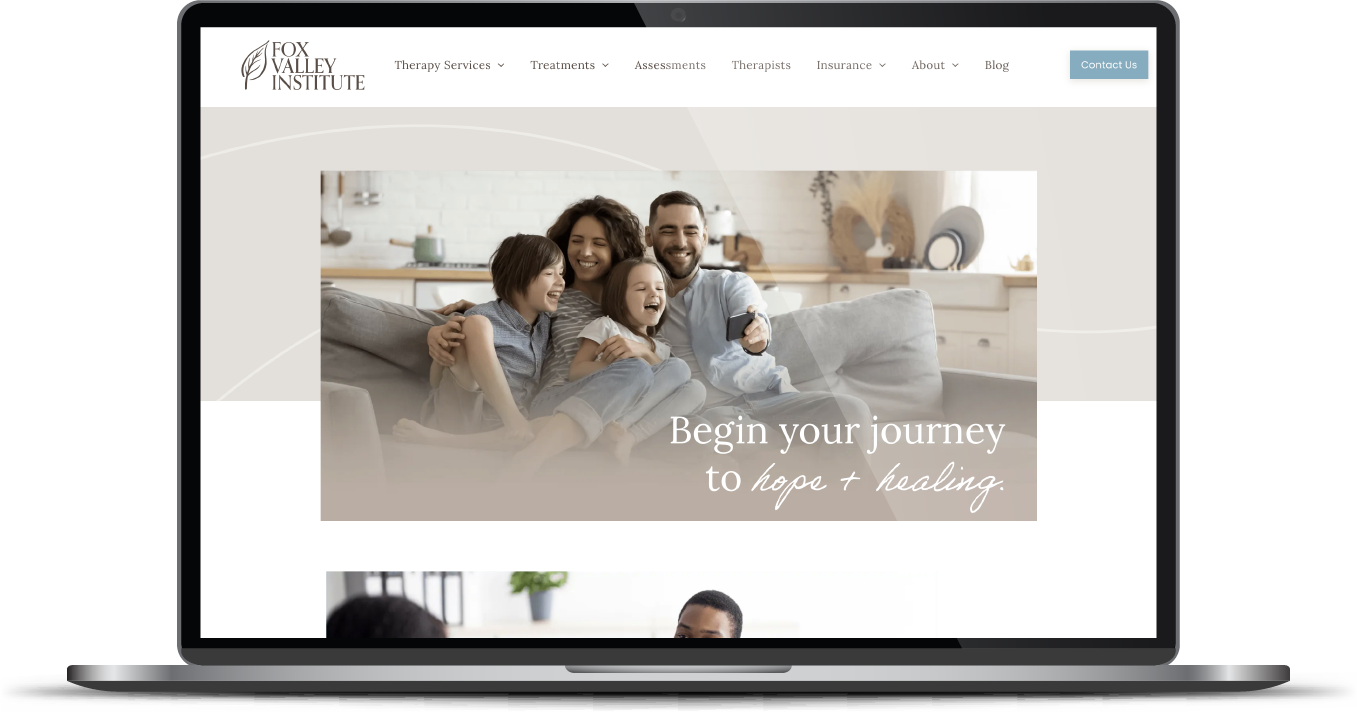
A trusted liaison recommended our work, and FVI’s leadership came to us fully aware their existing site was dark, uninviting, and complex. The goal? Create a warm and inclusive website that welcomes visitors and clearly communicates their services and expertise.
Built & Hosted using

Energetic, Bold, Inspiring
Logo Design / Website Design / Social Media
Our Approach
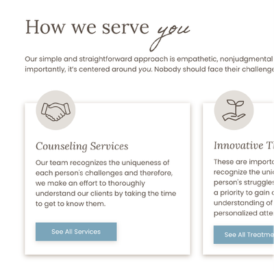
Convey compassion & offer healing through a gentle, refined style
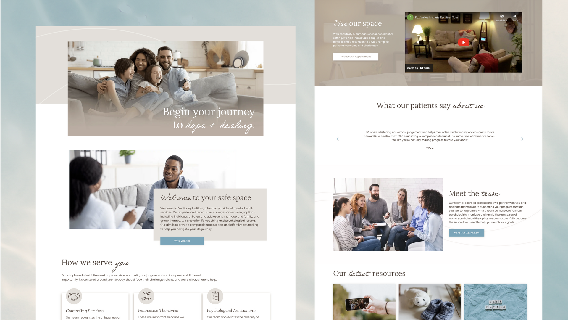
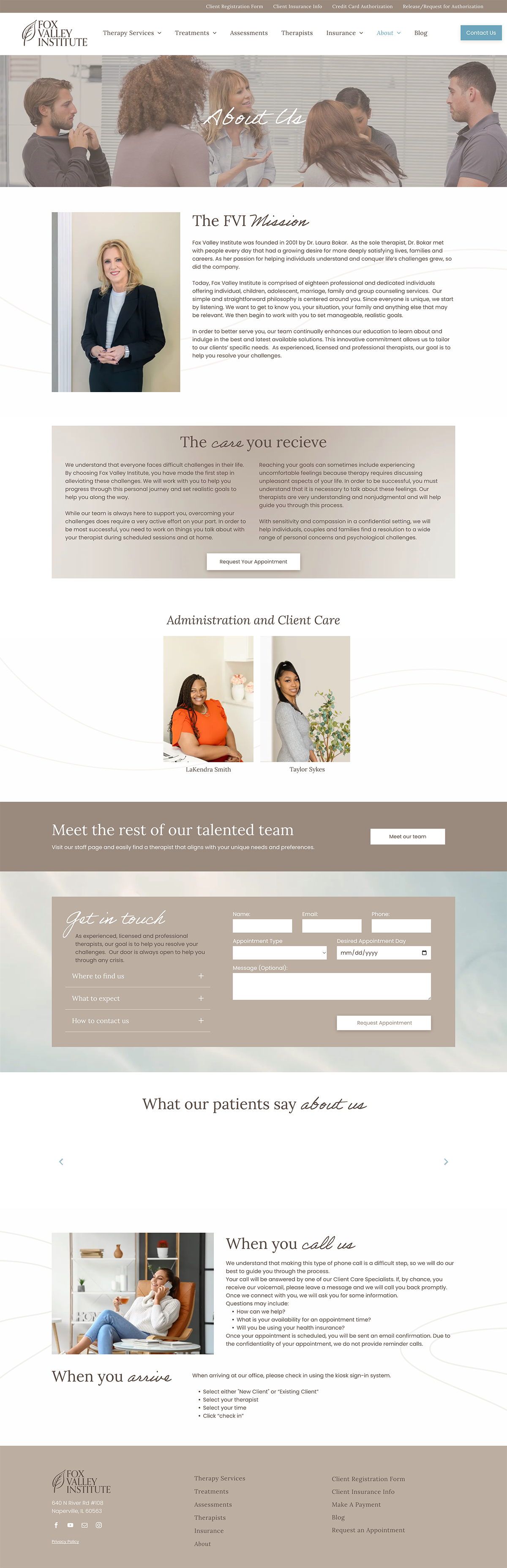
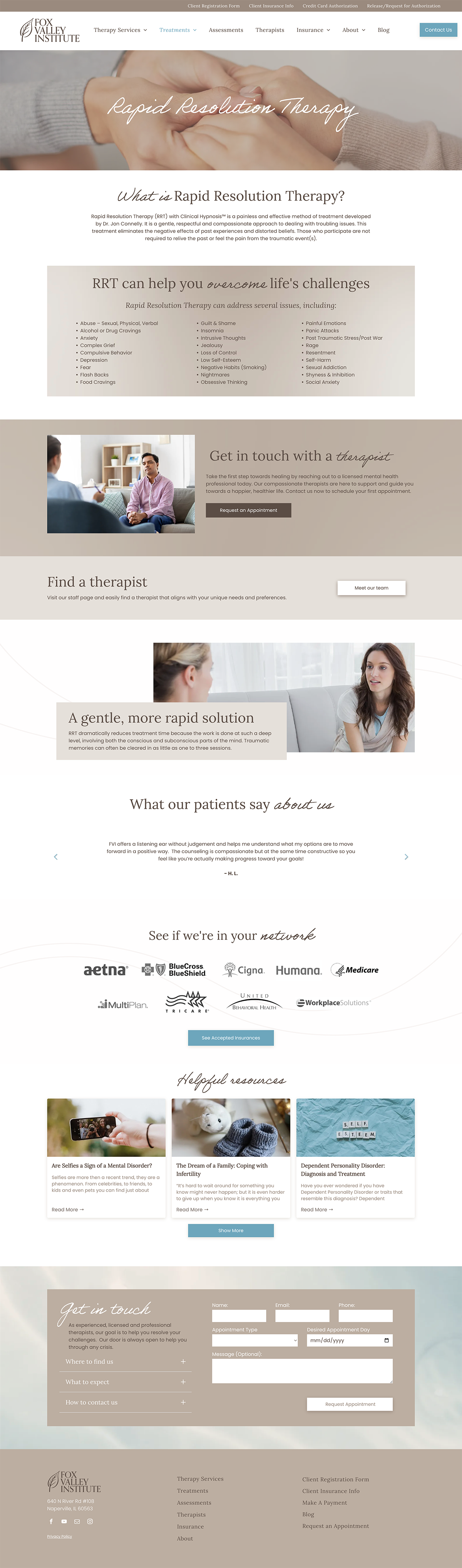
With an enormous amount of content on the website, the first goal was to develop a strategy for effective organization. Next, our creative geniuses attractively formatted the content on the Duda platform.
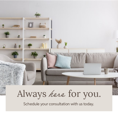
After making subtle changes to modernize their logo, we delivered a stunning aesthetic. Soft, neutral colors were chosen to better represent FVI’s gentle approach to therapy and counseling services. A diverse set of imagery was selected to appeal to a broad target market, and a handwritten-style font was incorporated to provide a personal touch.
Finally, the development team created a custom Duda widget so users could filter listed therapists by specialty, language, and treatment, enabling them to easily meet their needs or preferences. Each therapist received a fresh headshot and bio, and individual bio pages were also added for each team member. Our client loved how the Duda platform made it easier for them to edit or add individual bio pages for future growth and flexibility.


The Results
At project launch, we presented FVI with a user-friendly, approachable, and attractive website that eliminates visitor frustration and clearly communicates their core values.
Before & After
Welcoming fonts.
Using Lora, a modulated serif, allowed us to introduce elements of professionality while still communicating personality throughout FVI's brand. Ernie, a handwritten font, added a personal touch that points to the real people driving the mission of FVI. Poppins is an easily legible and familiar typeface that pairs well with both Lora and Ernie.
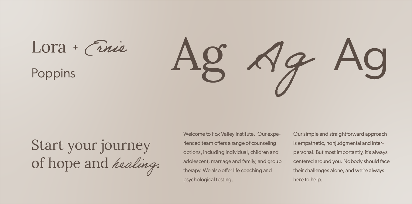
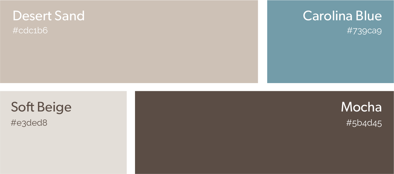
Soft, approachable browns and blues.
Following the client’s vision for a gentle, neutral site, we developed a color palette that speaks to their compassionate approach to helping clients heal and grow. Adding an accent of blue eliminated any monochrome feel and made the buttons that call visitors to action stand out.
More Case Studies
We love to share our clients’ successes! I quick review shows our extensive experience across diverse industries and our talent for aligning with a multitude of styles and branding guides. The one commonality? Our ability to bridge the gap between marketing and business growth through innovative and custom design. This is why companies come to us.

Contact Us
It's time to grow your business.
FVI Web Design Portfolio Contact Form
We will get back to you as soon as possible.
Please try again later.