School and Institutional Safety Products
School Safety Solution
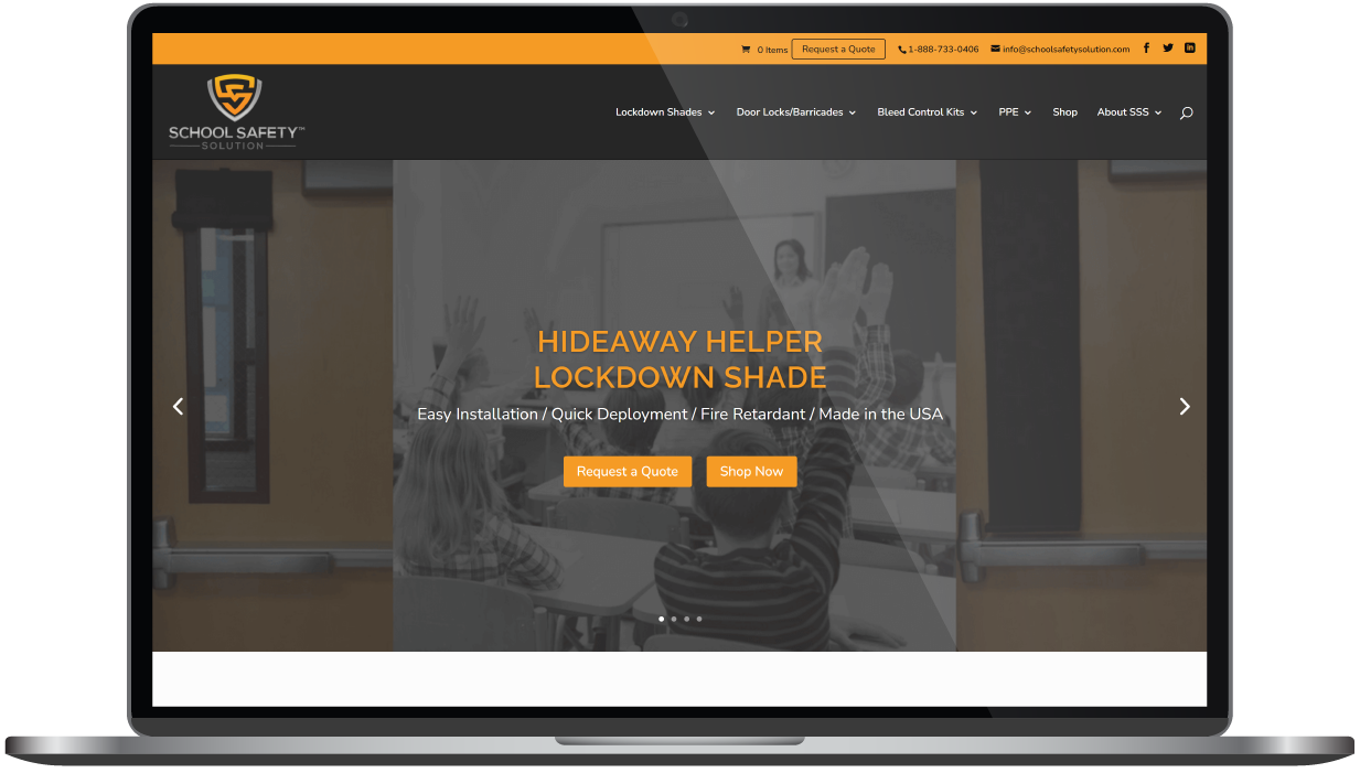
Over the last few years of working on SEO, School Safety has been reaping the rewards and seeing a great deal of success. They were also seeing the multiple limitations of their WordPress site. They asked us to create an official e-commerce website that would provide a better system (CMS) to support their growing needs, without jeopardizing the elements that were working well for them. They were open to revamping the look of their brand, as long as it helped achieve their overarching business goal: to re-strategize their website to increase online visibility.
Built & Hosted using

Reliable, Adaptable, Trustworthy
Website Design
Our Approach
Protect valuable resources while improving strategy
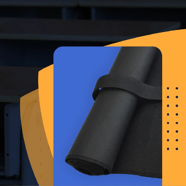
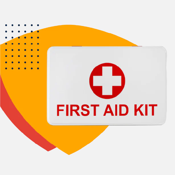
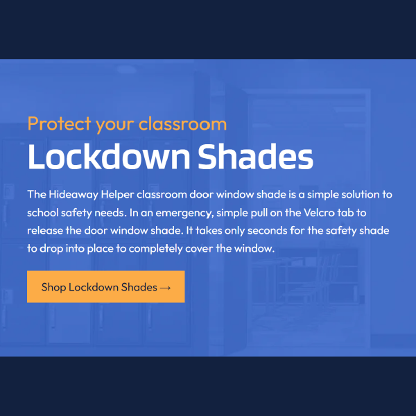
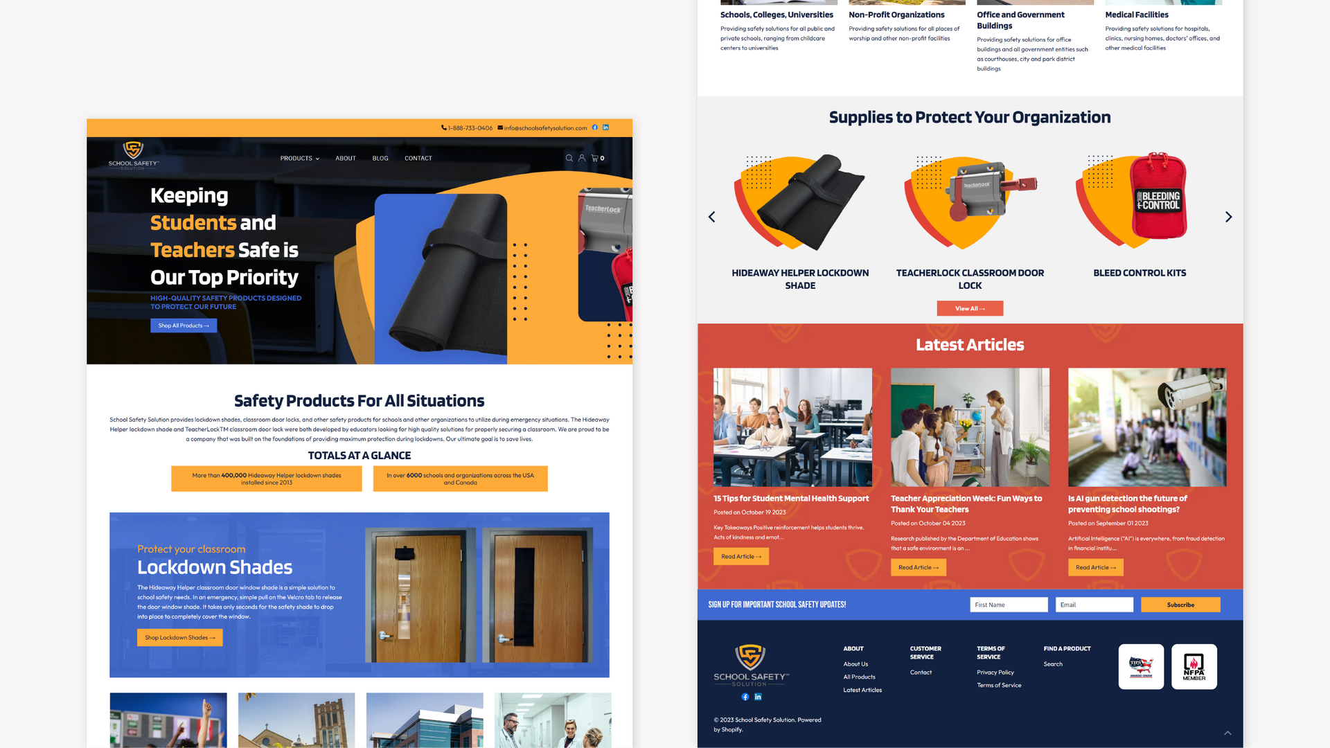
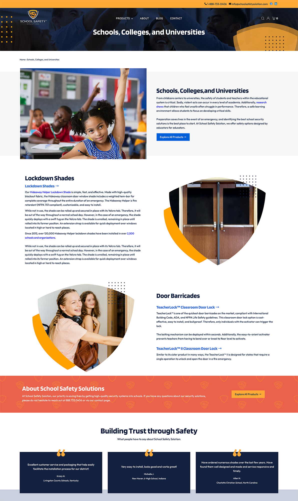
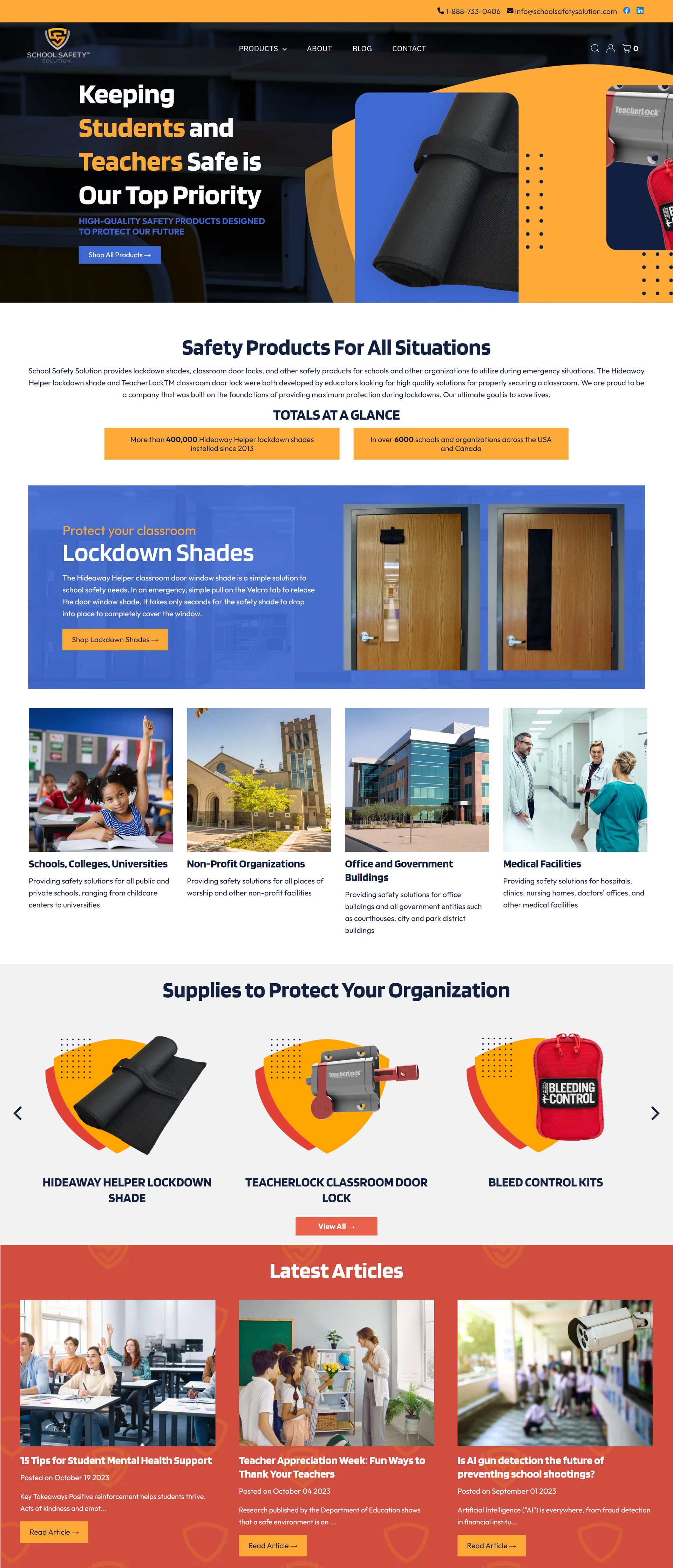
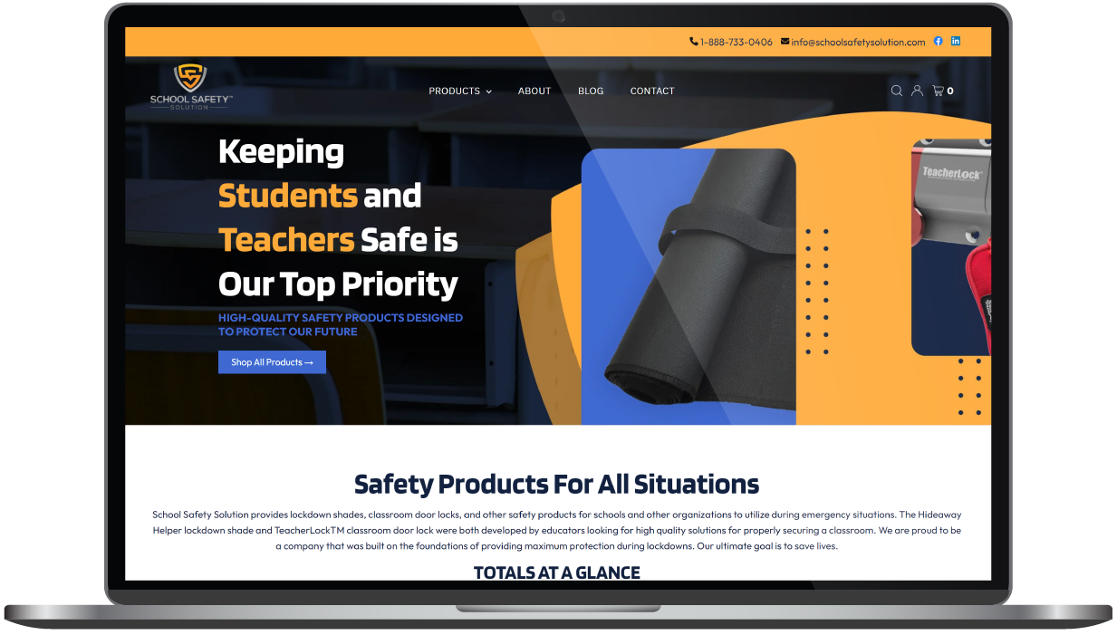
Maintaining the integrity of the hard work and search validation built into the website was paramount. Resources that were drawing traffic were protected throughout the rebuilding process, a challenge that called for our exceptional problem-solving skills and creativity. Keeping the client’s existing logo, we found create ways to apply it throughout the new design. The client’s shield logo shape was modified for use throughout the site, creating dynamic background graphics and personalized patterns. We also included dark background images throughout the pages to visually highlight the products being sold.
The Results
Change is good—when it protects what shouldn’t be changed. In this case, great results continue to come from identifying and guarding the resources successfully drawing traffic. Additionally, our team met the challenge of getting the e-commerce platforms to adapt to the needs of the content strategy s our client can now enjoy a faster CMS that supports their growing e-commerce needs.
"The RivalMind team has been tremendous to work with."
- Jon Hardecopf, President of School Safety Solution
School Safety Solution, located in Charlotte, North Carolina, has seen 83% revenue growth year-over-year and reports daily new customer acquisition.
Before & After
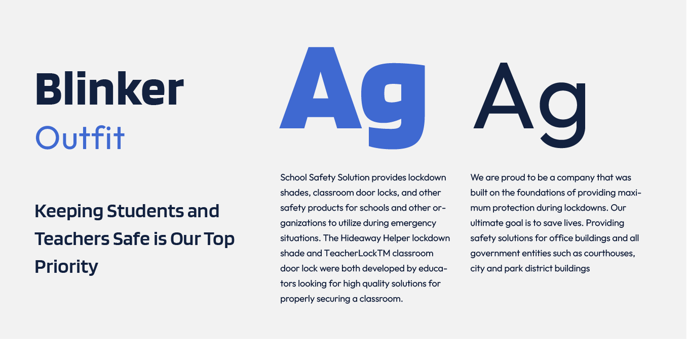
Clean, reliable font
The squarish curves of Blinker made this font an obvious choice for our team. It has an impactful and reliable visual appeal while maintaining a personal touch through its distinct letterforms.
To pair with the bold Blinker, our team opted for Outfit, a clean, no-nonsense sans serif font that’s perfect for body copy use.
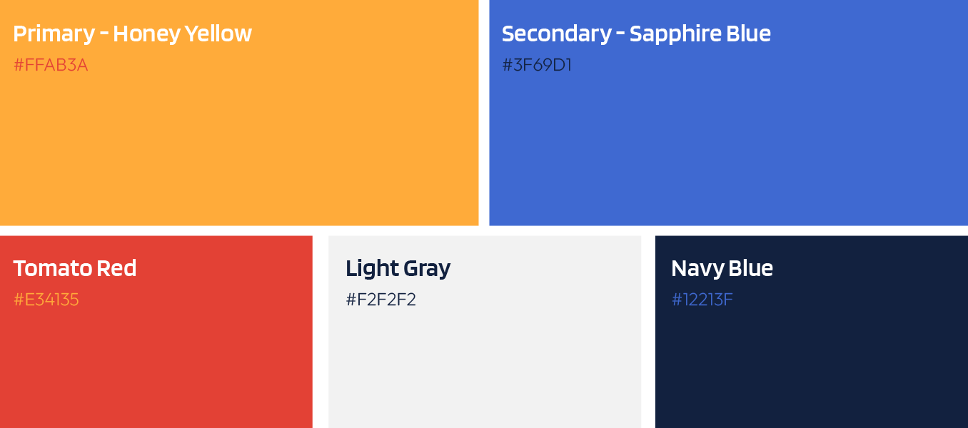
Vibrant, inspired colors
Inspired by the client’s logo, our team crafted a palette of orange, red and silver. Two additional striking colors were introduced to their original lineup: a vibrant cobalt and a deep navy. By using these colors intentionally within different sections, a visually well-balanced site was created.
More Case Studies
We love to share our clients’ successes! A quick review shows our extensive experience across diverse industries and our talent for aligning with a multitude of styles and branding guides. The one commonality you’ll see? Our ability to bridge the gap between marketing and business growth through innovative and custom design. This is why companies come to us.


