Non-Profit Organization
Willow Womens Center
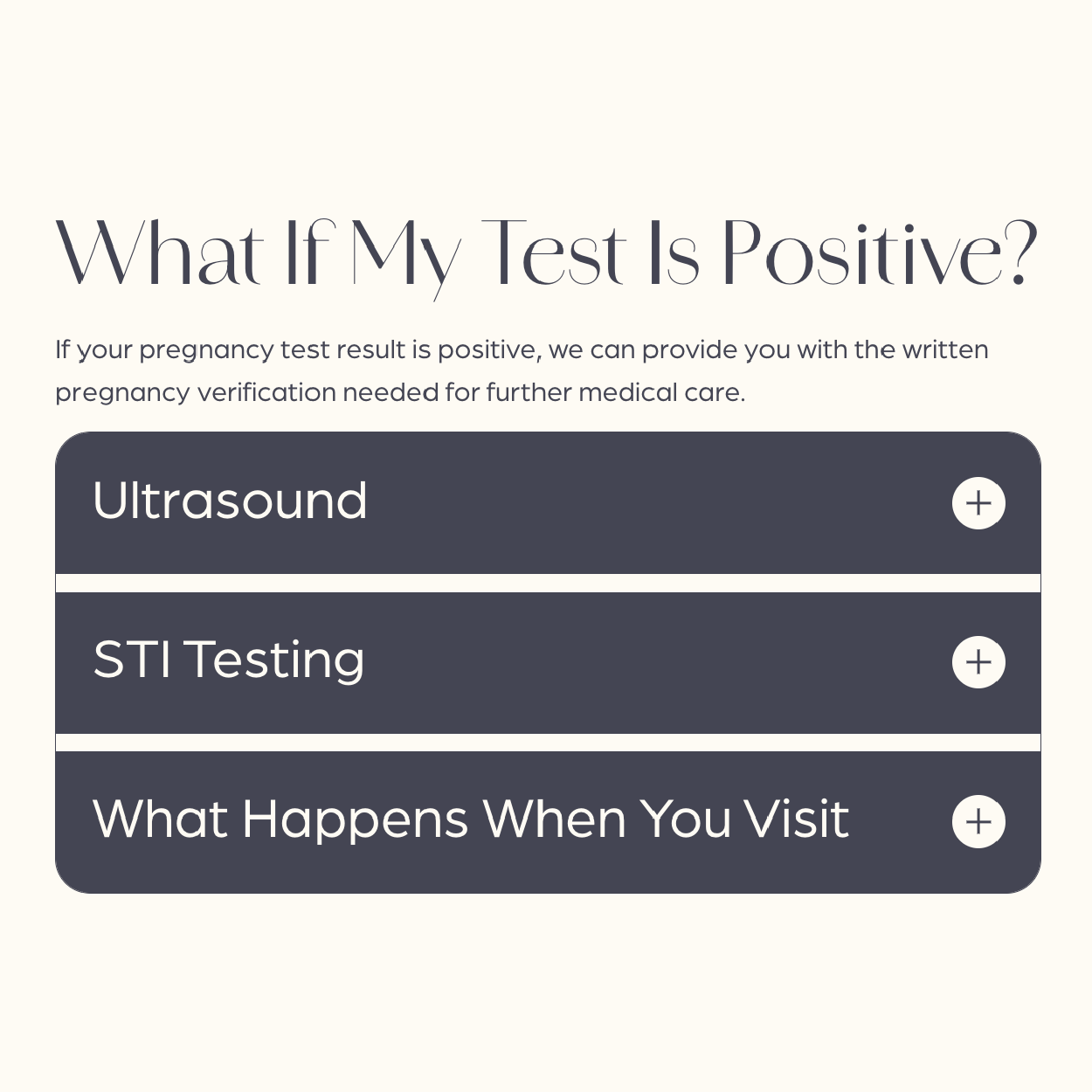
As a longtime happy client, the leadership of Willow came to us to develop a fresh look for their website. Their mission is to provide women with all the resources they need to make an informed decision about how to move forward with their pregnancy. Knowing that the average age of their clients in the past year was 25.6 years old, the goal was to provide valuable information to potential clients and to really connect with the needs involved with an unplanned pregnancy. Serving clients as young as 14 and as old as 50, it was also important that all information be easy to read and access.
Built & Hosted using

Modern, Soothing, Supportive
SEO/ Website Development
Our Approach
Striking yet approchable aesthetic
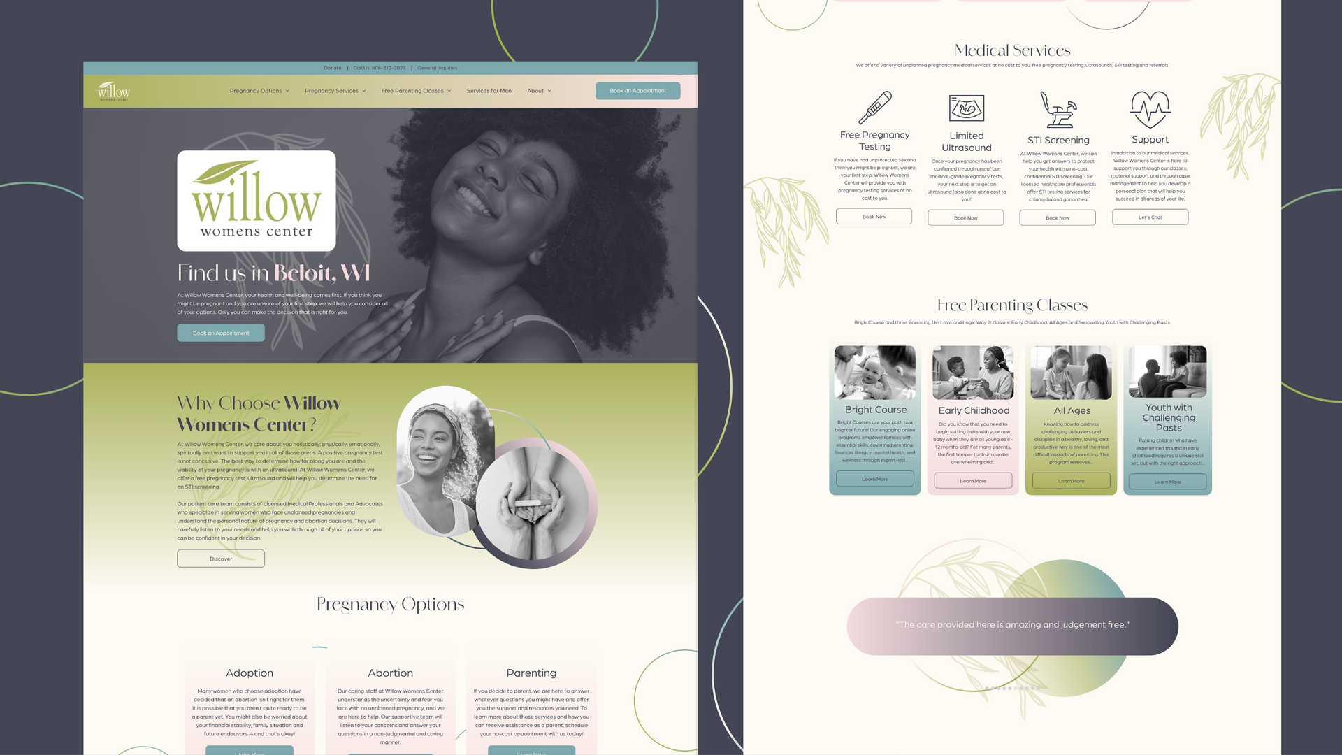
While the Willow Womens Center had a recognizable logo and a steady history using green as their primary color, RivalMind encouraged them to expand their color palette and overall brand. Through the addition of design elements and new typefaces, we were able to enhance their brand and expand audience appeal.
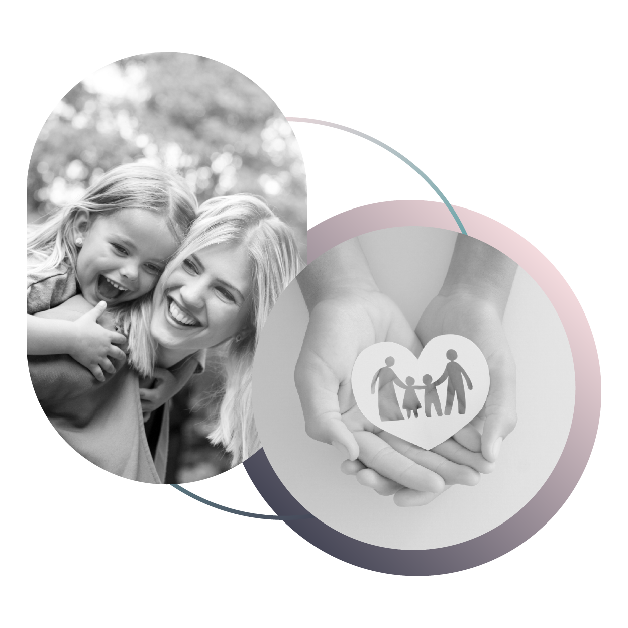
Our thoughtful selection of images complements the brand message by visually conveying the center's core values and mission, creating a cohesive and inviting brand experience. All stock imagery expresses the diversity in the women, families, and men they serve.
The Results
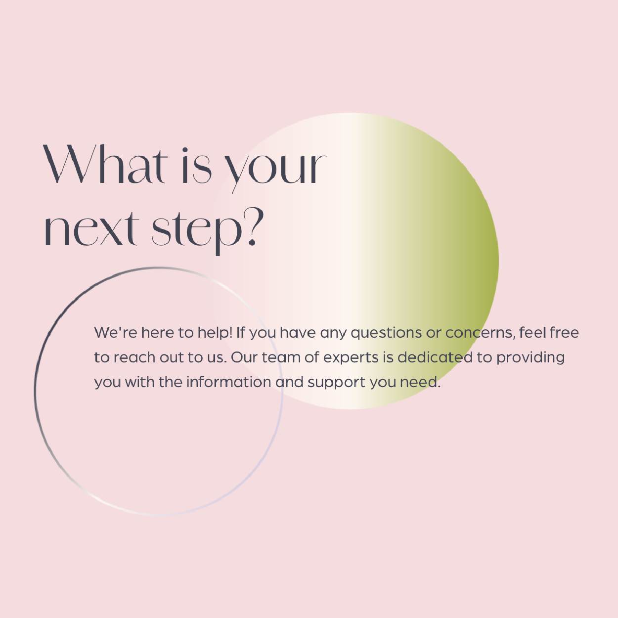
The design elements hit the target of creating a nurturing and professional feel, while the thoughtful content prioritizes the need for clarity and empathy. Overall, the brand positions Willow Womens Center as a trusted partner in women's healthcare, dedicated to providing non-judgmental support and valuable resources in a safe, caring setting.
This project helped the client see their brand in a new, more refined way. And our favorite result? Making this happy client even happier.
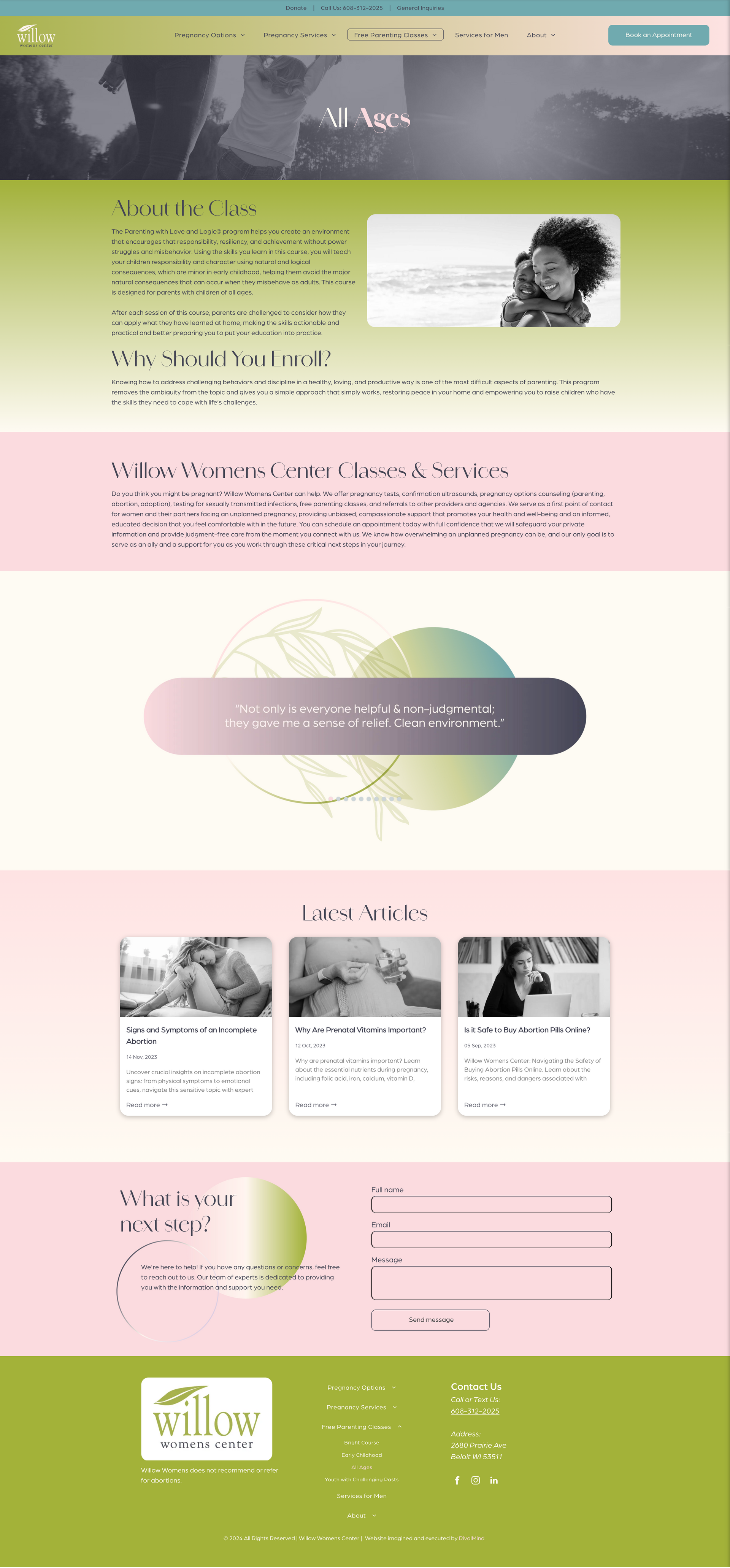

Before & After
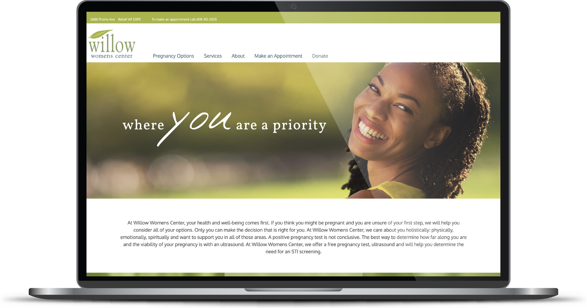
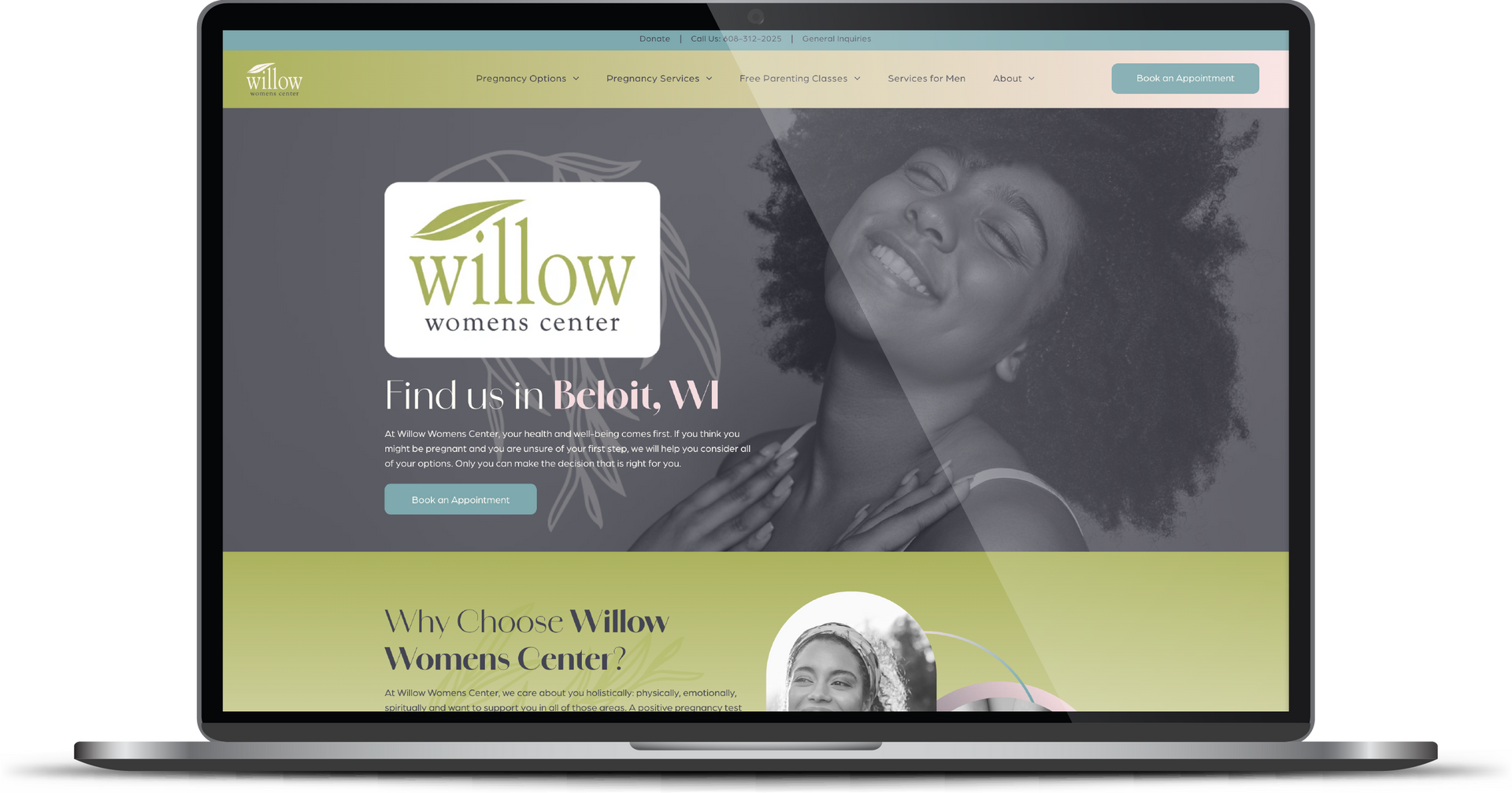
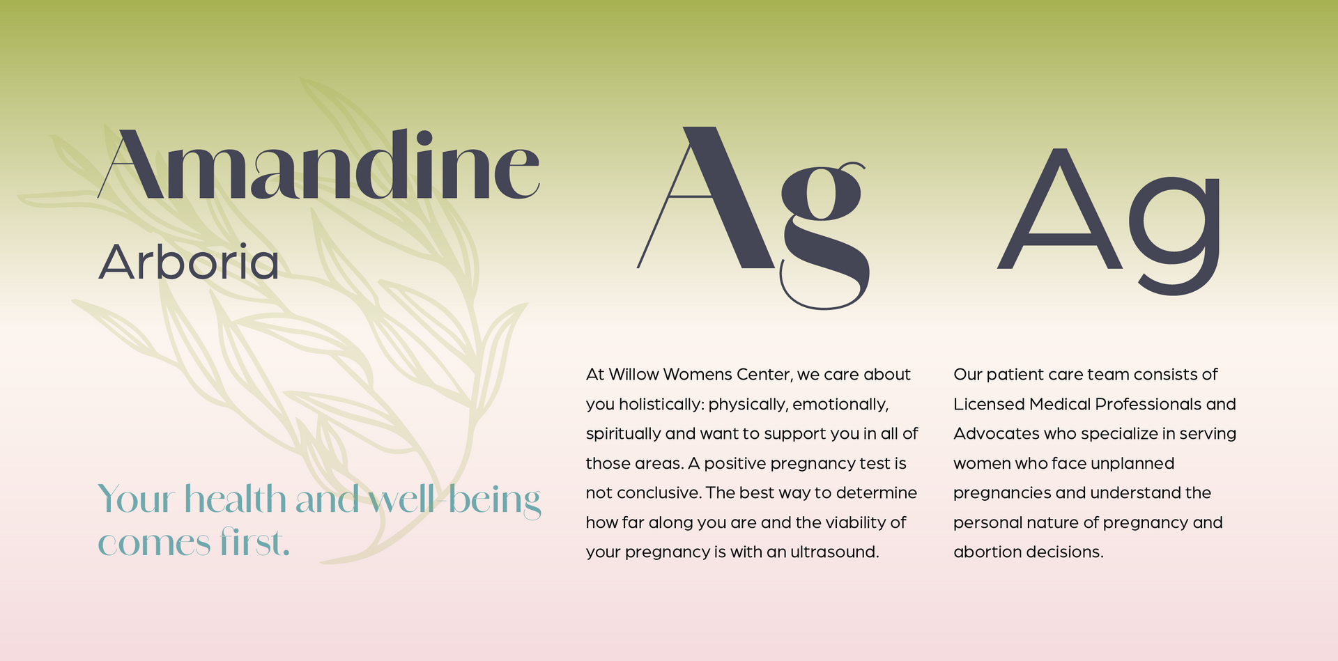
Modern and friendly font.
Amandine and Arboria fonts were brought together to create a harmonious blend of elegance, professionalism, and approachability. Arboria boasts a generous x-height and its wide characters portray a modern, friendly flair. Amandine is well-suited to luxury brands and delivers a sophisticated elegance. Together they reflect the center's dual focus on providing high-quality, reliable care while also being a compassionate and supportive resource for women.
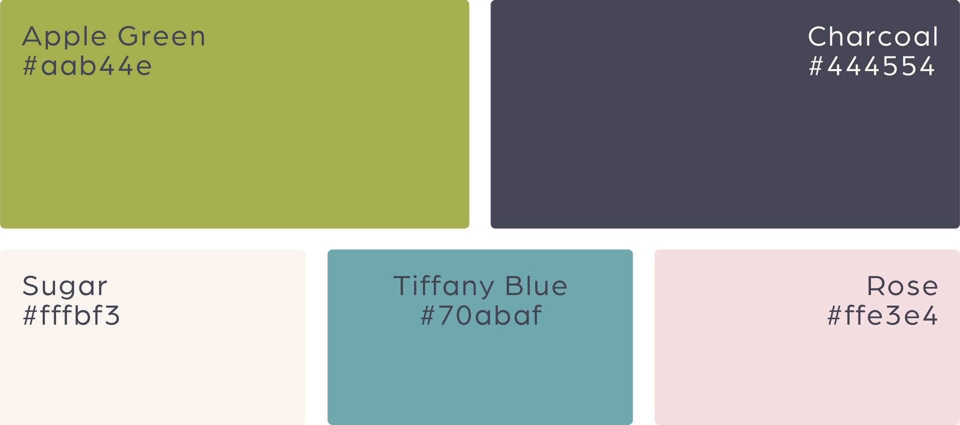
Tranquil colors with a modern touch.
Staying with the client’s primary color of soft green, we chose cooler shades of charcoal and Tiffany blue as the perfect complements. This combination creates a harmonious and refreshing palette, as well as providing a sense of calm and tranquility that remains modern and sophisticated. The inclusion of delicate rose and sugar tones adds warmth and lightness, balancing the overall look and providing an inviting feel to the brand. Together, this fresh new look encapsulates the nurturing and welcoming nature of Willow Womens Center, making visitors feel at ease and supported.
"RivalMind has had a significant impact on our future"
Willow Womens Center, an NPO located in Beloit, Wisconsin, benefits from “a huge increase in targeted online traffic” through its new website and SEO efforts.
Staff Spotlight
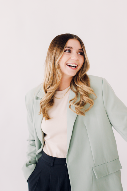
Designed by Alexis Camp
Alexis Camp showcases her talent by crafting a diverse array of elements, ranging from captivating graphics to dynamic website designs. Rooted in her unwavering passion for design, Alexis's approach embodies a commitment to exploration, constantly seeking to push the boundaries of creativity. With an appetite for innovation, she pursues fresh perspectives and original concepts, ensuring that every project she undertakes resonates with creativity and excellence.
Specialties: Duda Web Development, Illustration, Logos/Branding

More Case Studies
We work across an expanse of projects at RivalMind, and we love to share our clients’ successes. For each case study, our goal is the same: bridging the gap between marketing and growth through innovative and custom design. This is why companies come to us. Dive into more of our favorite web design projects below!


