Concrete Cutting
Cobra Concrete
After working with the RivalMind SEO team for years and being pleased with the results, the need for a comprehensive update became apparent. Advanced strategies of SEO had become limited by the outdated website infrastructure and navigation.
With a strong foundation of trust established, RivalMind proposed a rebuild, rebrand, and redesign. The need for the work was clearly explained, along with the multiple benefits the completed project would deliver. Knowing our expertise and abilities, the client wholeheartedly embraced the proposal.
Built & Hosted using
Edgy, Masculine, Grunge
Website Design
Our Approach
Rebranding and restructuring for maximum impact
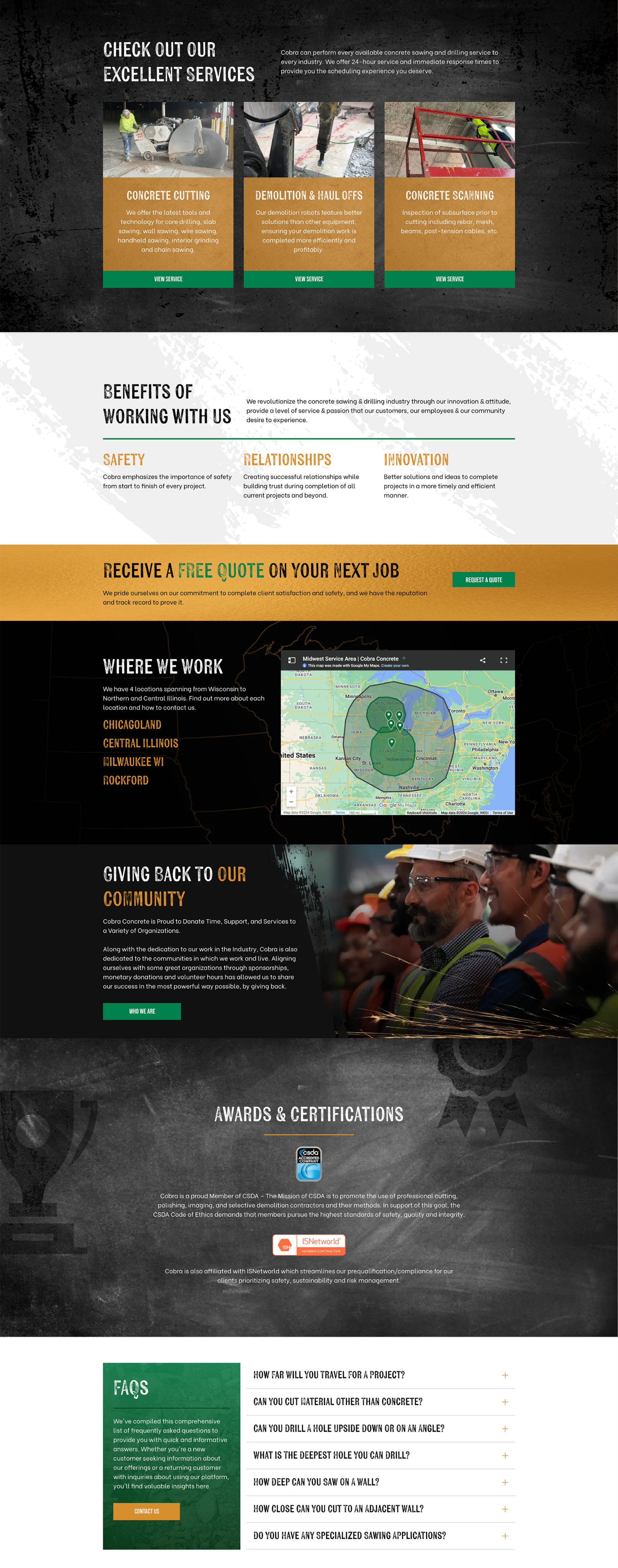
Clients are busy working on their business, so the RivalMind team has perfected the art of working with limited direction. In this case, we brought definition to the charge of building a “kick-ass” website. It would overcome existing limitations, elevate the Cobra brand, exemplify blue-collar professionalism, and move their website into a future of unlimited growth opportunities.
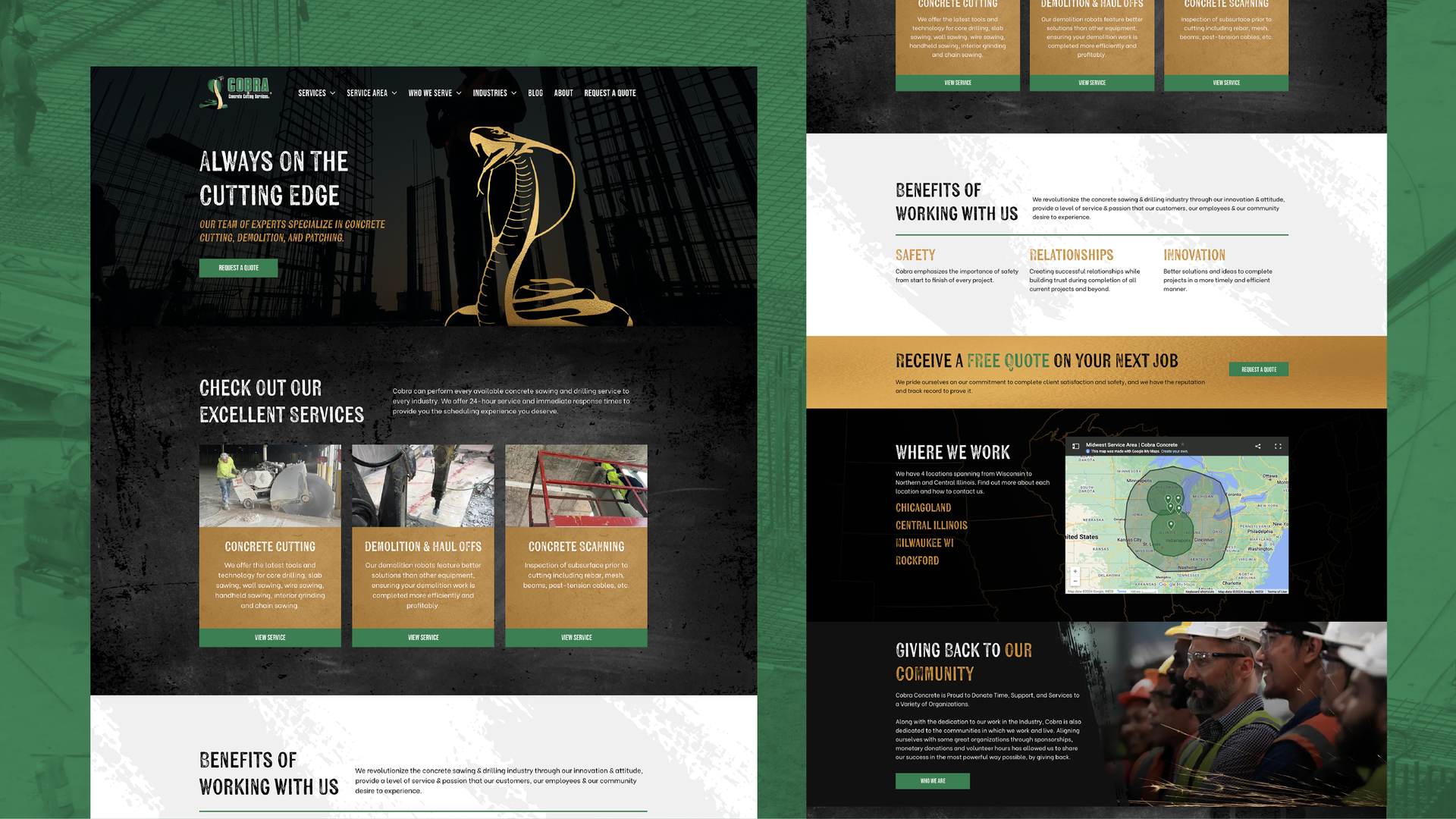
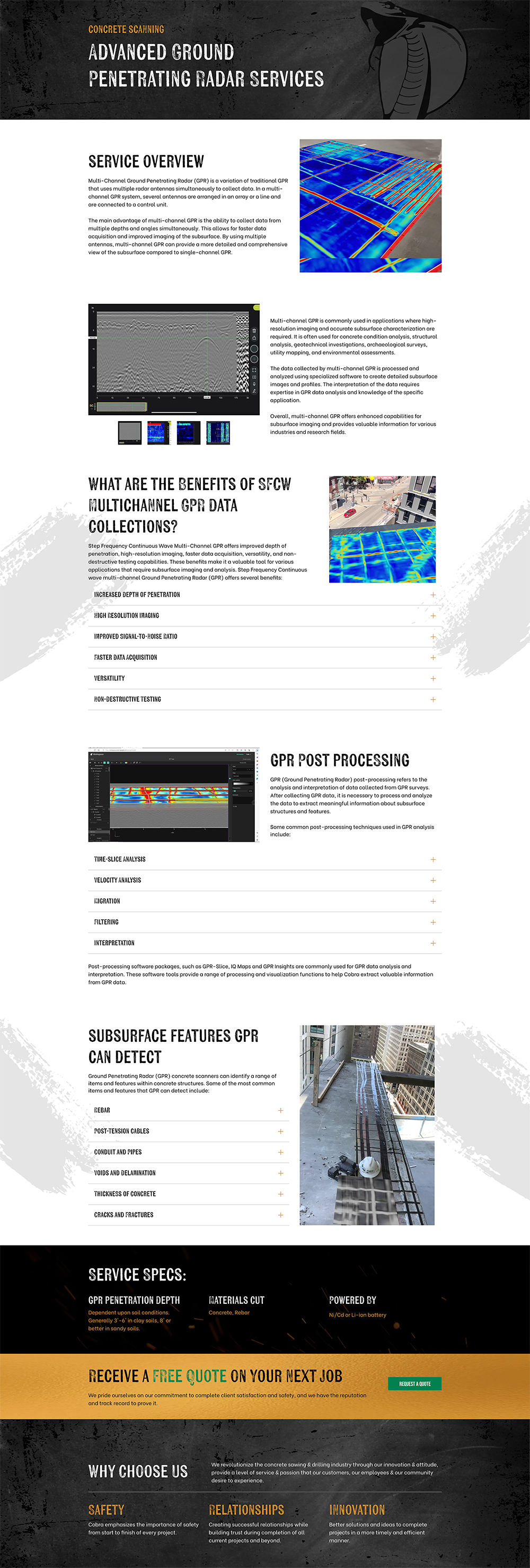
The entire website was restructured to accommodate sophisticated SEO strategies and deliver a simplified, intuitive experience. Our designers created a fresh look that borders on the magical.
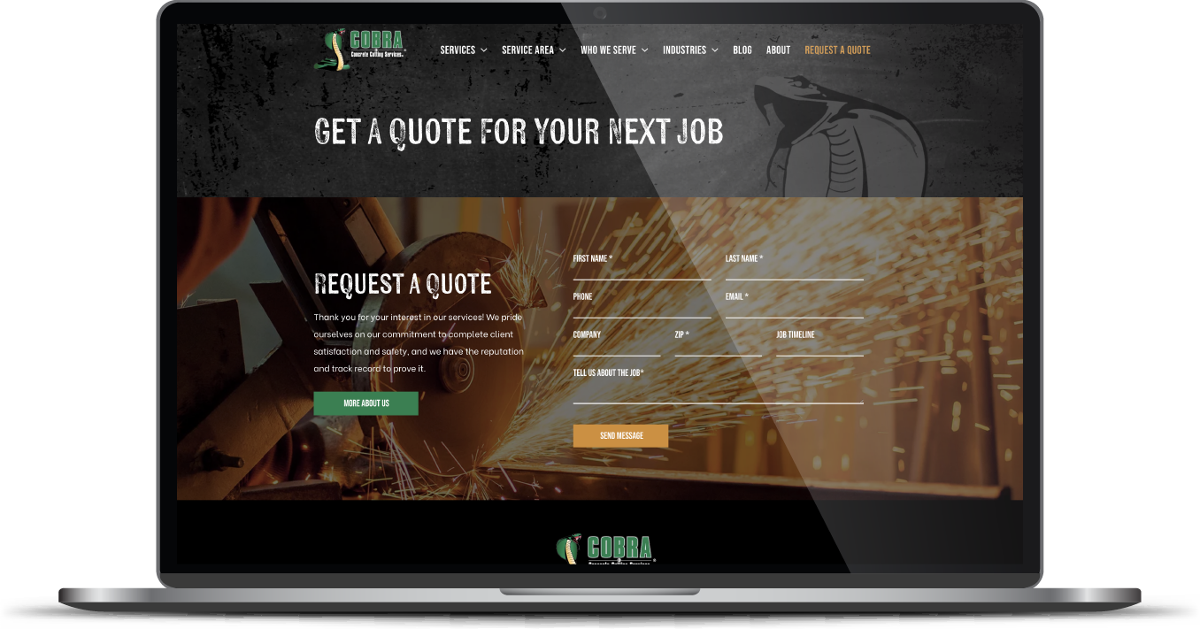
By incorporating existing elements of the Cobra brand, the new site welcomes returning customers with a familiar feeling that is simultaneously updated and modernized but not so jarringly different that one might think Is this even the same company?
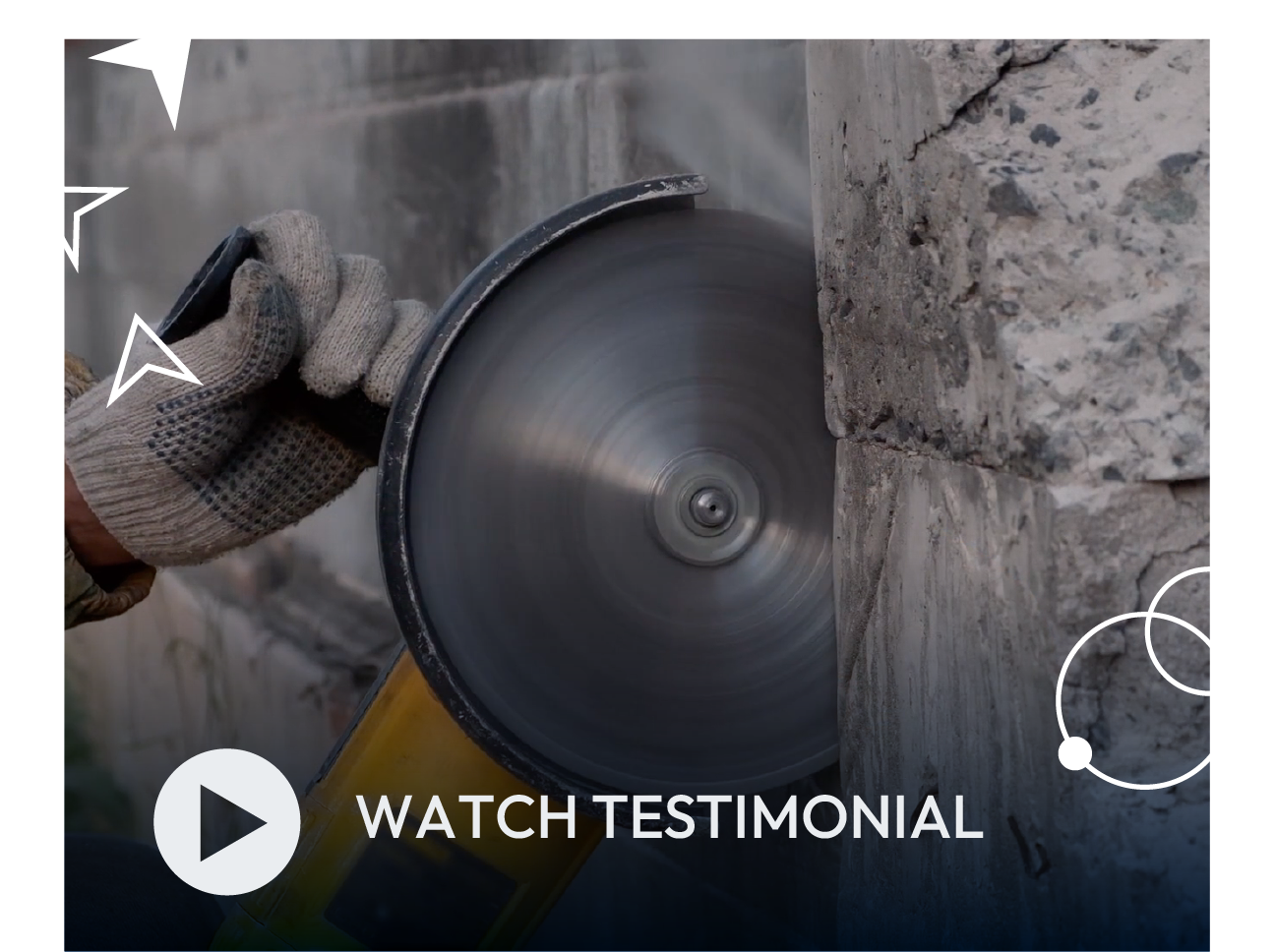
The brand was further informed by work-focused images that highlight their main service of concrete cutting. Coupled with the existing cobra logo, the overall effect is a masculine, construction aesthetic that nailed the client’s “kick-ass” vision.
The Results
The client was so pleased with the process and end-product, they signed up for our social media services. Our website design work and overall project efficiency signaled that they would greatly benefit from handing social media work to us—and we are happy to leave the concrete work to them.
"RivalMind are results-oriented and a great group to collaborate with."
- Dan Foley, President of Cobra Concrete
Cobra Concrete Cutting, with locations in Chicago and Milwaukee, has more than 100 position-one listings and is converting Google traffic into big business.
Before & After

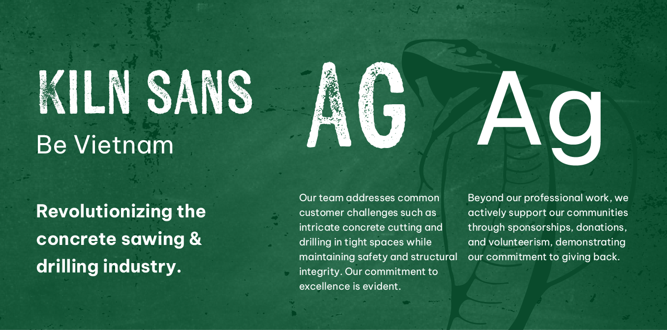
Rough and gritty font.
Kiln font family give headers an appropriate rough and gritty appearance. Be Vietnam, an easy-to-read sans serif font, conveys functionality and useability serves well for the body content.
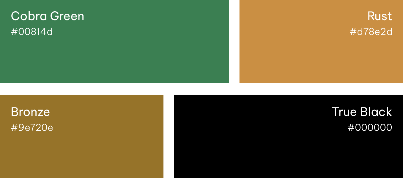
Familiar colors with a masculine emphasis.
The use of green and orange tones was carried over from the previous site to provide brand familiarity, though used less frequently. More emphasis was placed on grays and black to update the look and communicate the modern masculinity of the brand.
More Case Studies
We work across an expanse of projects at RivalMind, and we love to share our clients’ successes. For each case study, our goal is the same: bridging the gap between marketing and growth through innovative and custom design. This is why companies come to us. Dive into more of our favorite web design projects below!


