Manufacturing Supplier
Bracing Systems
Since 1972, Bracing Systems has dominated the Midwest region for selling and renting scaffolding systems, specifically hydromobile equipment. The organization approached our team with a loyal customer base, many of whom had worked with Bracing Systems for decades.
However, the highly-trusted construction equipment and contractor supplies had a single-page website and minimal online visibility. The company’s vibrant reputation, capabilities, and history were incongruent with their digital image – and Bracing Systems’ leadership knew it.
Built & Hosted using
Gritty, Established, Tough
Logo Design / Website Design / SEO
Our Approach
Rebrand and strategize for a strong online presence
Having formed a relationship with the leadership team at Bracing Systems from previous projects, we hit the ground running. We outlined a three-fold goal: strategically transfer a wealth of information from the previous site to the new platform, refresh the Bracing Systems brand, and ultimately bridge the gap between business reputation and online presence.
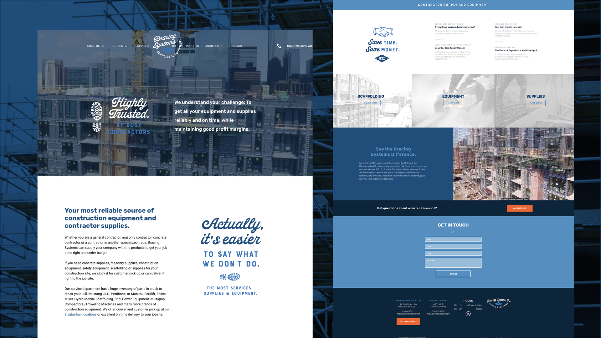
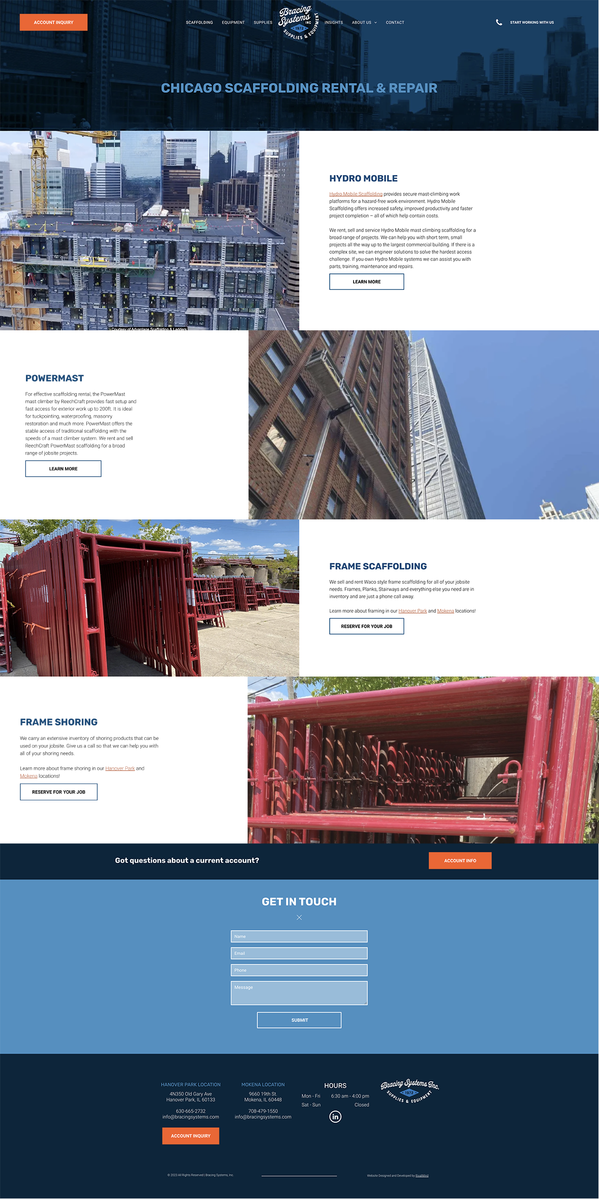
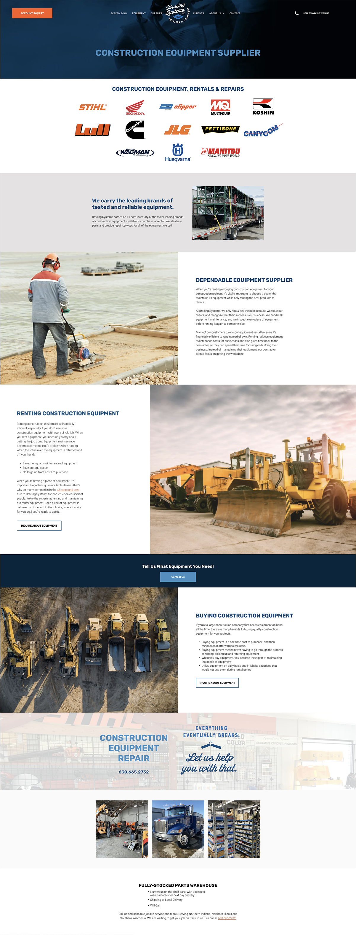
Our creative team refreshed website branding while staying true to the vintage brand guidelines Bracing Systems’ had employed for decades.
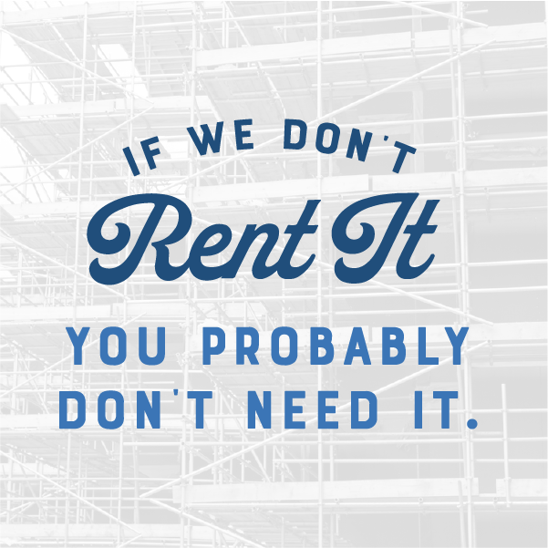
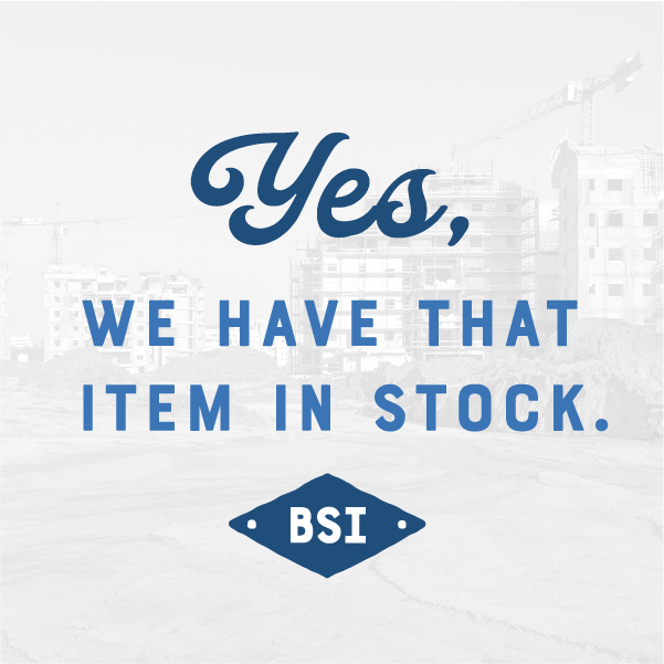
We incorporated visually-intriguing videos into key places on the website, transformed and modernized the logo, and enhanced coloring guidelinesFinally, the design team crafted customized graphics to clearly display Bracing Systems’ values. These are integrated in strategic locations across the platform.
Ultimately, the new site is aesthetically-pleasing and user-friendly. Intuitive menus and click-to-call functionality allow busy contractors to efficiently reach out for a quote.
The Results
After launch, Bracing Systems decided to capitalize on their new platform and pursue ongoing SEO services with our team. The new website is a fantastic conversion tool. Online traffic driven to the website now understands the who, what, and why of Bracing Systems within seconds, inspiring visitors to become customers.
"RivalMind found the market. They generated business."
- Tom Williams, Owner of Bracing Systems
Bracing Systems hired RivalMind to drive online sales. Two new websites were developed—a massive ecommerce site, which sells construction supplies, and a brochure website with an emphasis on equipment repair, rental, and sales.
Through SEO, Bracing Systems experienced a substantial boost in online sales, repair requests, and heavy equipment purchases.
Watch the testimonial to hear more.
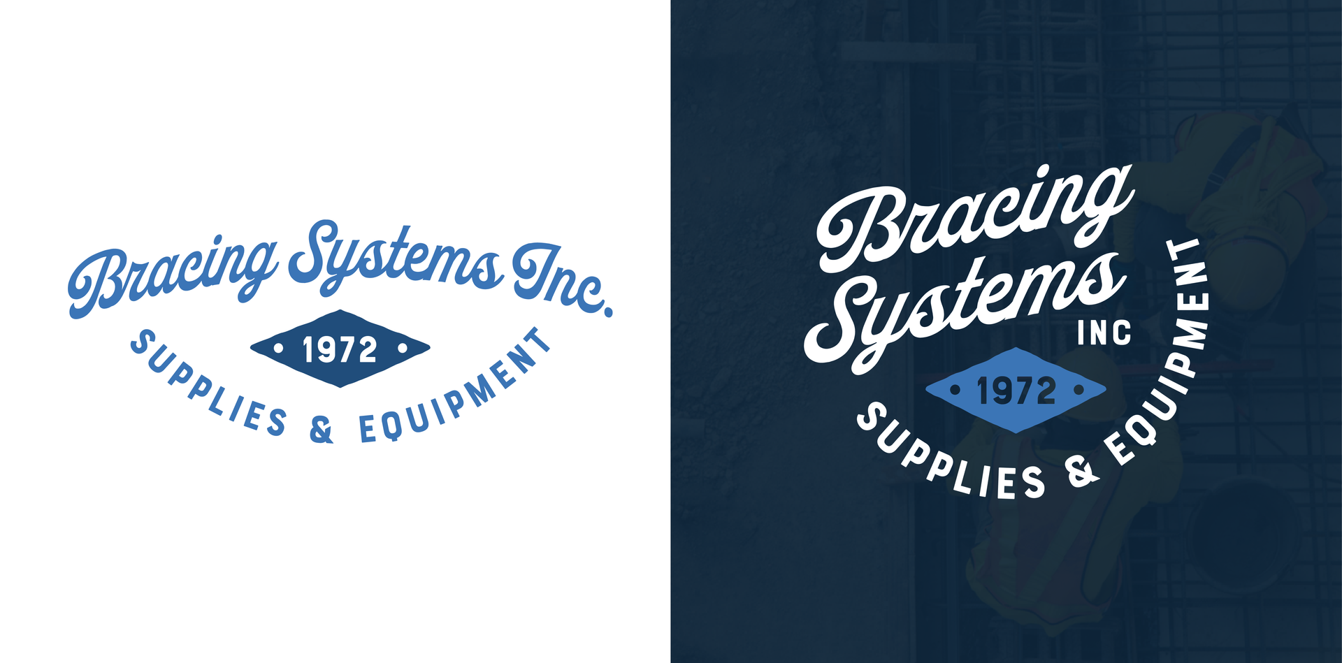
A Brawny, Established Logo
Bracing Systems came to us to have a revitalized brand that better represents who they are. We landed on this logo because we felt it best represented a well-established, industrial company, while still having a unique style seen in the script font for the logo.
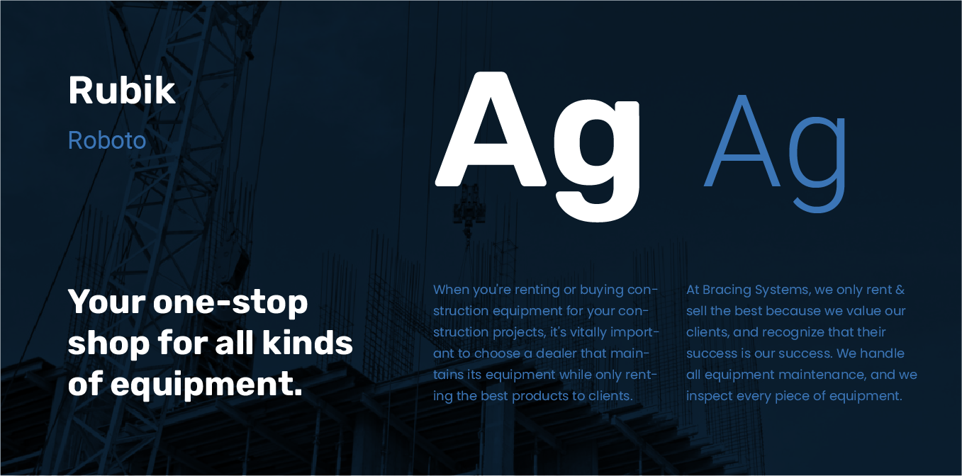
Strong, identifiable fonts
Rubik represents the strong, industrial presence that Bracing Systems has had within their industry since 1972. As a bold, sturdy font, it clearly represents the values that the manufacturing distributor embodies. Roboto is a simple, clean sans serif that pairs well with Rubik and is highly legible for body copy.
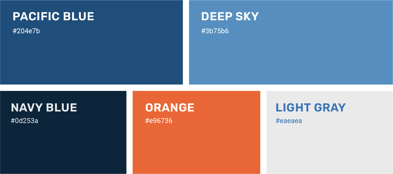
Blue hues accented with a bold orange
When rebranding Bracing Systems, our team selected a cohesive and complementary color scheme that would communicate an established strength. The orange accent allows for important content to stand out.
More Case Studies
We work across an expanse of projects at RivalMind, and we love to share our clients’ successes. For each case study, our goal is the same: bridging the gap between marketing and growth through innovative and custom design. This is why companies come to us. Dive into more of our favorite web design projects below!


