IT Solutions & Criminal Justice Software
JANO Tech
A new sales manager identified Jano Tech’s need for a new look and an updated, restructured website. It was imperative that the company improve their online presence and ensure that those looking for IT solutions and criminal justice software find Jano Tech quickly. We delivered an extensive brand overhaul and a website that captures the attention of potential clients and quickly establishes Jano’s credibility and expertise.
Built & Hosted using

Reliable, Professional, Distinct
Website Design
Our Approach
Clarifying the Brand to Capture Attention
In every industry, it’s essential to stand out in the marketplace in order to acquire new customers and retain existing customers. As a supplier of comprehensive software solutions to companies and governments, presenting a solid and reliable brand is critical.
Starting with Jano Tech’s strong logo and loosely defined brand colors, our team expanded and further define a brand that’s quickly recognized by existing client and captures the attention of potential clients.
The brand we crafted communicates the reliability, security, and technological edge that represents Jano’s core values.


The Results
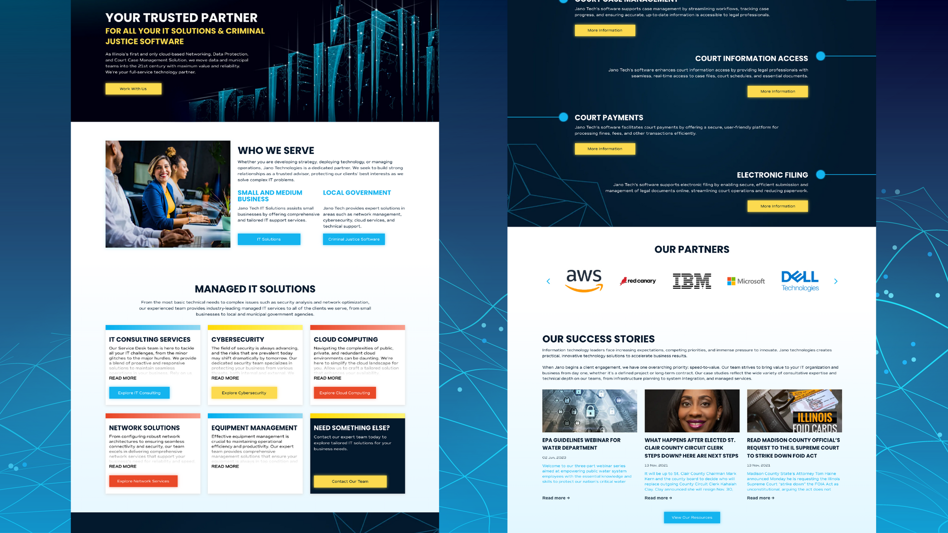
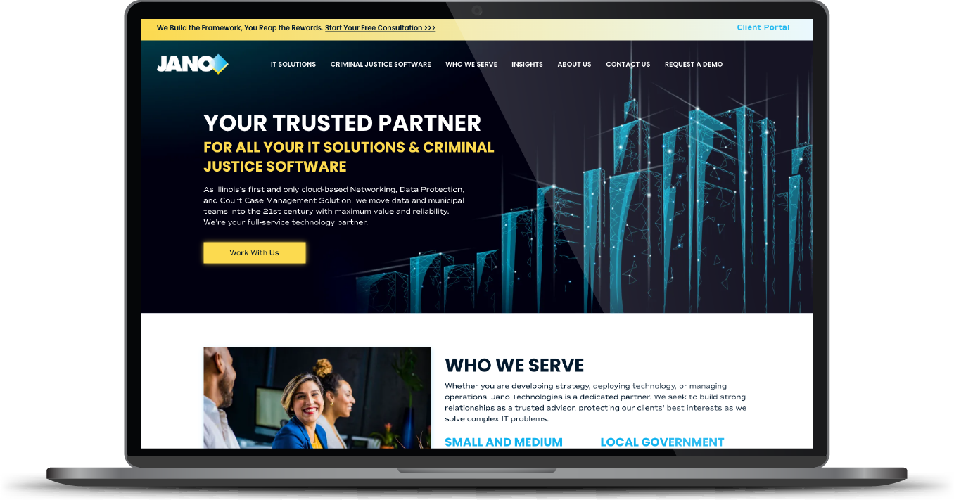
Every part of this client’s website was rethought, redesigned, and fully strategized for SEO. The carefully selected technology-themed imagery now complements the blue color scheme. The striking hero and contact sections with customized gird illustrations further emphasize Jano Tech’s purpose. The calls-to-action are now more engaging and better lead visitors to next steps. And with a complete brand overhaul as part of the package, the client couldn’t be happier.
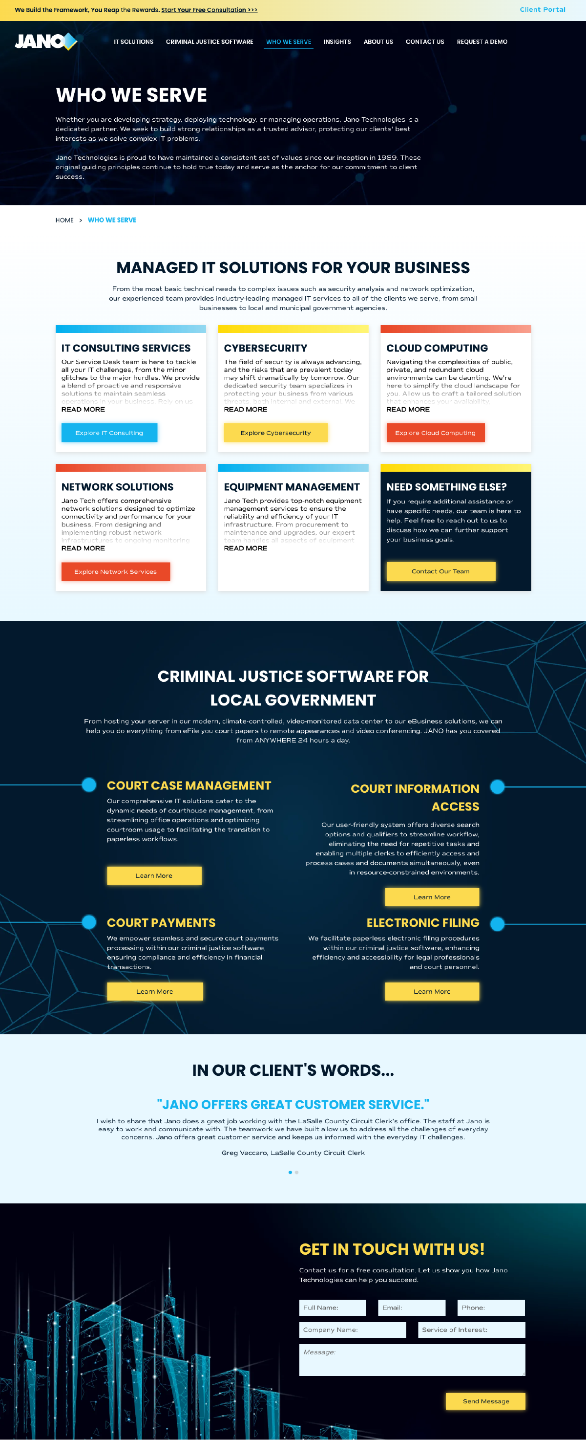
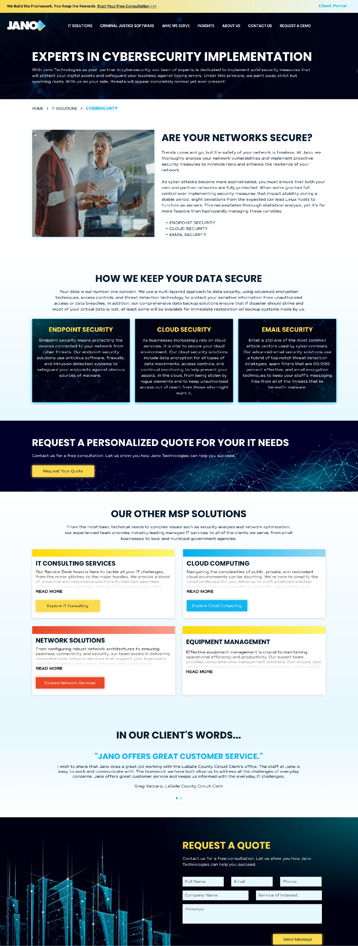
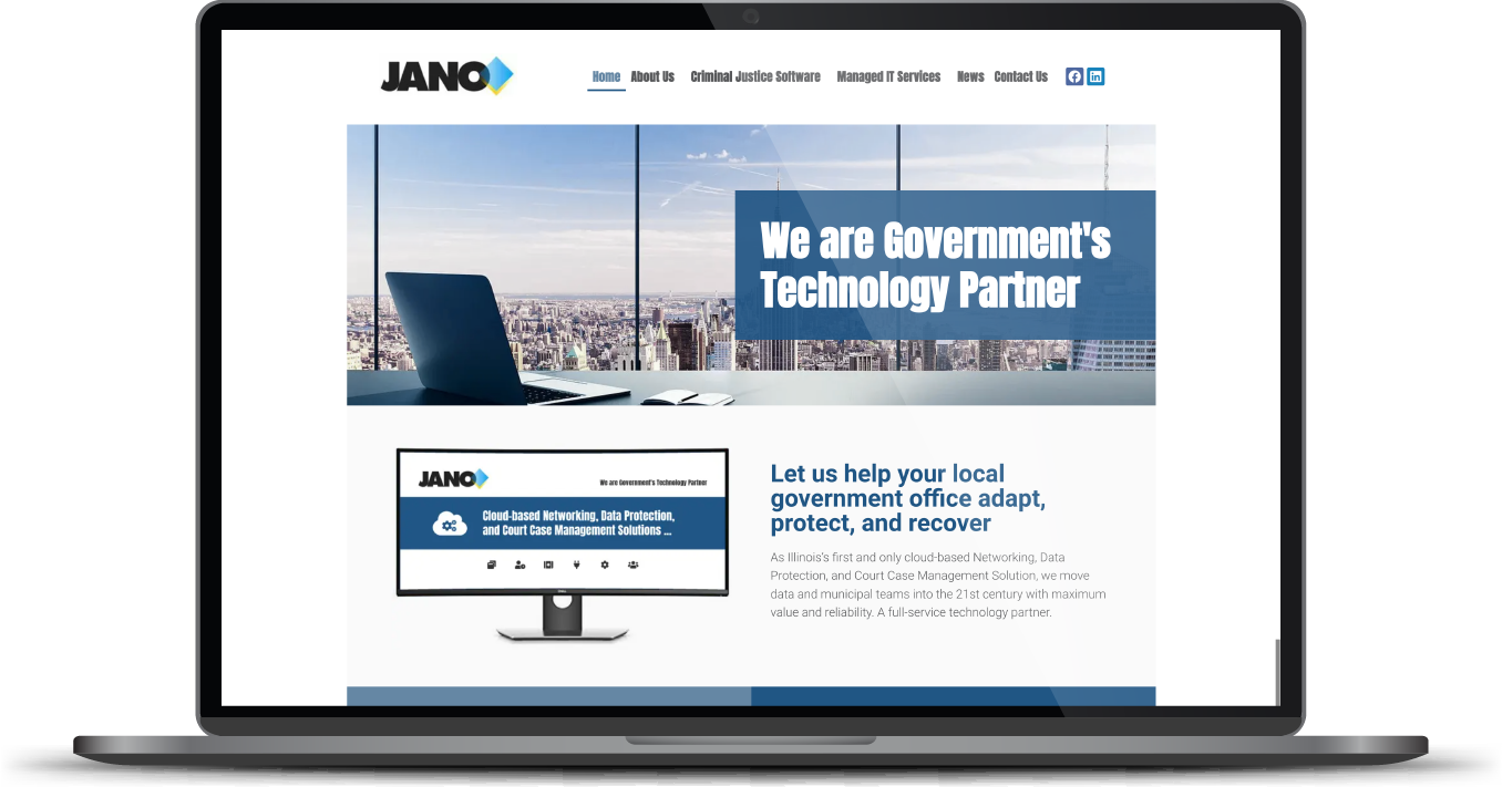
Before & After
Bold yet approachable font.
Giving a nod to the original logotype without directly copying it, our team selected Poppins as the main website font. As a geometric, approachable font, it was also a great choice for bold headings. To add some singularity to the design, we paired Poppins with the more stylized Commuter Sans, which lends a fresh, contemporary feel to the site.
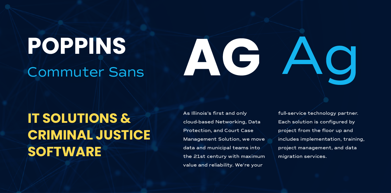
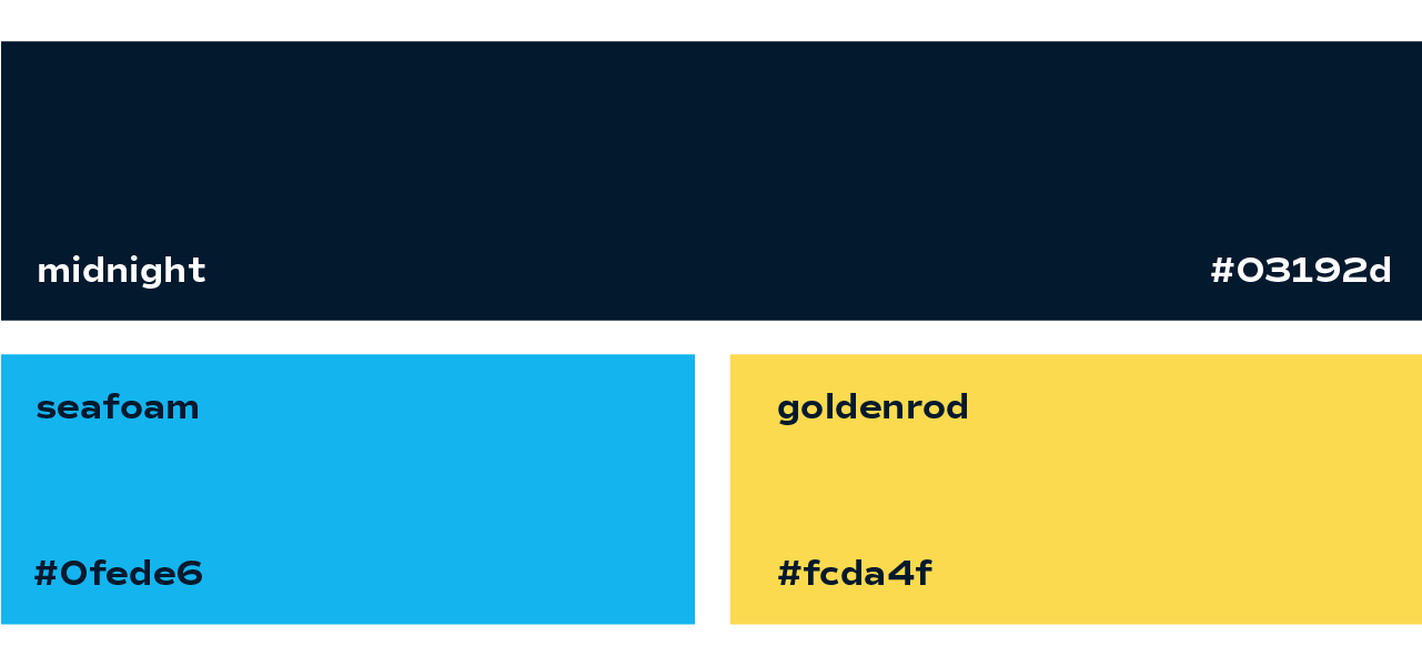
High-Contrast Color Scheme
We opted to keep the vibrant blue and bright yellow in the client’s logo, but in order to prevent the palette from feeling too youthful, our team selected a deep midnight tone to add contrast and balance to the project. Using a tasteful combination of dark and light allowed us to build a well-structured site with visual strength.
More Case Studies
We work across an expanse of projects at RivalMind, and we love to share our clients’ successes. For each case study, our goal is the same: bridging the gap between marketing and growth through innovative and custom design. This is why companies come to us. Dive into more of our favorite web design projects below!