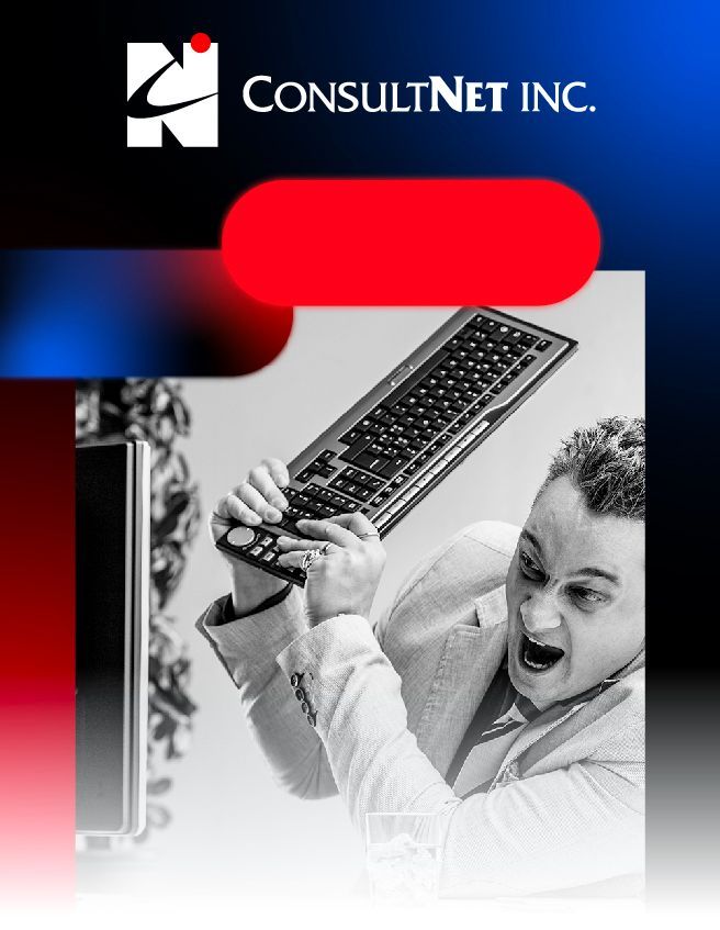
Movie Production
Kamerad
We can thank our reputation and the clients who recommended us for bringing this client our way. This project is a perfect example of our ability to customize our creativity to the unique vision of the client and the specific goals of the website.
The main purpose: to announce the release of an upcoming movie. The biggest challenge: a really tight timeline for designing, development, and launch. Our design work would also be limited to the graphic elements provided by the client, along with our creation of background graphics. It was critical to capture the grit of the movie and to have the visual experience of the website elicit the same feeling as the movie.
Built & Hosted using

Dark, Dramatic, Bold
Website Design

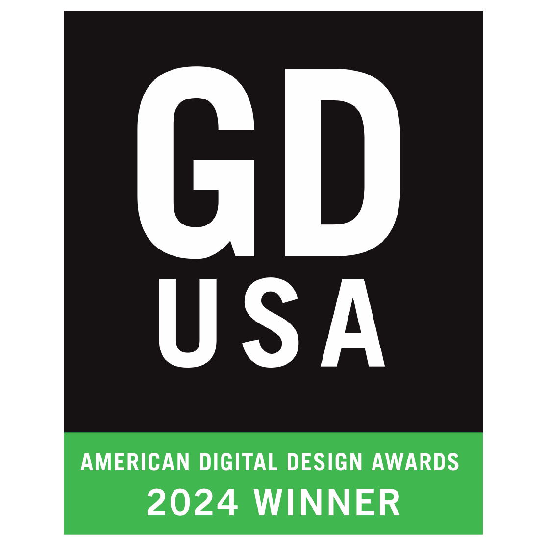
Celebrating Our Award-Winning Web Design
Our promotional website for Kamerad, a compelling short film, has won the 2024 American Digital Design Award from GDUSA! This award recognizes our dedication to creating a visually stunning and immersive digital experience that captures the essence of the film. We’re honored to contribute to showcasing Kamerad in a way that resonates with audiences.
Our Approach
Crafting a sense of characters, movement, and imagery
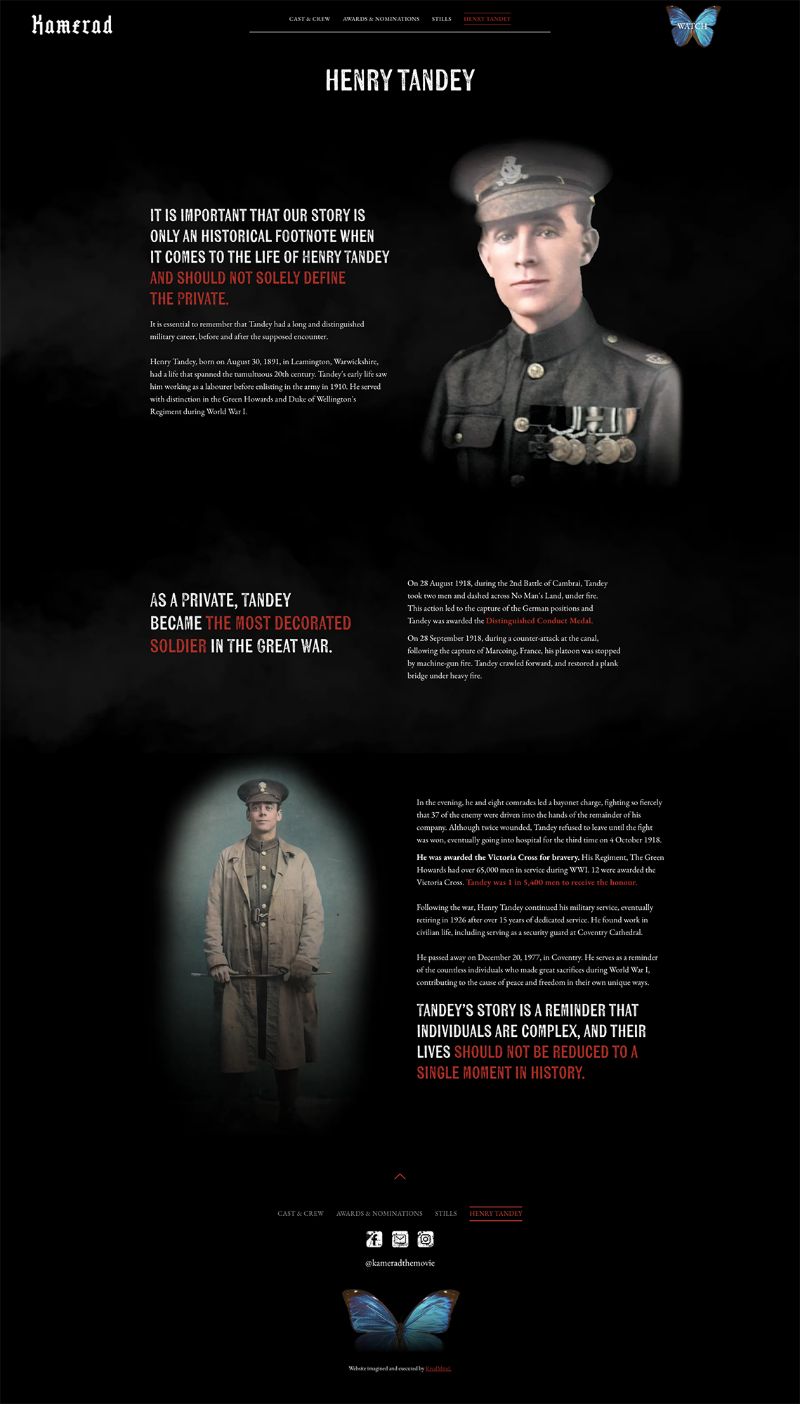
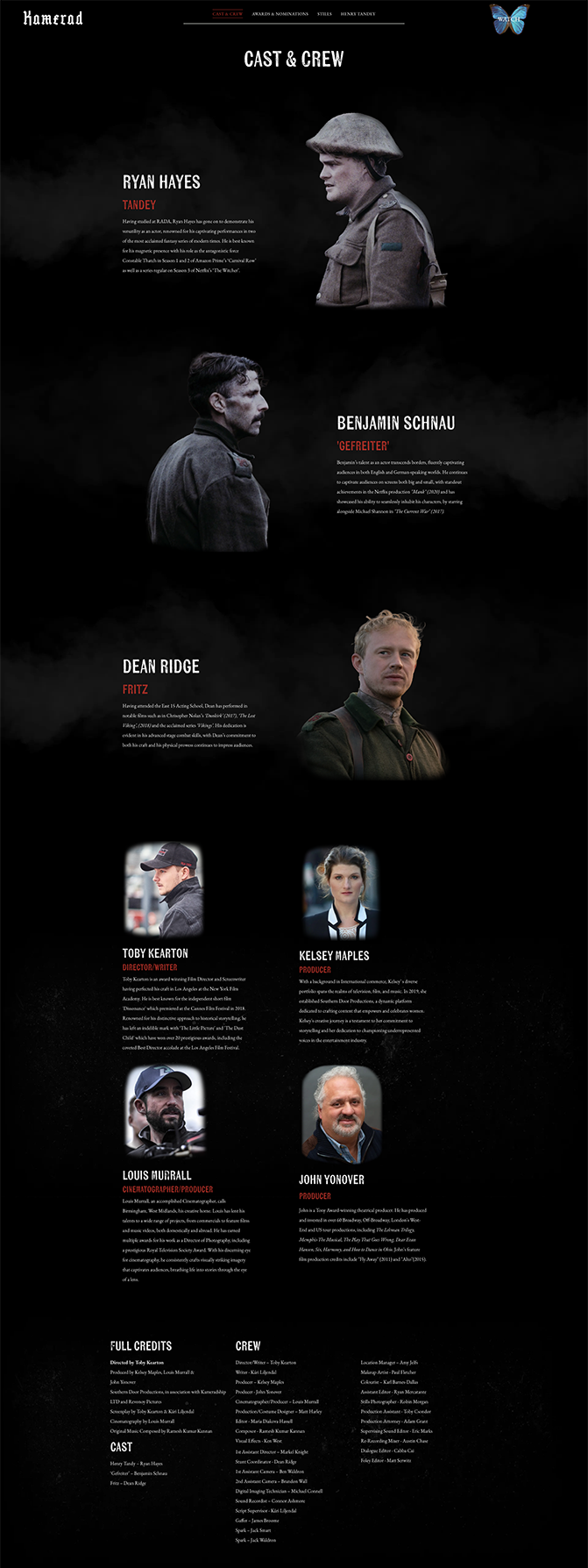
Working collaboratively to clarify the brand, we surfaced the need to emphasize the characters in the movie in order to align with the brand and client goals. To reflect that Kamerad is a short film, our team created with “moving images” throughout the site.
Overall, the branding is dark and dramatic, yet it radiates a profound sense of hope through imagery and text. The sense of movement and storytelling echoes the importance of the film’s message.
A significant emphasis was also placed on both the movie's production and Henry Tandey, the central figure of the film. With imagery featuring the characters, actors, and the production crew, we were able to convey the significance and weight of this historical story. To uphold the sense of hope revealed in the movie, a recurring motif of a blue butterfly is featured throughout the site.


The Results
When a talented and creative client says, “You and your team have done a fabulous, top-notch job,” it is high praise indeed. From the design to the clear and steady communication of progress from the project manager, this client could not be happier.
Gritty fonts to capture emotion.
While the client specified EB Garamond for the body copy, our team chose to create headlines in Kiln Sans. Not only is it the perfect complement to the body copy, the fonts also work together to capture the grittiness and tense dynamic in this film. Together, they successfully convey the movie’s time period.
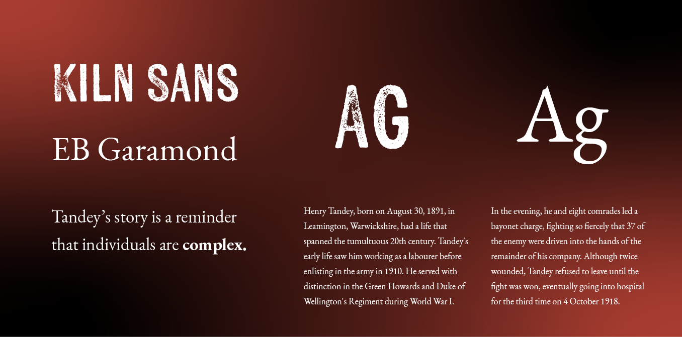
Deep, dramatic red with shades of black.
The color scheme is a thoughtful combination of four colors: two shades of red, black, and a gray accent. These colors add a dramatic, tense mood to the site. The two variations of red highlight both headings and body copy, strategically creating emphasis where needed.

Staff Spotlight
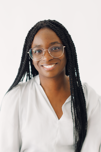
Designed by Krystyanna Joseph
Krystyanna Joseph is the driving force behind groundbreaking website designs at RivalMind. Her approach is defined by a relentless pursuit of innovation, fueled by a deep commitment to research, boundless creativity, and an unwavering dedication to pushing the boundaries of her skills and perspectives. With every project, she sets the bar higher, ensuring that RivalMind remains at the forefront of cutting-edge design and client satisfaction.
Specialties: Duda Web Development, Animation/Motion Design

More Case Studies
We love to share our clients’ successes! A quick review shows our extensive experience across diverse industries and our talent for aligning with a multitude of styles and branding guides. The one commonality you’ll see? Our ability to bridge the gap between marketing and business growth through innovative and custom design. This is why companies come to us.