Non-Profit Women's Clinic
Avail
With a website that was falling short of its potential, Avail’s leadership team came to us for help. With good listening and probing questions, goals were quickly identified. They wanted a streamlined, functional platform that would allow them to easily make edits. And of course it should also be on-brand, communicate a welcoming feeling, and be organized to produce better internet marketing results.
It was also quickly decided that designing the website in WordPress would be too costly and the CMS was too complicated to achieve their goals. Once the RivalMind team communicated all that Duda offered, there was clear agreement: Duda checked all the boxes to provide a much-improved, optimized, and user-friendly marketing tool for this New-York based women’s clinic. Avail's website needed help.
Built & Hosted using

Welcoming, Skilled, Gentle
Website Design / SEO
Our Approach
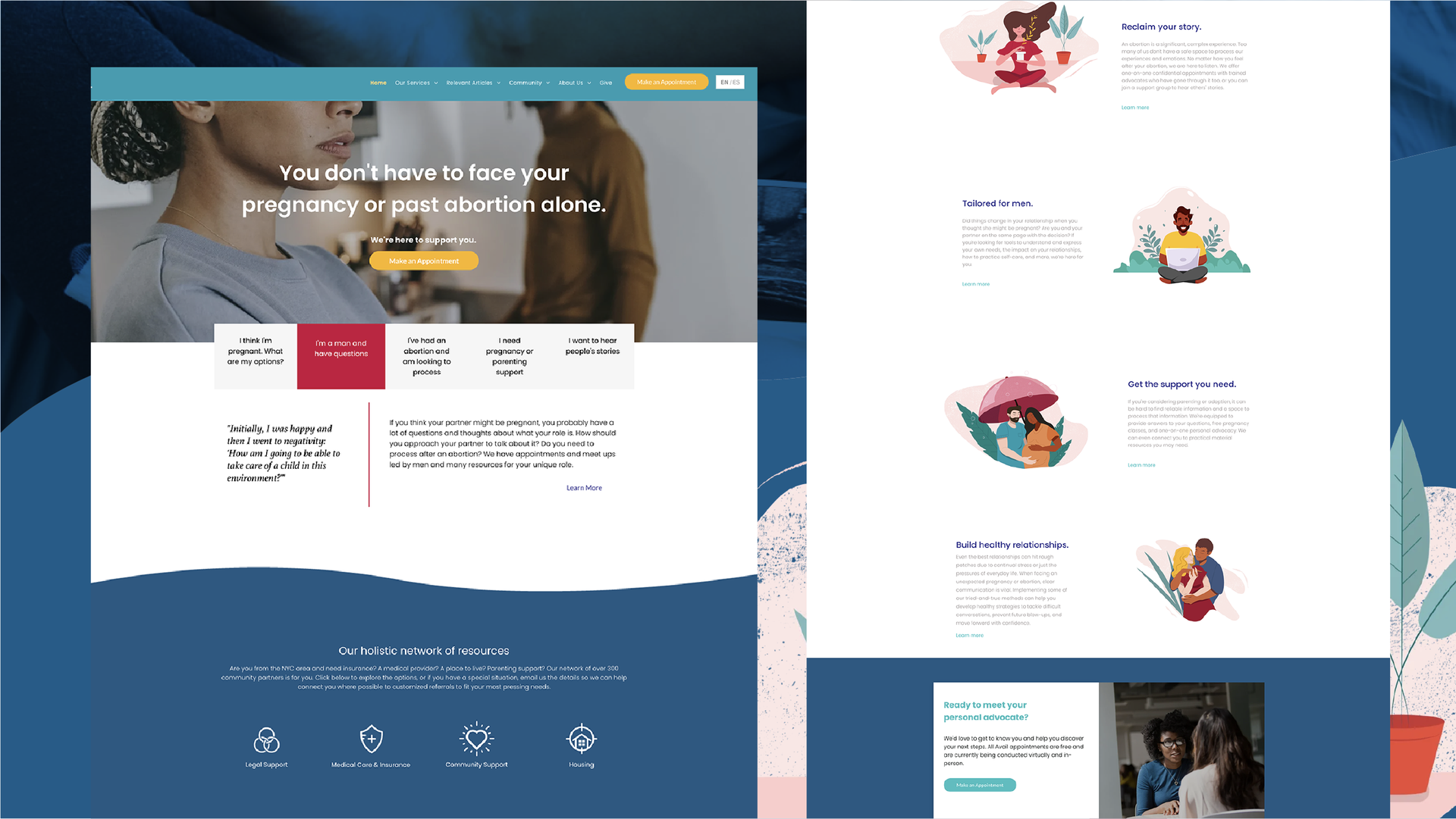
Welcoming visitors to a well-structured website
We always create uniquely customized websites for our clients, and with this project, we also crafted customized widgets to accomplish specific functionality needs. These included make-an-appointment and chatbot functionality, as well as geotracking elements.
We also provided training to ensure Avail leadership could confidently and expertly work within the platform. From updating colors, images, and text to duplicating pages, the Avail team was equipped to use the website for their marketing initiatives as needed, without being handcuffed to a developer.
Working alongside Avail’s design company, we provided technical support to create an extremely unique, user-friendly platform. When visual appeal meets optimal user experience and streamlined functionality, everyone is happy.
The Results
Having worked with our SEO team for many years, Avail already had a strong and profitable internet presence. Now they have a beautiful website that does everything they wanted it to do—all provided within their time frame and budgetary restrictions. Bolstered by a new, Google-ready platform, the women’s clinic saw an immediate increase in website visits and conversions.
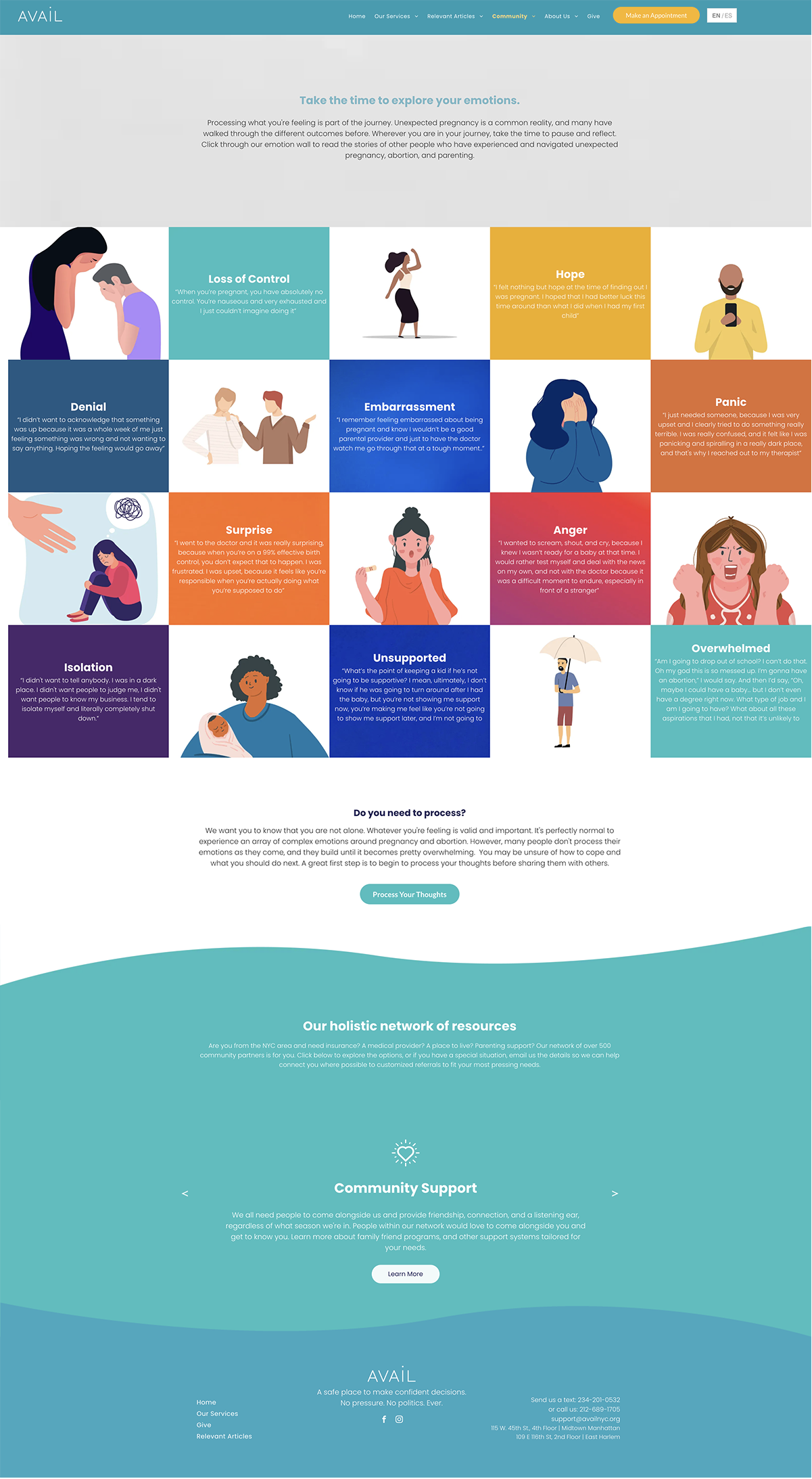

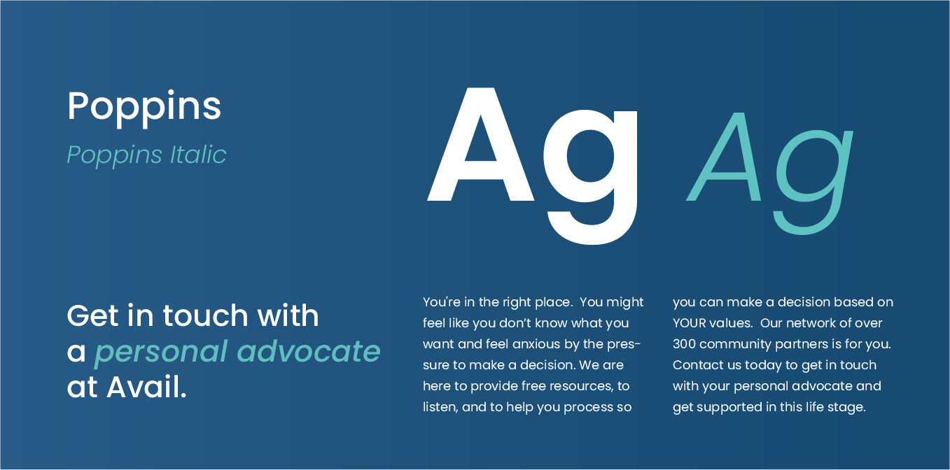
Approachable, clean font.
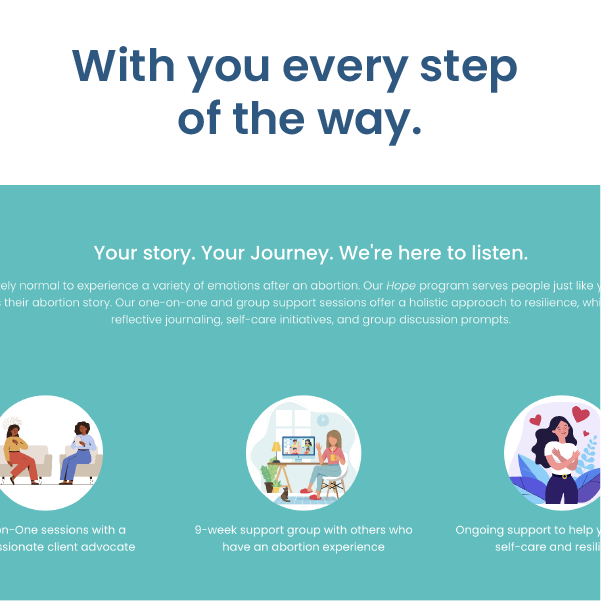
As a popular web font, Poppins brings a feeling of familiarity to any site. The openness and straightforward geometric shapes of the font were a perfect fit for Avail's brand and user needs. Accenting text with Poppins italic created a cohesive, yet dynamic design.
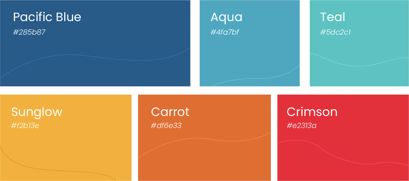
Vibrant, welcoming colors.
Avail's brand colors express the hopefulness they want to communicate to their clients. The colors are also eye-catching and lend themselves to the creation of dynamic designs. Approachable and well-designed are two standout elements of the Avail site.
More Case Studies
We love to share our clients’ successes! A quick review shows our extensive experience across diverse industries and our talent for aligning with a multitude of styles and branding guides. The one commonality you’ll see? Our ability to bridge the gap between marketing and business growth through innovative and custom design. This is why companies come to us.


