Physical Therapy Website
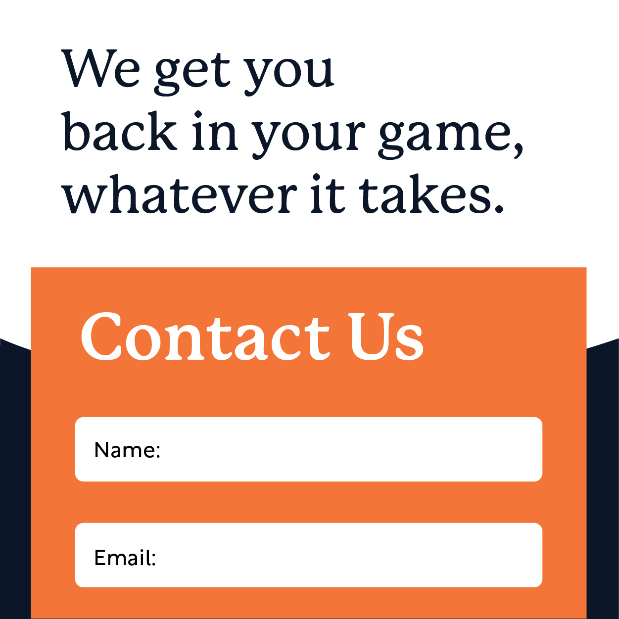
Back in Game Physical Therapy
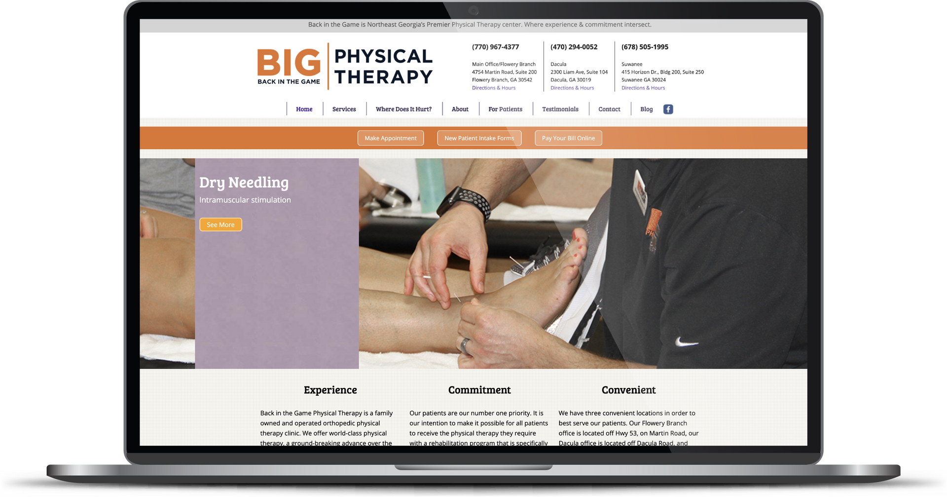
The BIG Physical Therapy team originally approached RivalMind for SEO services. After taking a deep dive into their website, however, we realized starting with a redesign was vital for optimal results. The leadership team at BIG agreed wholeheartedly, and we dove into development.
Built & Hosted using

Sleek, Smooth, Strong
Website Design / SEO
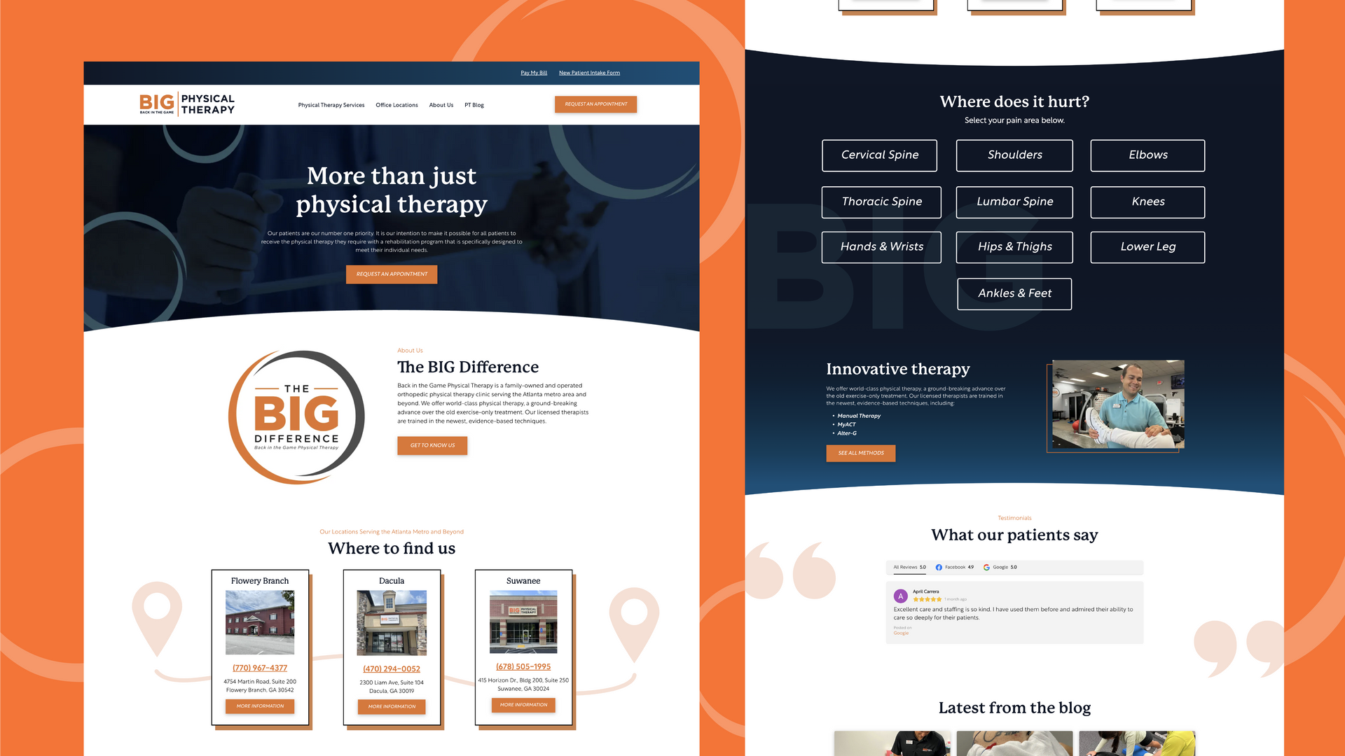
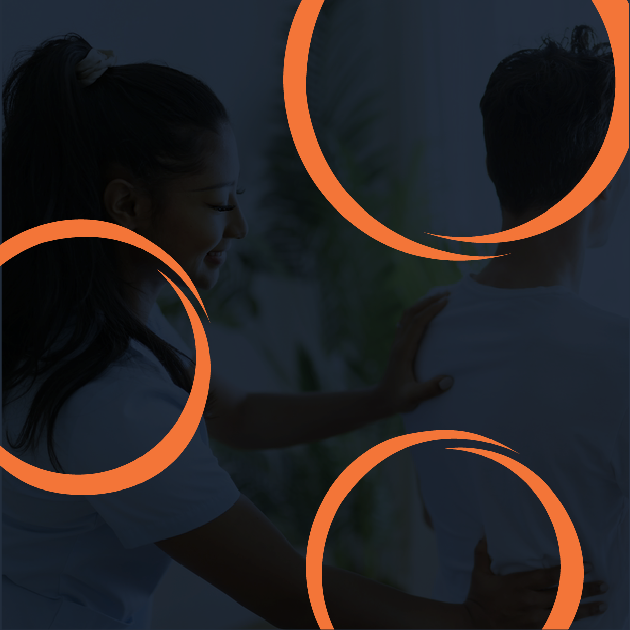
Celebrating Our Award-Winning Web Design
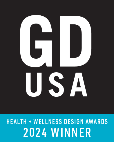
We are honored to have received the GDUSA Health and Wellness Design Award for our work on the Back in the Game Physical Therapy website. GDUSA recognized our design for its high quality, strong imagery, and striking contrast, all of which create a visually engaging user experience. Additionally, the website features interactive functionality that allows users to easily navigate and identify their specific ailments, reflecting Back in the Game's commitment to patient care and innovation. This award highlights our dedication to building a site that not only looks great but also enhances user interaction and support.
Our Approach
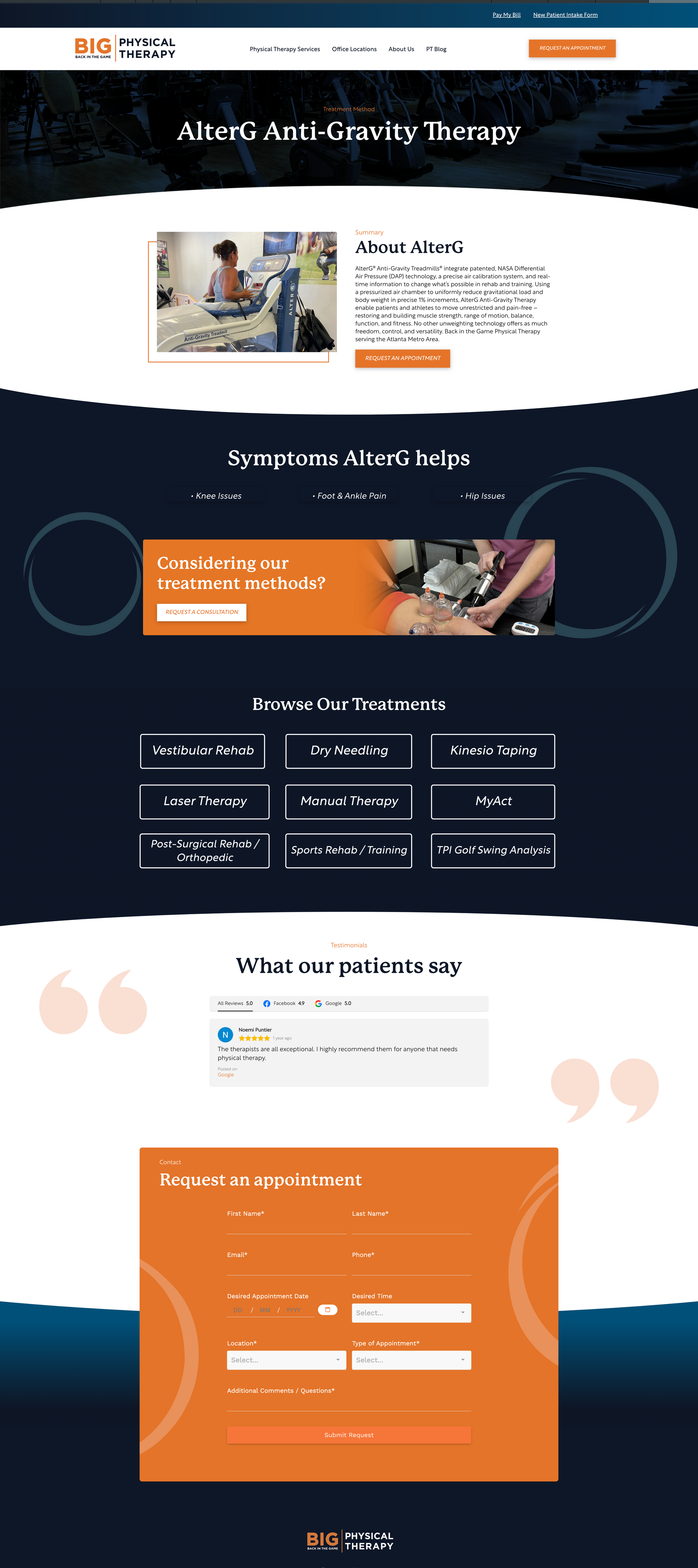
Showcase expertise in a welcoming way
During our discovery meeting with BIG Physical Therapy, we emphasized three primary focuses:
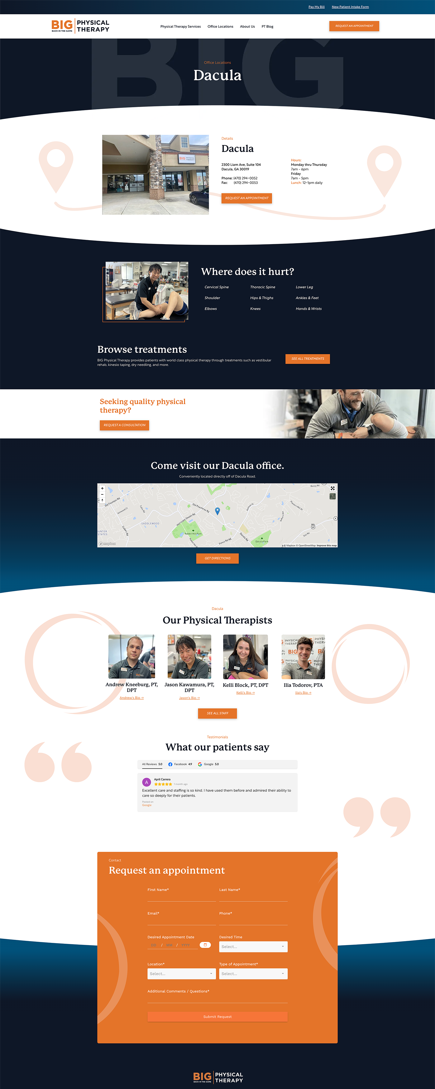
First, create user-friendly navigation to help prospective patients identify correct treatment based on pain areas. Next, incorporate strategic calls-to-action (CTAs) on the website. Finally, build a network of internal links between service areas, locations, blogs, and bios.
Featuring each of BIG’s office locations on the homepage allows users to instantly interact with or get more information about the client's locations. The client provided various photos of their employees and offices, bringing personal credibility to the site.
To emphasize the expertise and education BIG brings to all their work, at the bottom of every staff bio page, we included links to blogs authored by individual team members.

The Results
After launch, BIG leadership headed into ongoing local search engine optimization (SEO) with our team, armed with a website designed for long-term digital success.
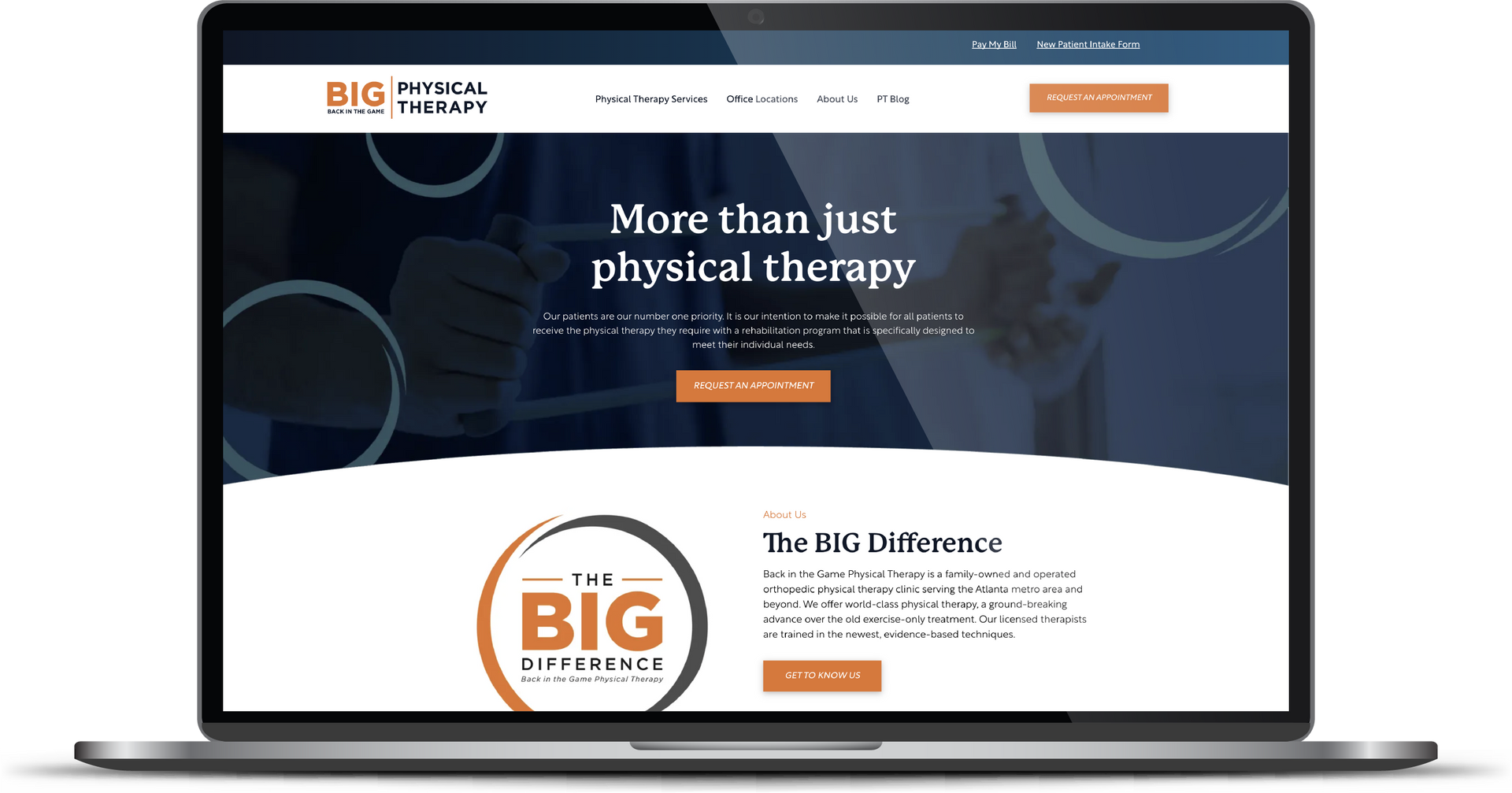
Before & After
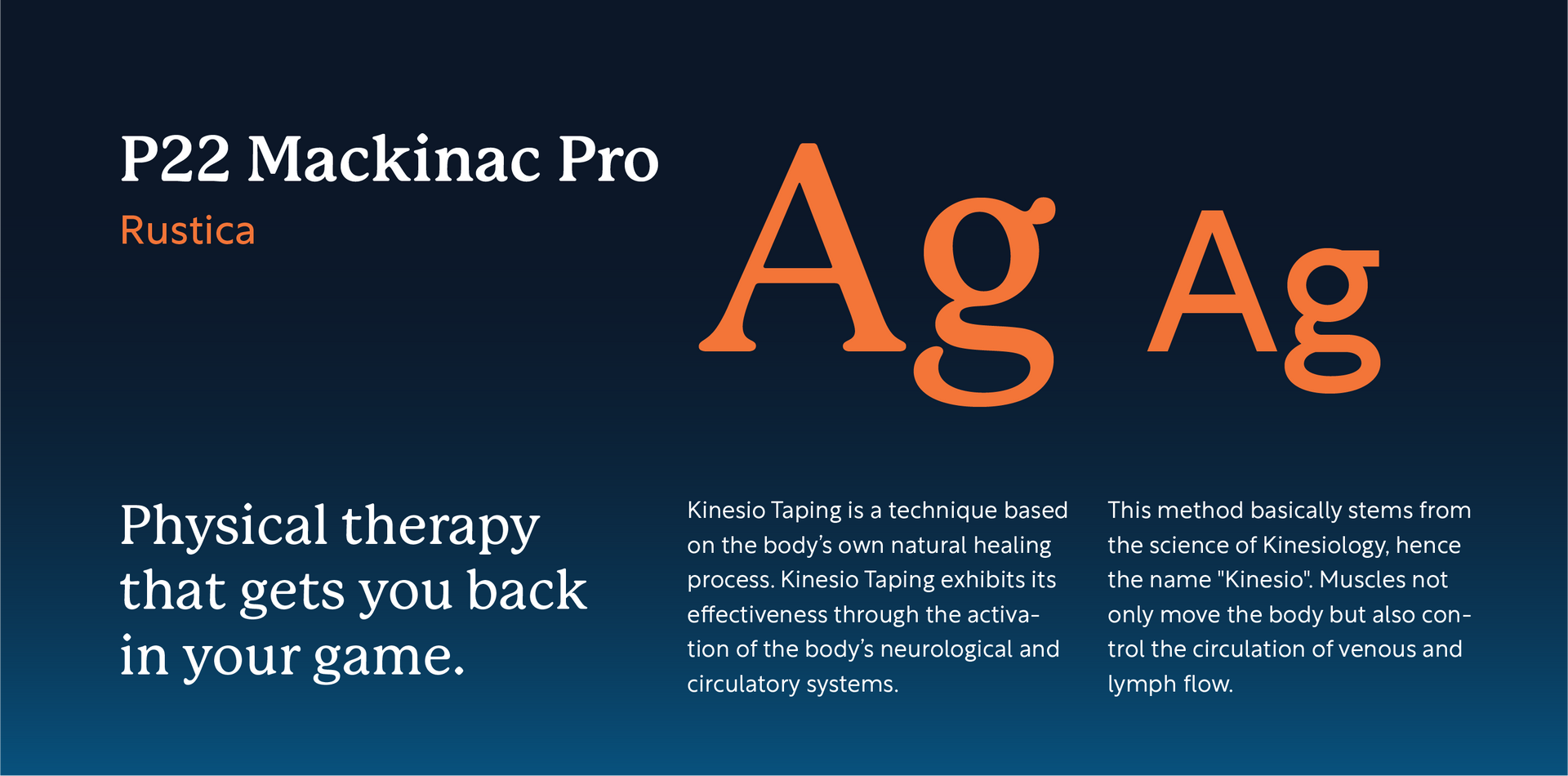
Approachable, intelligent fonts
P22 Mackinac Pro speaks to the approachability and welcoming nature of the client's staff. With gentle, rounded serifs, this font communicates sophistication in an accessible way. Rustica's sharp simplicity embodies the effective, intellectual approach that this client takes when treating their patients.
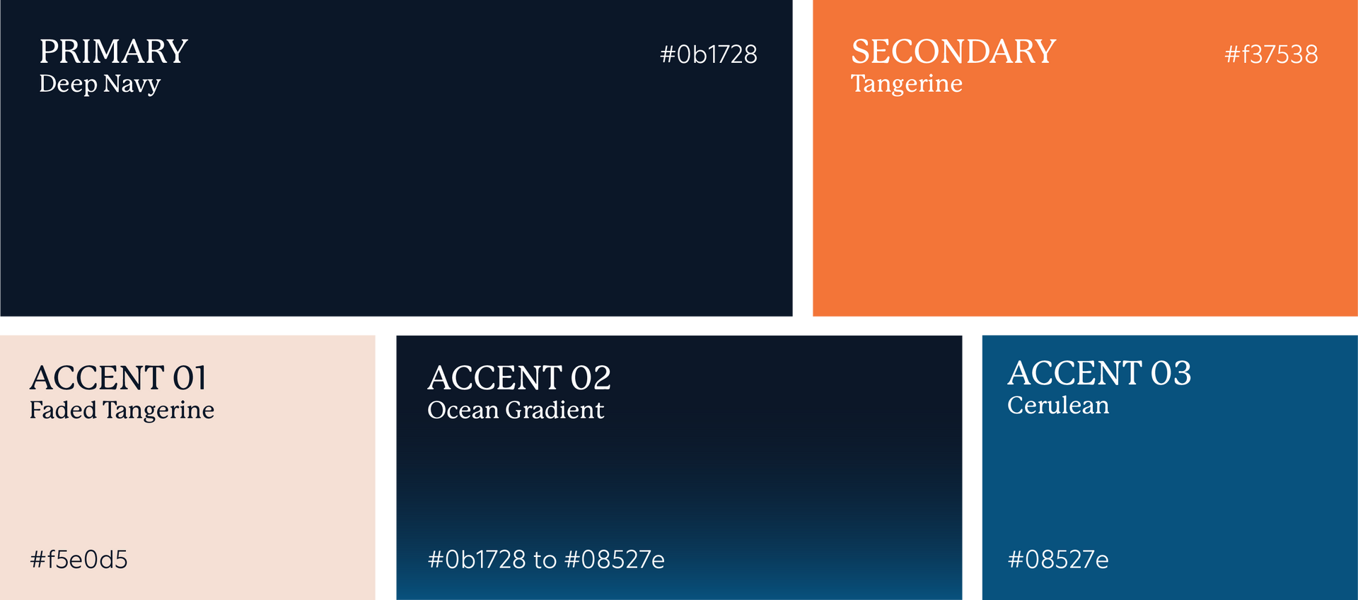
A refreshed approach to brand colors.
This project included a subtle update of brand colors for the client, which included increasing the saturation on the orange, introducing Cerulean as an accent color, and creating a strong blue gradient. These updates help the brand better communicate the energy and depth with which this client approaches all their treatments.
More Case Studies
We work across an expanse of projects at RivalMind, and we love to share our clients’ successes. For each case study, our goal is the same: bridging the gap between marketing and growth through innovative and custom design. This is why companies come to us. Dive into more of our favorite web design projects below!