Truck Rentals & Jobs
Bloom Trucks
Like most industries, over the road trucking is fiercely competitive. And like most clients, Bloom wanted to drive new business to their website. As we initiated SEO and PPC services, it revealed the limitations of the existing website, and through client education and trust, everyone agreed a website redesign and redevelopment was the answer. It also provided the perfect opportunity to update and improve visual elements of their brand.
Built & Hosted using
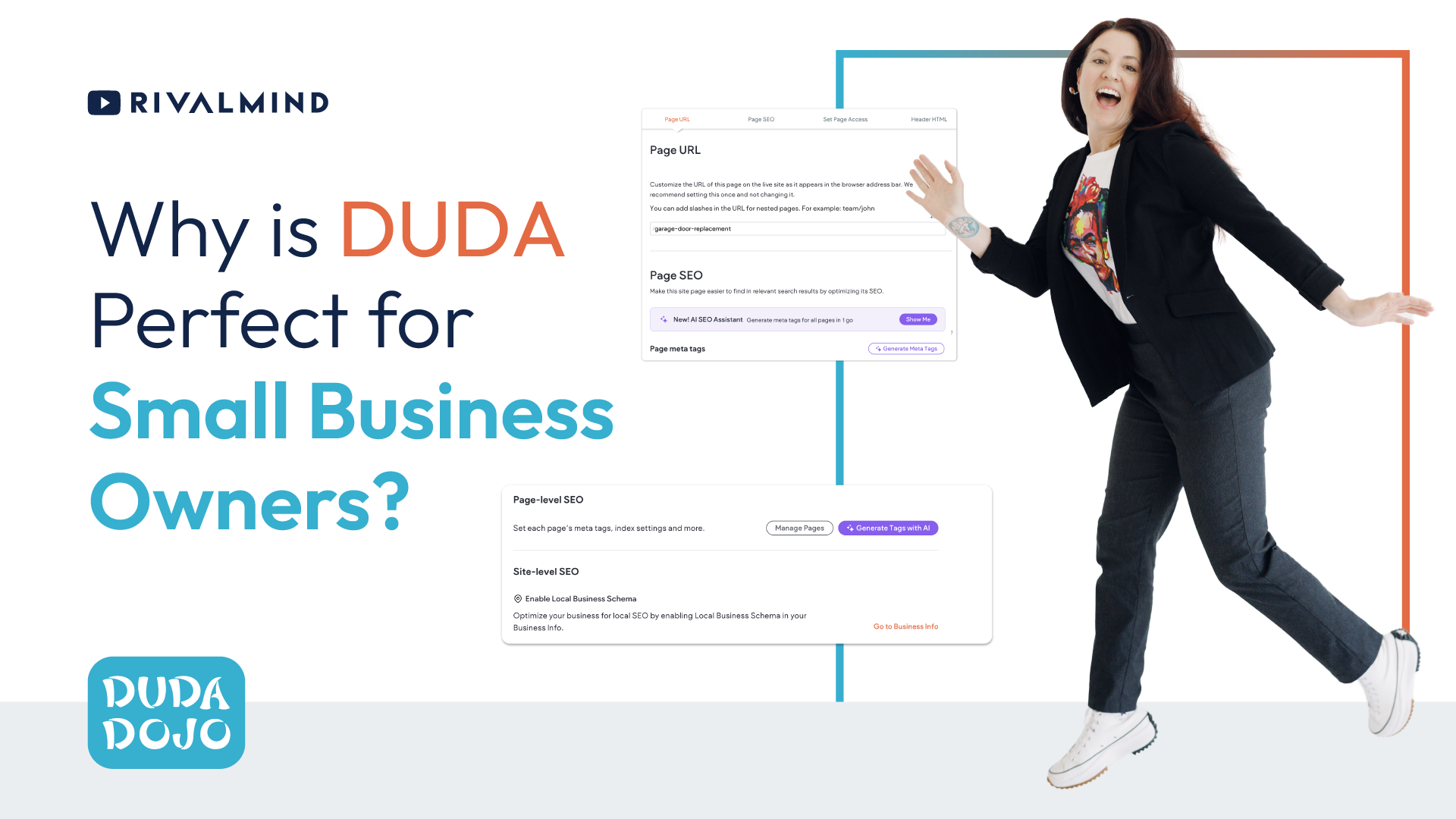
Technical, Secure, and Data-Driven
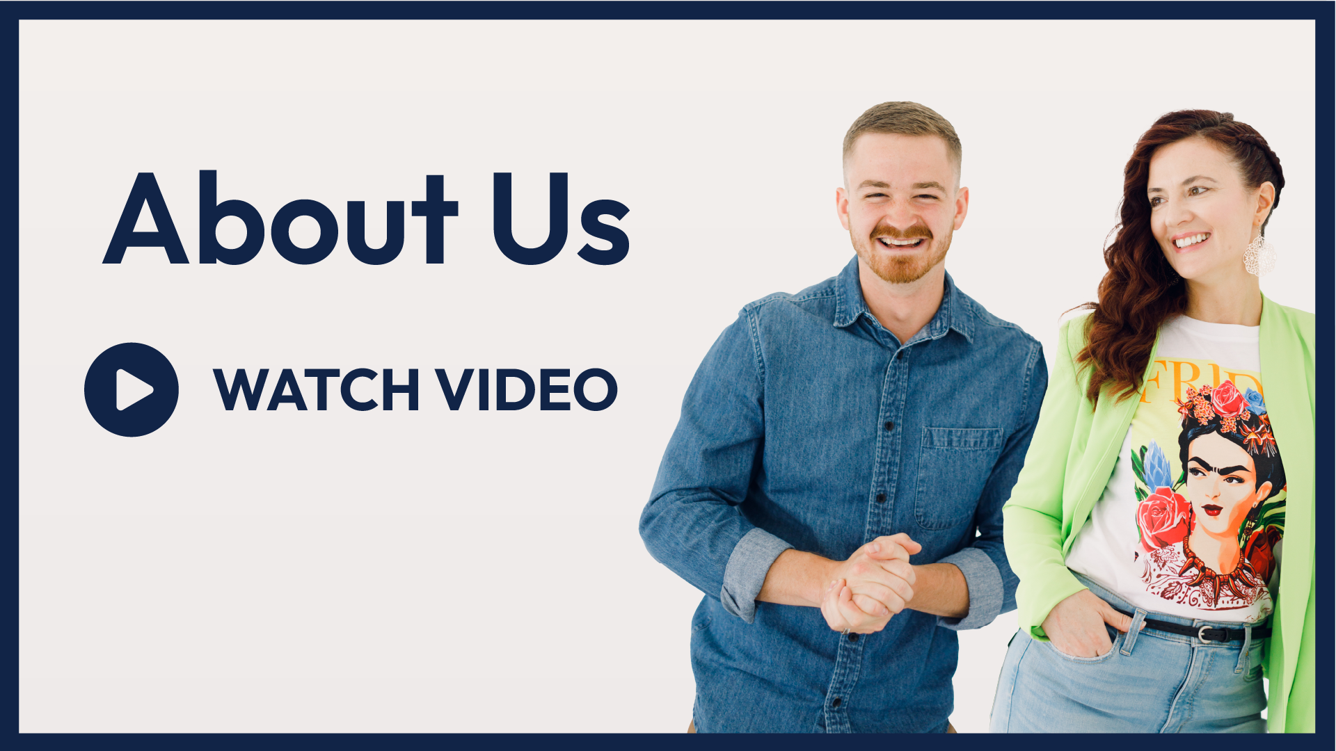
Logo and Website Design / SEO / Social Media
Our Approach
Rebrand and strategize for a strong online presence
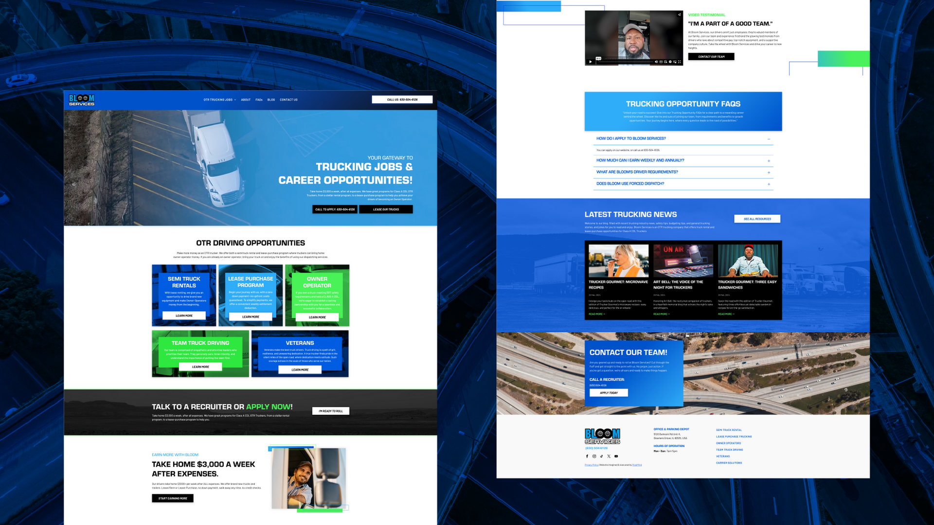
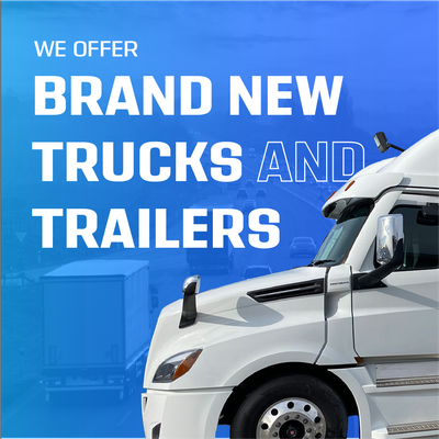
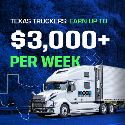
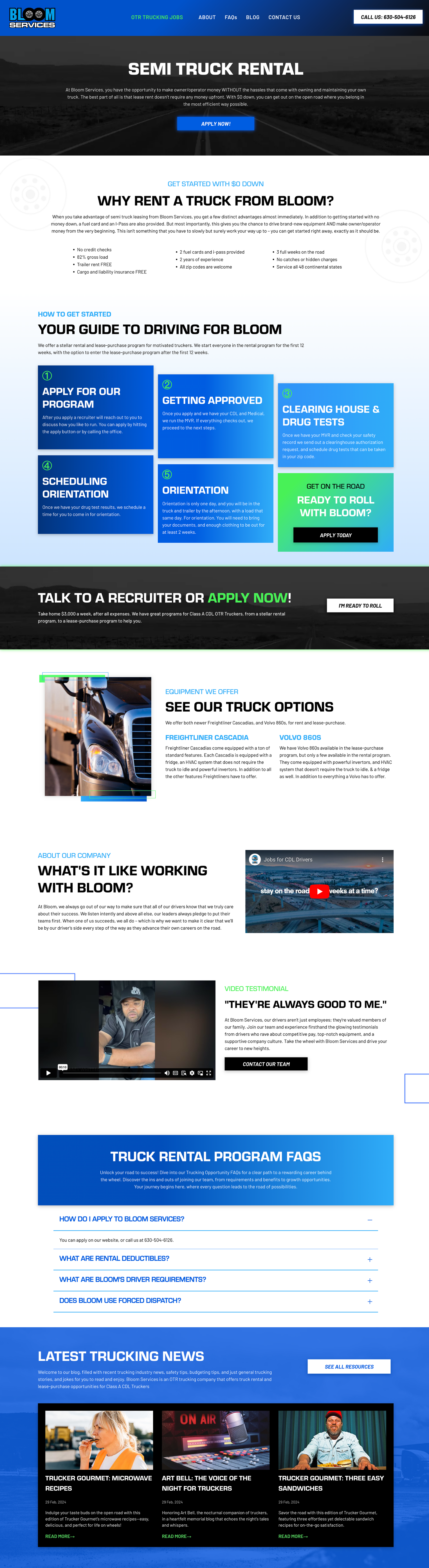
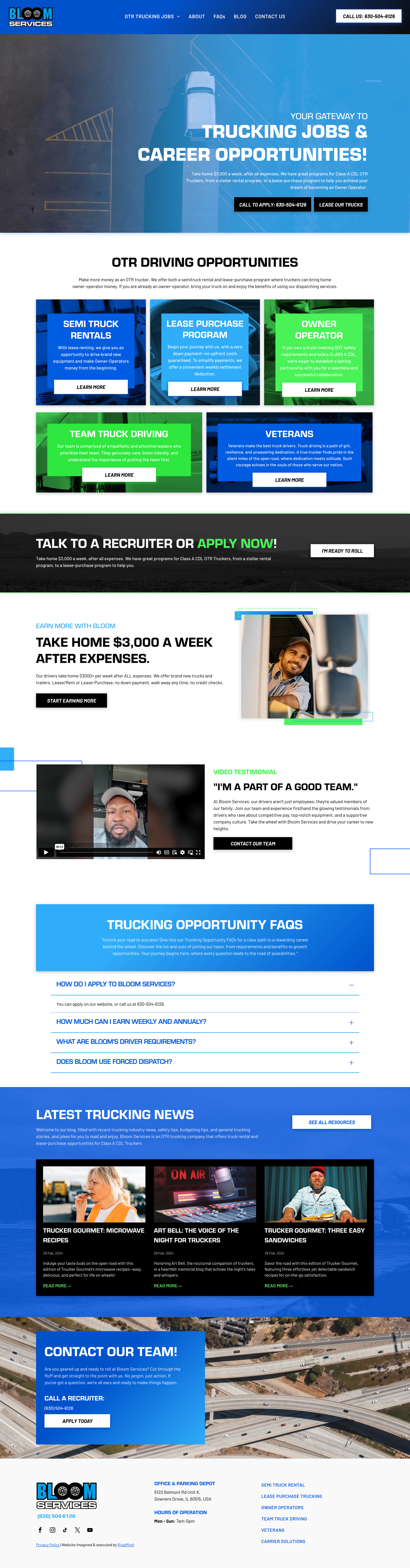
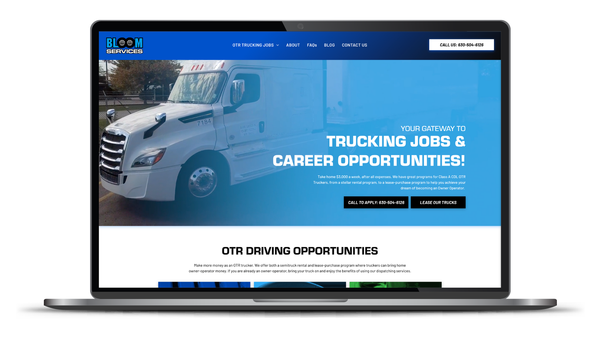
Starting with an outdated logo, we removed superfluous shadow effects and presented a simplified, updated, and memorable logo. To emphasize the personal nature of Bloom, we incorporated imagery of seasoned drivers on the road and sourced images that looked similar to Bloom’s Fleet. The tire icon from within the Bloom logo was also used as a background graphic, further “driving” the Bloom brand to the forefront and adding a touch of personality to the website.
Great website strategy comes from examining assumptions for accuracy, applying a creative view that rethinks everything, and researching the competition to elevate unique value.
This approach delivered stunning impact, including a greatly improved user experience. Visitors can now more directly connect with the carrier type
They’re looking for—and more quickly engage and convert.
With clear and consistent client education, we thoroughly explained why we proposed various changes and kept our client excited and on-board throughout the process.


The Results
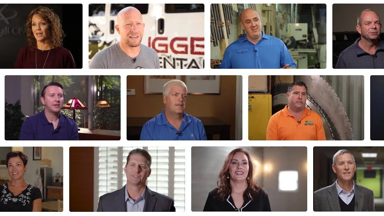
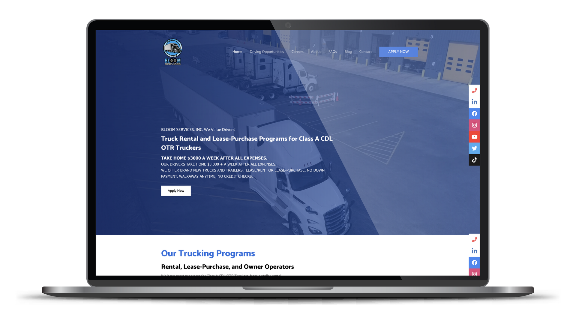
It just takes a glance to appreciate the improved visual impression, the organization of the content, and the clarity of communication. RivalMind experts crafted a bright, bold, and memorable brand to catch the attention of quality drivers looking for a team that feels like a family. The client loves the video testimonies and with the updated logo, images, color scheme and font selection in hand, Bloom now has a firm foundation for any additional marketing materials.
Before & After
Strong and steady fonts.
The use of Eurostile for headings enables Bloom’s website to quickly communicate boldness and reliability. It also lends itself to emphasizing the priority of information so content is quickly accessible and orderly. By pairing the wide Eurostile with the condensed Barlow for body copy, Bloom’s site has proper contrast, is visually balanced, and is both engaging and highly legible.
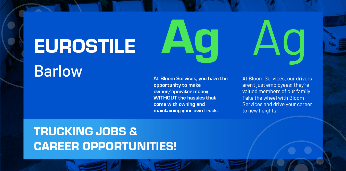
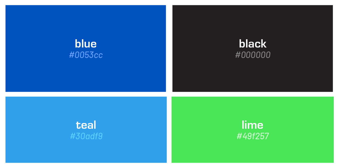
Atmospheric blue hues.
By selecting bright, bold colors, Bloom is able to stand out alongside strong competitors with vibrant brands. The tones of blue speak to clear skies (something every trucker likes to see!) and the neon green shade gives a psychological green light to anyone looking to apply.
More Case Studies
We love to share our clients’ successes! A quick review shows our extensive experience across diverse industries and our talent for aligning with a multitude of styles and branding guides. The one commonality you’ll see? Our ability to bridge the gap between marketing and business growth through innovative and custom design. This is why companies come to us.

Contact Us
It's time to grow your business.
Bloom Trucks Web Design Portfolio Contact Form
We will get back to you as soon as possible.
Please try again later.