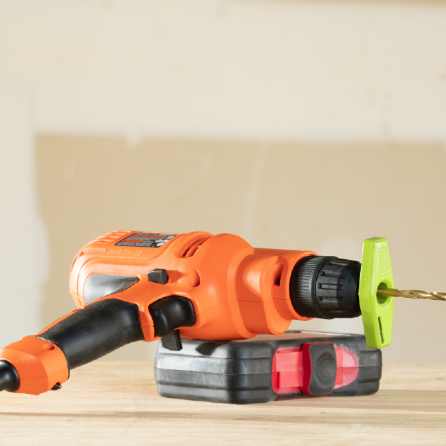
Patented Power Drill Accessory
BullseyeBore
Web development can go wrong in countless ways, and a bad experience with another web developer brought this client to RivalMind. It didn’t take long for our team to demonstrate expertise and provide the assurance that we could confidently manage the process, clearly communicate progress, hit every (tight!) deadline, and nail the vision.
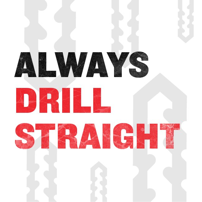
The patented BullseyeBore Core product magnetically attaches to a drill bit, emitting a laser that allows a user to make an accurate and straight hole and is the first of several planned products under the BullseyeBore brand name. The client’s top priority was to develop a site to launch this product and build his Kickstarter campaign to fund further product development.
Built & Hosted using
Intense, Industrial, Impactful
Website Design

Our Approach
Introducing problem solving innovation
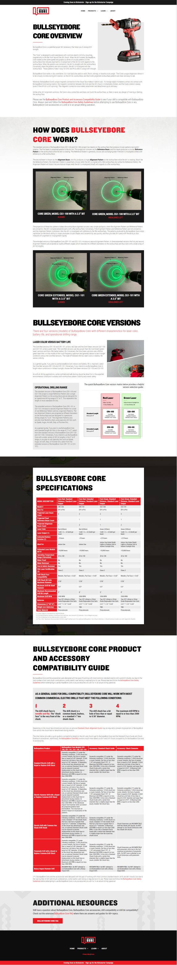
With an estimated 100 million people around the world using a power drill every day, the products' ability to ensure straight drilling offered a very unique and attractive value. It was vital that visitors could quickly see how their work, projects, and lives could be made easier with this safe and easy product. We crafted a home page where video and headline copy work together to captivate, while clear calls to action move readers to deeper engagement.
The client’s strong brand identity and vision, along with existing videos and a large catalogue of imagery facilitated a highly collaborative project and a streamlined process. Just as the product is uncomplicated, flexible, and easy to use, so is the BullseyeBore Core website.


The Results
The overall impression is masculine and sharp; ease of use is immediately apparent.
The client was beyond pleased with the final product, the management of the project, the design work, and the collaboration. And though we feel a great sense of accomplishment with every happy client, with this one, there is something even more rewarding about knowing we completely hit the bullseye.

Geometric and masculine font.
Knockout font was chosen for headings based on its ability to work with the logo design as well as its clear and masculine presentation. Geometric and sans serif, it infuses the site with a unique, bold and modern edge—perfect for the innovative product. Roboto, specifically designed for use on screen and designed to balance content density with reading comfort, is used for the paragraph text.
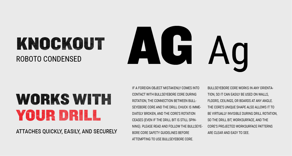
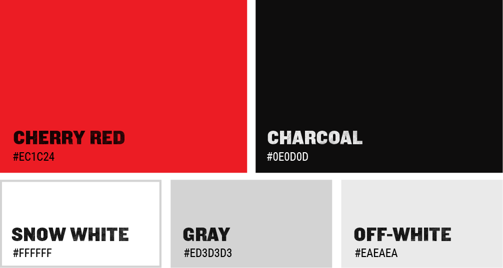
Bold and industrial color palette.
Working with the established black and red palette, we added more white to increase the impact, drive uniqueness, and emphasize the practical, problem-solving nature of the product.
More Case Studies
We work across an expanse of projects at RivalMind, and we love to share our clients’ successes. For each case study, our goal is the same: bridging the gap between marketing and growth through innovative and custom design. This is why companies come to us. Dive into more of our favorite web design projects below!