Pregnancy Counseling Website
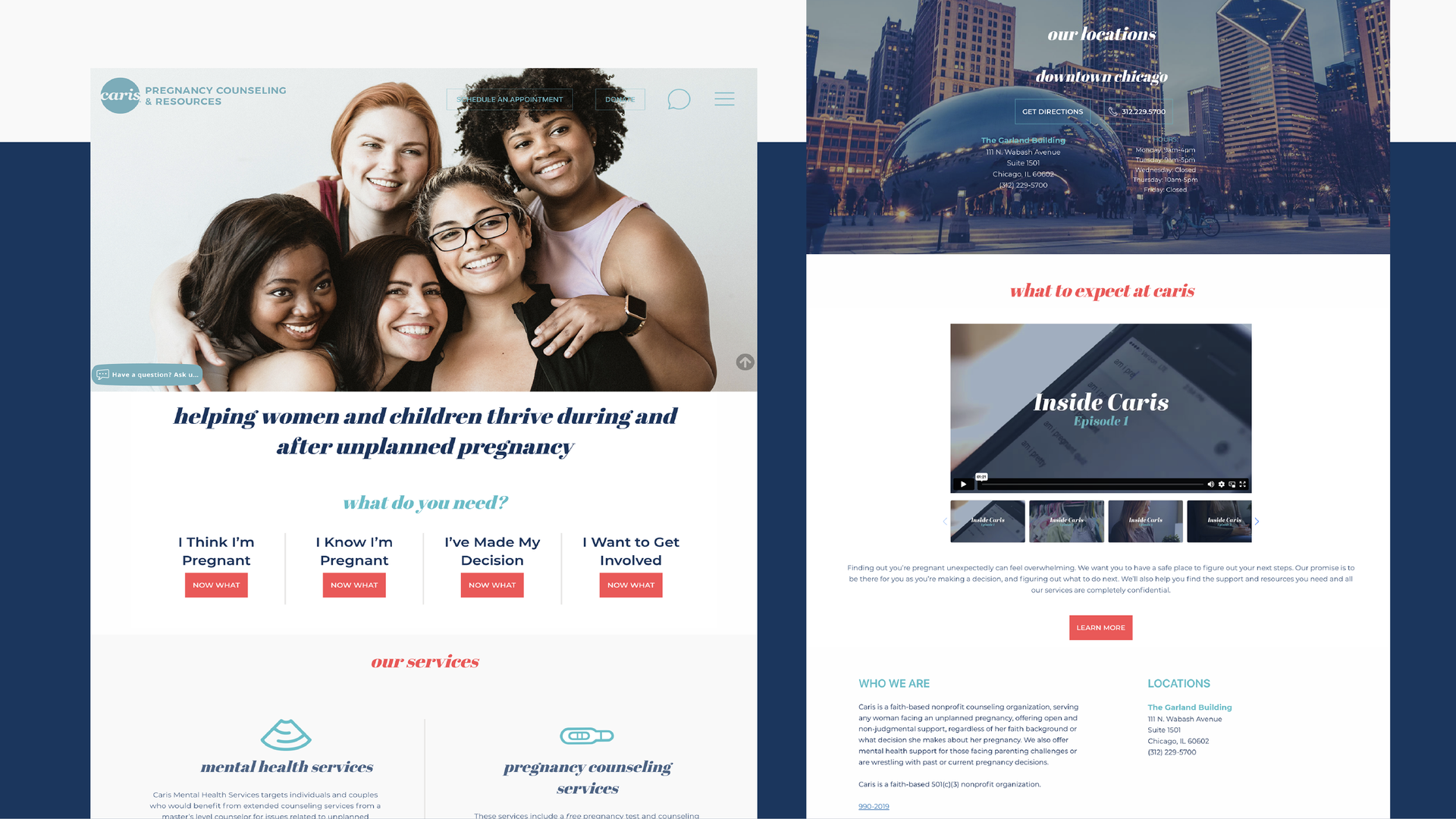
Caris
A non-profit with a huge heart for emotionally supporting vulnerable women, Caris approached RivalMind with a partially completed website. Their former web development company abandoned the project halfway through, leaving only burned bridges behind. Caris’ mission deserved better. We were their final hope.
Built & Hosted using

Bold, Impactful, Inviting
Website Design
Our Approach
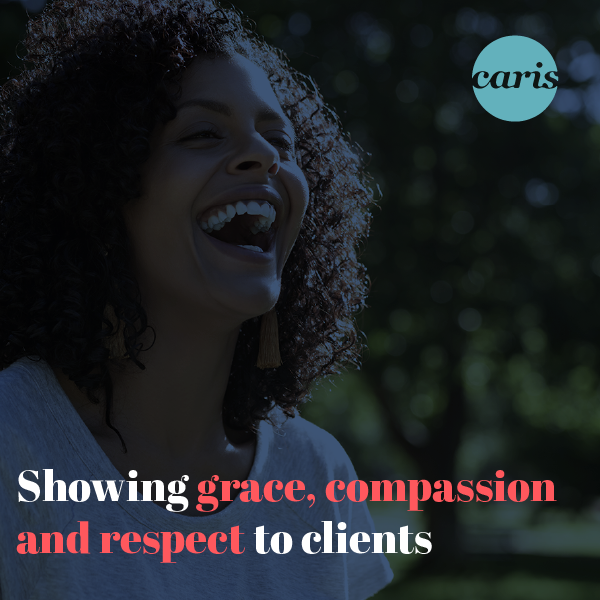
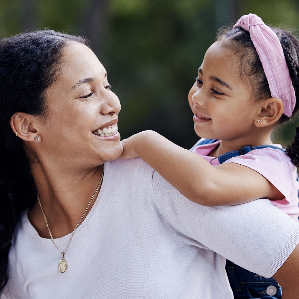
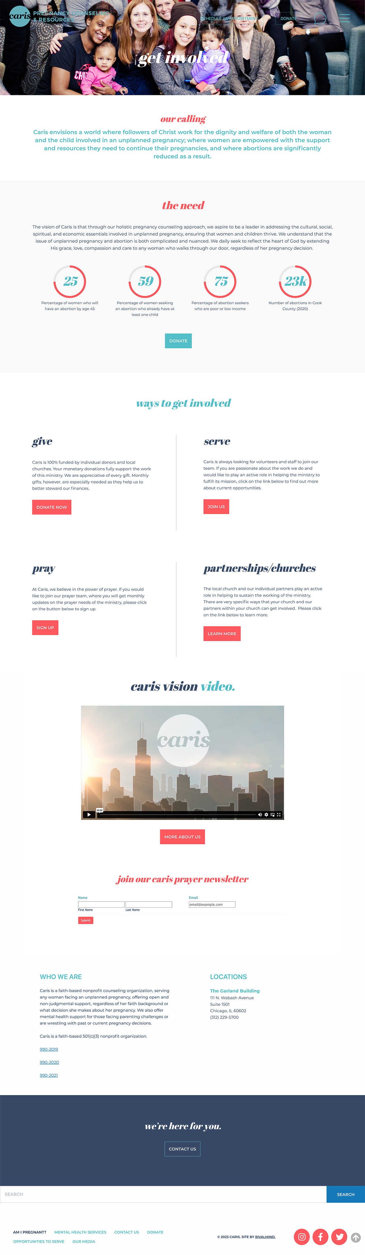
Impact young women through bold imagery and style
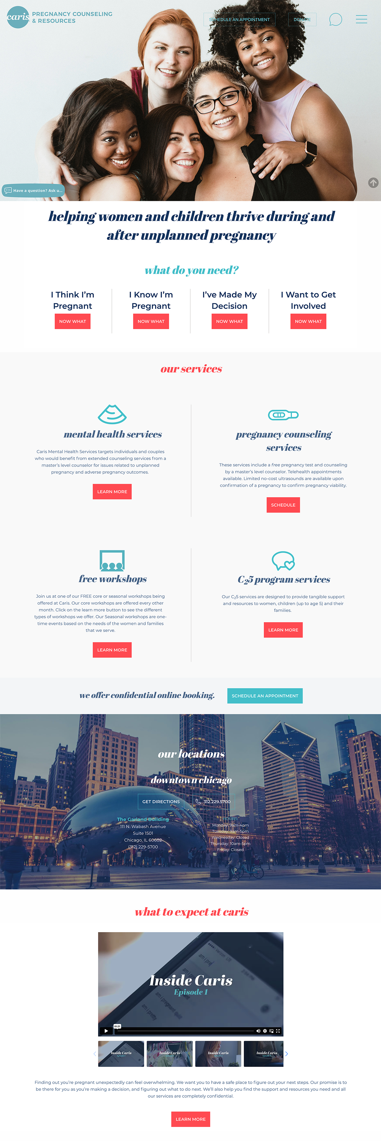
Before beginning design and development, the RivalMind creative team asked questions and listened. We wanted to give Caris a personalized experience, free of heartache, uncertainty, and foggy communication. Once we gathered a clear vision of Caris’ goals, our team transformed the fractured, partially-developed website into a beautiful digital platform.
The Caris project was a unique challenge - we morphed a misshapen homepage and sitemap with new and improved site architecture and responsive design principles.
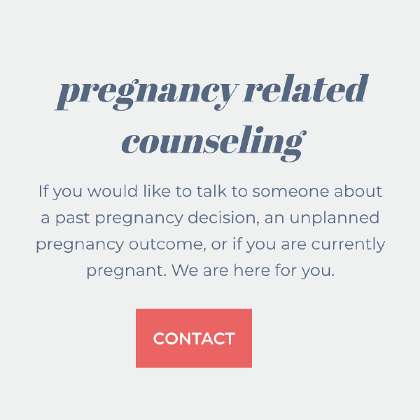
Our creative team crafted wireframes and style tiles, selecting colors, typography, and imagery designed to secure user attention, highlight work, services, and locations, and answer important questions.
Additionally, we guided Caris staff through the process of establishing and implementing an appointment scheduler. The user-friendly scheduler instantaneously syncs with Caris’s internal system, fostering an optimized user experience and internal organization.

The Results
Since website launch, Caris has been accurately portrayed on the web with a visually-impactful platform, allowing the organization to thrive while helping women thrive.
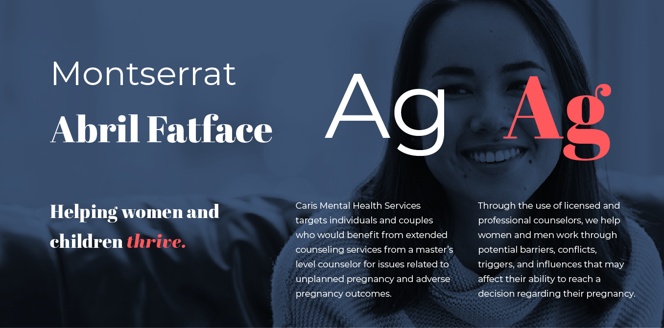
Striking, inspiring font.
The typefaces Montserrat and Abril Fatface were chosen for their impactful and bold shapes; terms that describe Caris perfectly. The clean curves of Abril Fatface invite users in and the simplicity of Montserrat allowed easy readability.
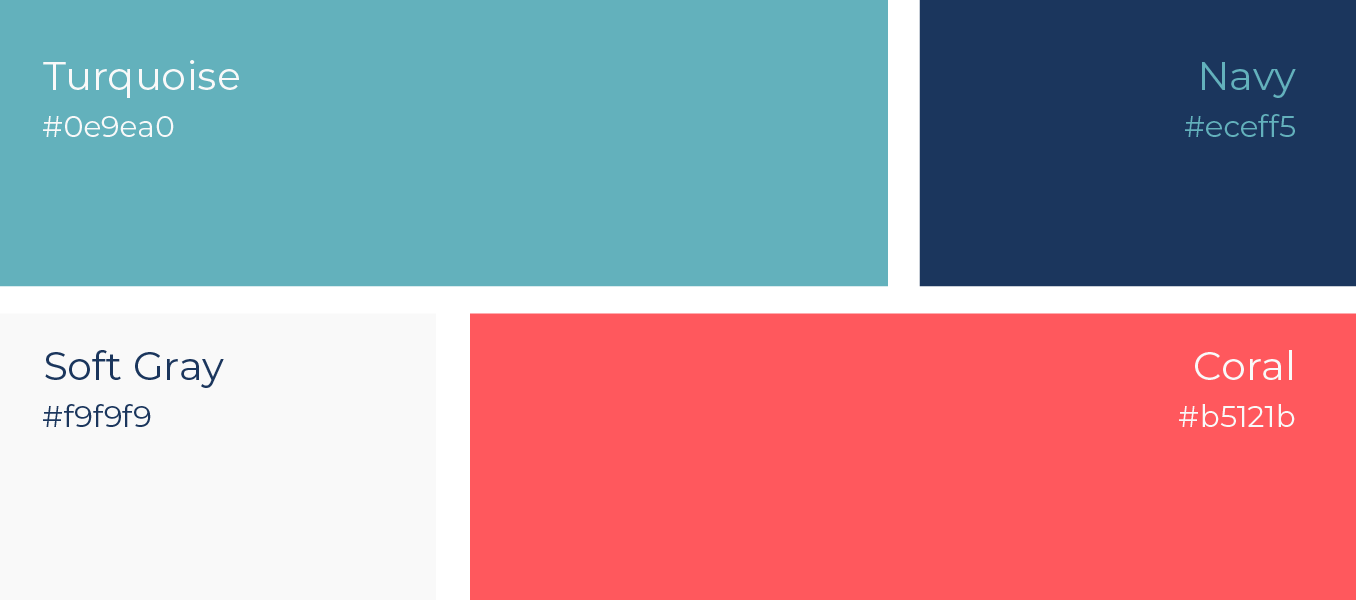
Bold, vibrant red with friendly blues.
The color designated as Coral intertwines with the friendly blues to create a captivating and harmonious color palette. The rich, commanding presence of the red hue draws users in and exudes warmth. This color combination creates a friendly and welcoming feeling.
More Case Studies
We work across an expanse of projects at RivalMind, and we love to share our clients’ successes. For each case study, our goal is the same: bridging the gap between marketing and growth through innovative and custom design. This is why companies come to us. Dive into more of our favorite web design projects below!