Church Website
Chicago Church of Christ
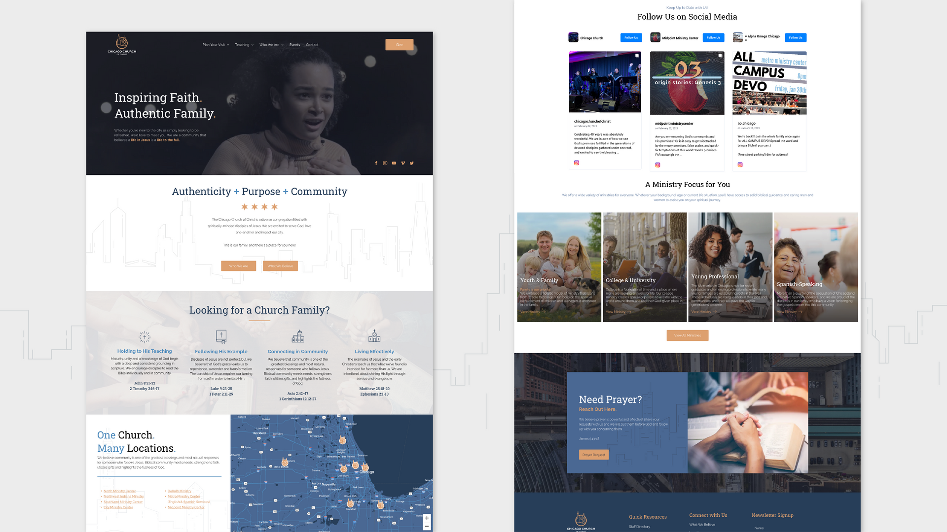
Chicago Church leadership concluded that their current website wasn’t capable of doing all they wanted it to do. Visually, it no longer represented them well and it wasn’t reaching the audience that wanted to attract. Along with representing each individual campus and ministry as unique locations under the umbrella of their main website, leadership had an expansive vision to revitalized their digital presence and produce robust social platform growth.
Built & Hosted using

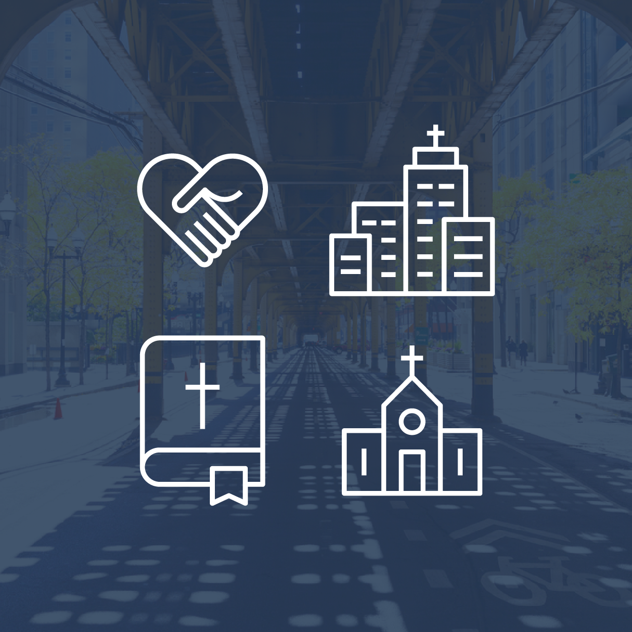
Friendly, Urban, Steadfast
Website Design / SEO
Our Approach
Convey a welcoming community with an urban style.
After a deep dive to fully understand each of digital goal, our team charted a path to create a beautiful, welcoming site that would meat every functionality and aesthetic requirement.
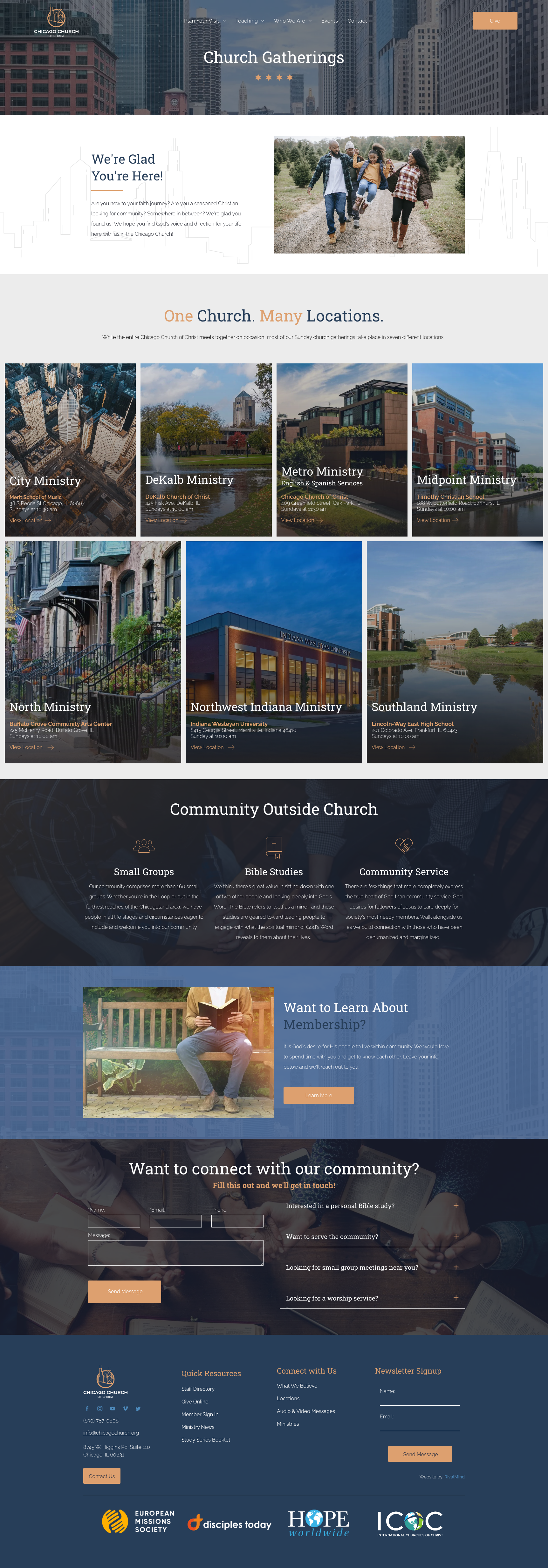
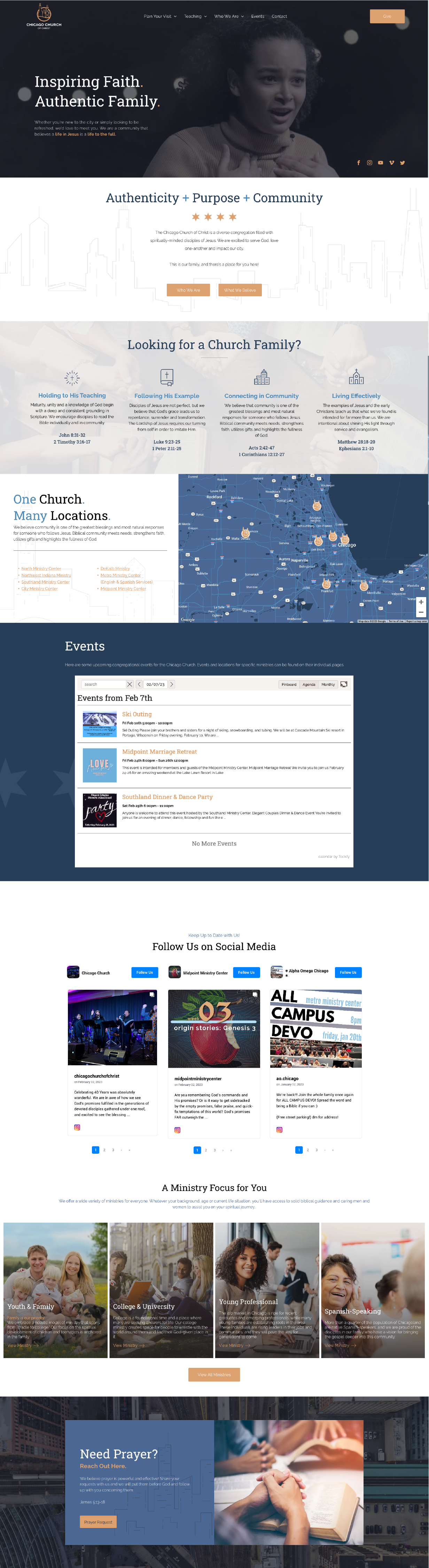
The fresh design was targeted to appeal to a younger audience, showcasing Chicago visual elements while still appealing to their national audience. Now visitors could find impactful resources and share audio, video, and written documents through the platform.
Our team also configured a solution that would allow Chicago Church to host streamlined events through the site.
As requested, our team created individual location and ministry pages that clearly and attractively represent the unique offering. And we merged a social media display into the homepage design to promote Chicago Church’s increasingly robust and active social media profiles.


The Results
Now emphasizing a modern, urban look that still feels personal and welcoming, the client’s vision has come to life. Additionally, 3 of the top 10 traffic-driving website pages strategized, written, and published by RivalMind and have brought great impact. The church has a 5x increase in organic traffic to their downloadable evangelism bible study guide from optimizations done by RM. And a 15% YOY growth in organic traffic!
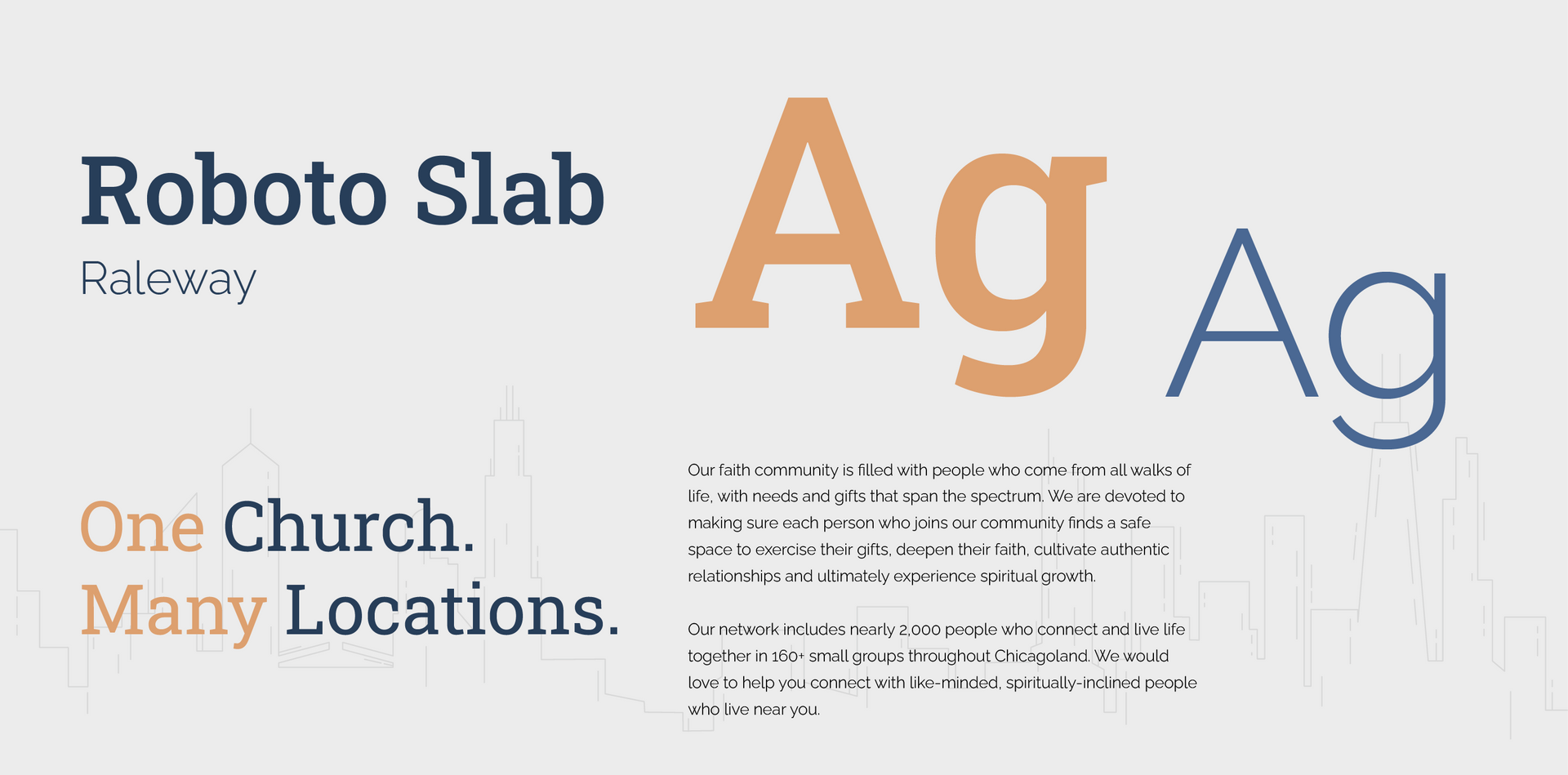
Sharp, distinct fonts
Roboto slab and Raleway, which are both strong geometric fonts, evoke the industrial urban feel of this Chicago-based church. While strong and identifiable, these typefaces also maintain a sense of familiarity and comfort, a message that's vital to the mission of this church.
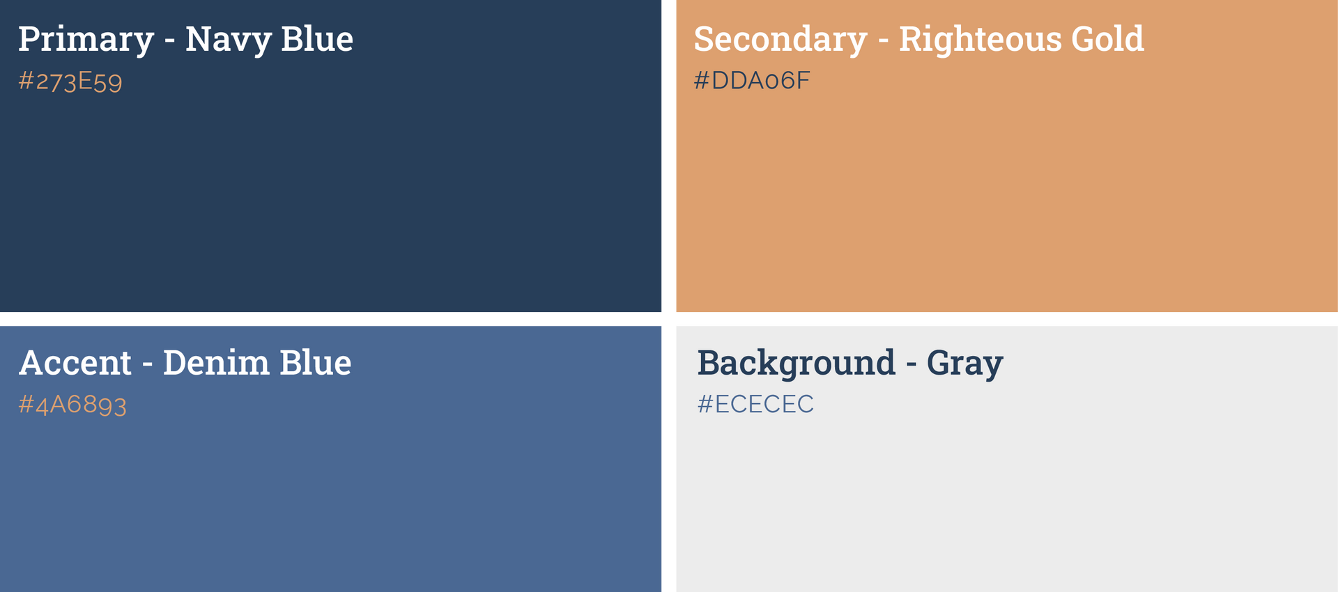
Mature, navy blue with subdued orange.
Pulling from the blue skies and clear Lake Michigan water of Chicago, we crafted a muted complementary color palette that speaks to the modernity and gentleness that the church prioritizes.
More Case Studies
We love to share our clients’ successes! A quick review shows our extensive experience across diverse industries and our talent for aligning with a multitude of styles and branding guides. The one commonality you’ll see? Our ability to bridge the gap between marketing and business growth through innovative and custom design. This is why companies come to us.