Medical Market Research
The MarkeTech Group
As an industry leader in healthcare marketing research, this company operates in a unique and very nuanced market. Since understanding clients is foundational to a successful project, we utilize a thorough intake process, which enables the RivalMind team to quickly grasp The MarkeTech Group’s industry, their competition, and the goals of the new website.
Built & Hosted using

Sterile, Technological, Professional
Website Design / SEO
Our Approach
Communicating expertise and efficiency
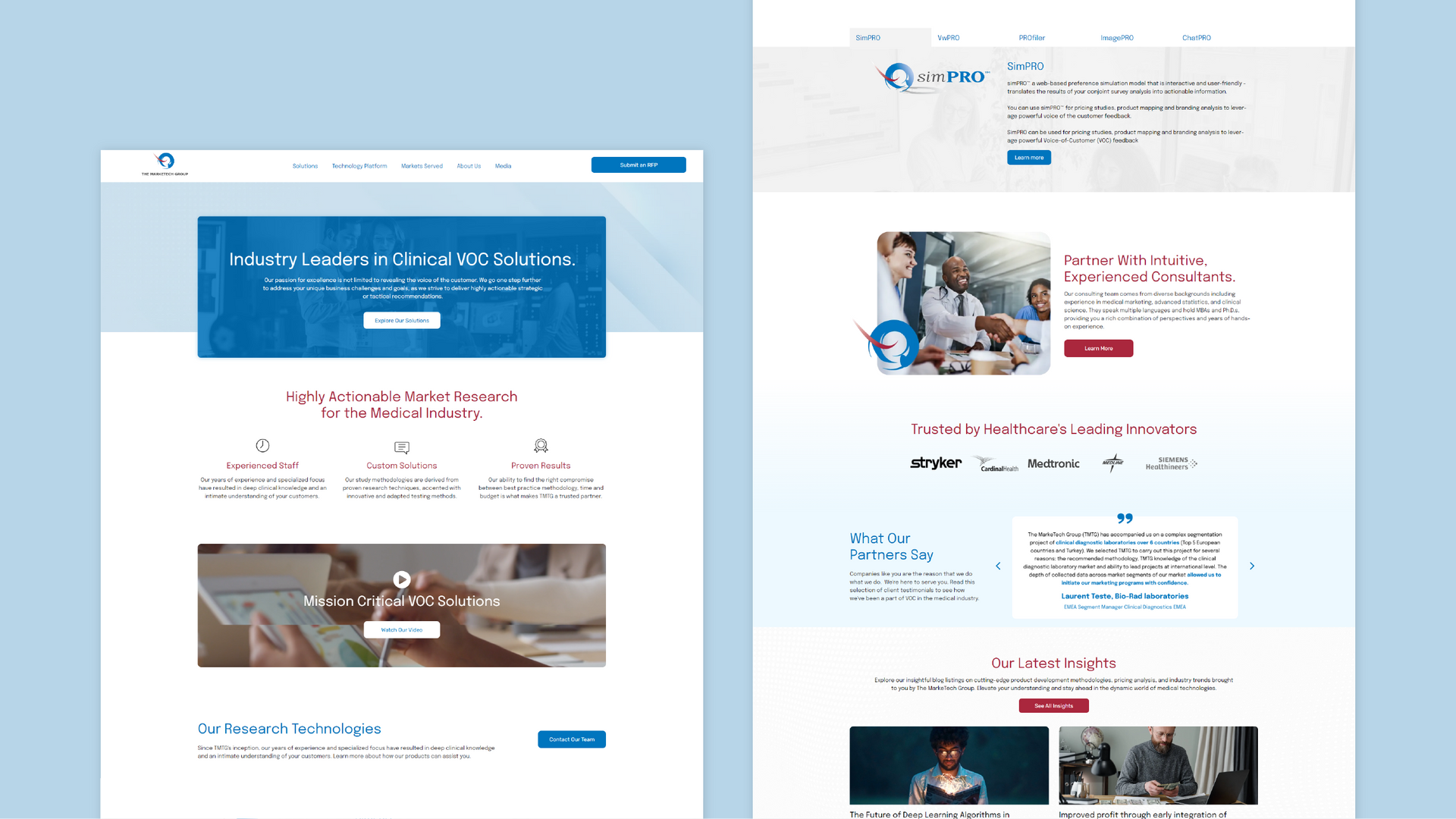
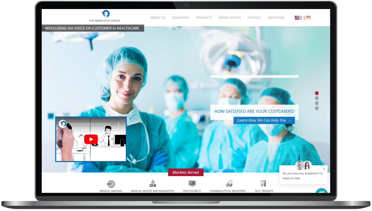
The MarkeTech Group (TMTG) facilitates expert-level customer experience reviews for medical equipment, giving them a position in the medical industry as a bridge between the business and medical sides of the medical equipment industry. It’s essential that their brand communicates the educated, efficient nature of their work in the medical industry while establishing this unique bridge. Our team carefully selected images to intentionally reflect interactions with businesspeople with a balanced representation of the doctors or nurses who use the equipment.
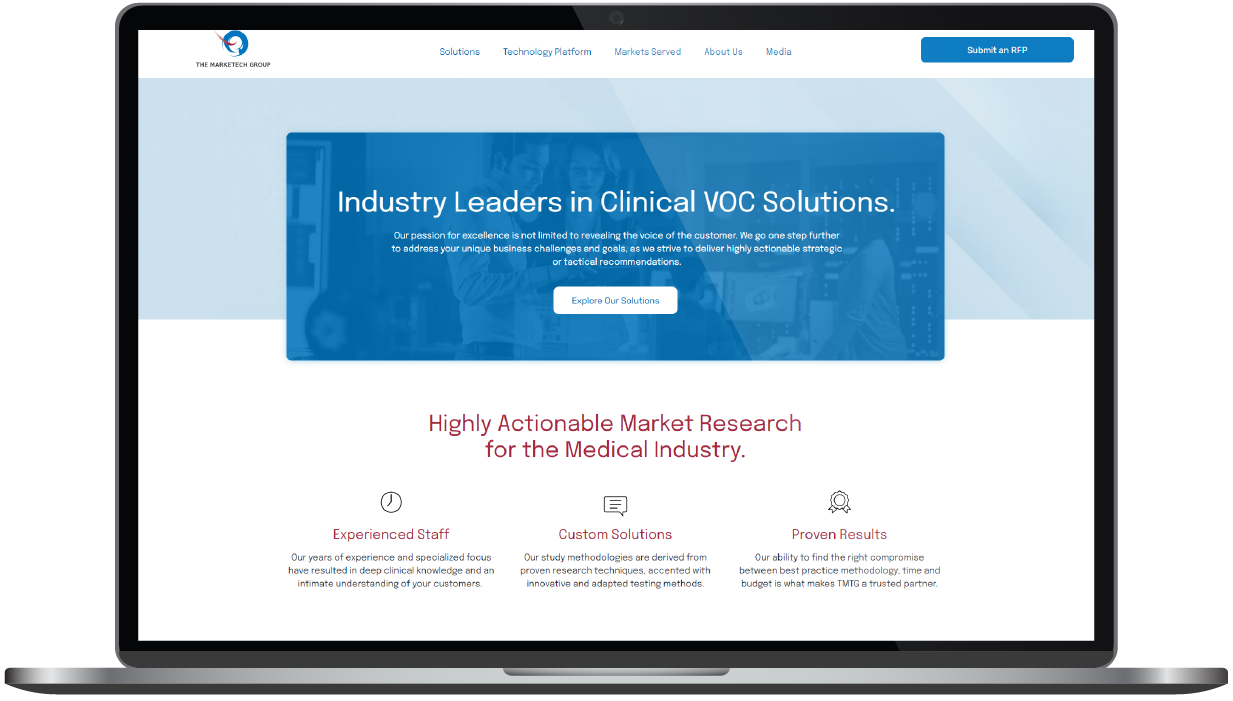
Keeping with the efficient, medical tone of the brand, our team implemented high-tech, abstract backgrounds and imagery. To soften the site and communicate the personal, human touch within the evaluations, we used rounded corners and added shadows to create a more interactive, three-dimensional essence.


The Results
Who doesn’t love an impressive before-and-after transformation? More than a touch up or refresh, the client gained all the benefits of a new site that was entirely fresh completely re-organized. The MarkeTech Group was so pleased with the improved branding, the overall impact of the site, and the process of working with RivalMind, they engaged us for SEO services.
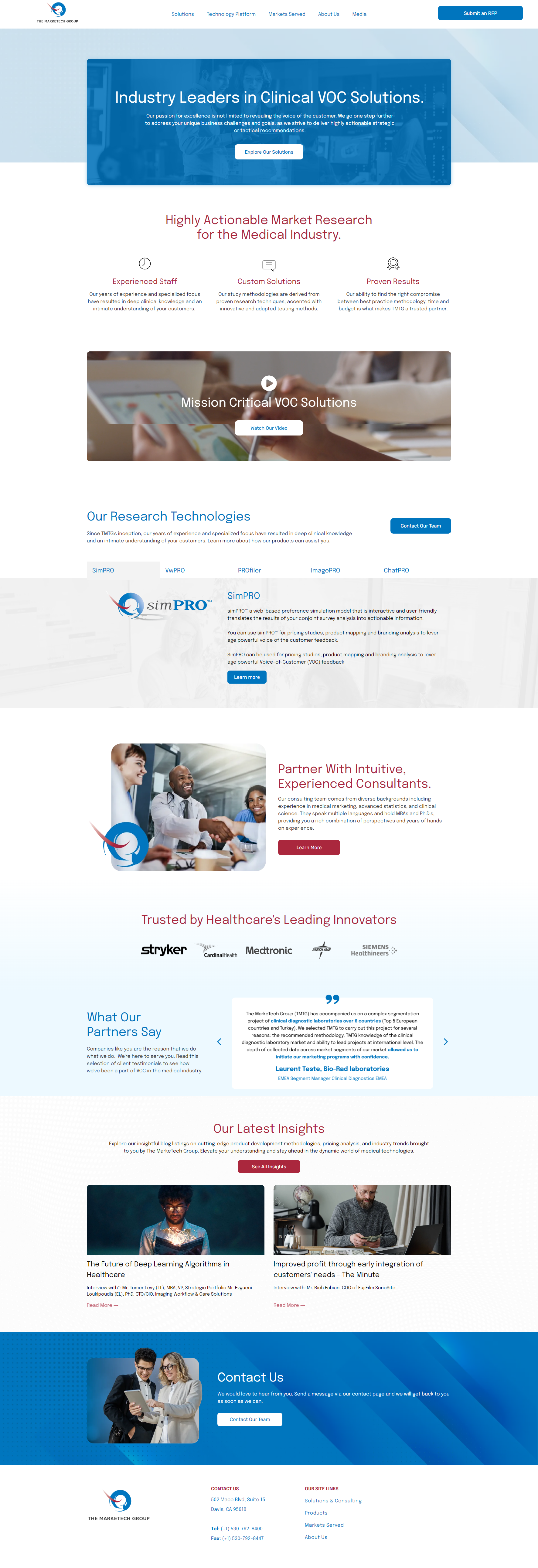
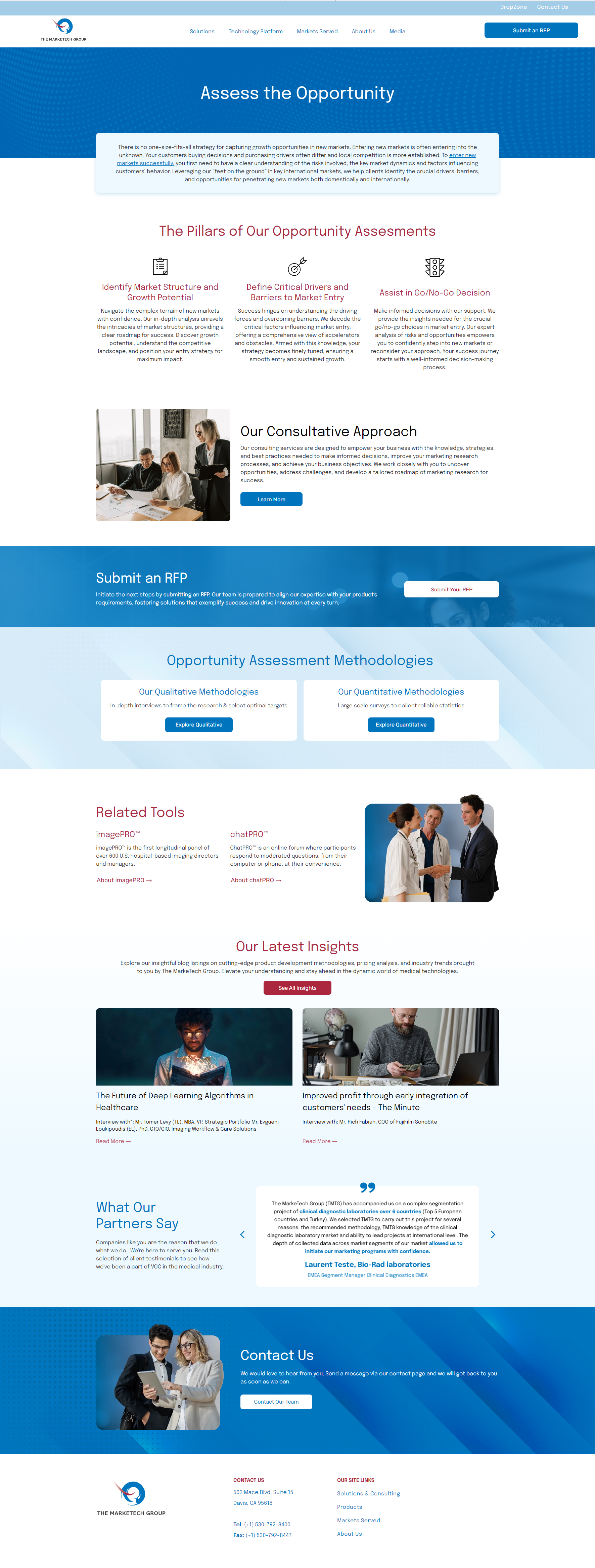
Before & After
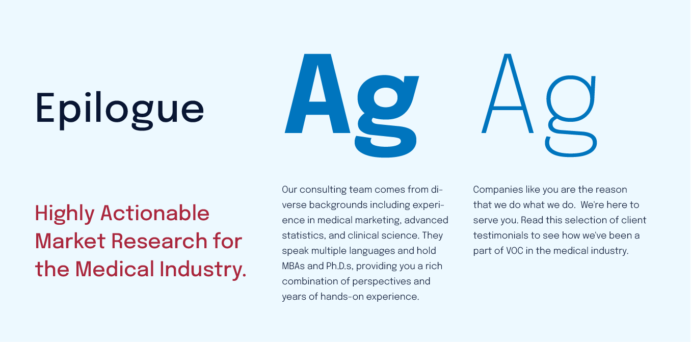
Clear and distinctive font
Epilogue is a distinctive font with a range of variables that made it an excellent choice to be used across the entire site. As a condensed sans serif with strong monospace properties, Epilogue speaks to the computerized, data-driven services TMTG offers. Its usage also provides more brand recognition than TMTG’s original, more common font, Verdana.
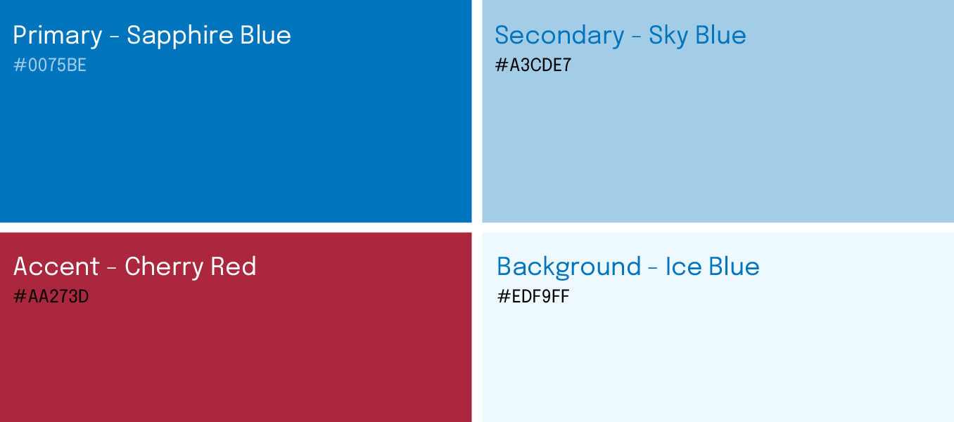
Clean and professional yet personal
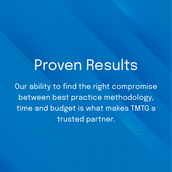
There were two strong colors in the client’s existing palette: a deep blue and a crimson red. Our creative gurus wanted to provide some brand consistency so opted to keep these high contrast colors while adding a soft cloud blue and a light gray. This combination of colors gave the client the fresh look they were seeking and added an important dimension to the visual impression. The look is now sterile and professional, with a softness that communicates the personal touch that had been missing.
More Case Studies
We work across an expanse of projects at RivalMind, and we love to share our clients’ successes. For each case study, our goal is the same: bridging the gap between marketing and growth through innovative and custom design. This is why companies come to us. Dive into more of our favorite web design projects below!