Financial Services
Rose Financial
Our mission is to help companies thrive, driving transformational growth through innovative digital marketing—and Rose Financial was primed to benefit from several of our services. Rose had newly developed proprietary software ready to show off on a new website (which is another project we tackled!) but in order to do that, their original site needed to be updated, including a refresh of their brand. They also engaged us for SEO services and Google ads management.
Built & Hosted using
Organized, Professional, Bright
Website Design / SEO / Google Ads Management

Our Approach
Attract motivated people through dynamic design
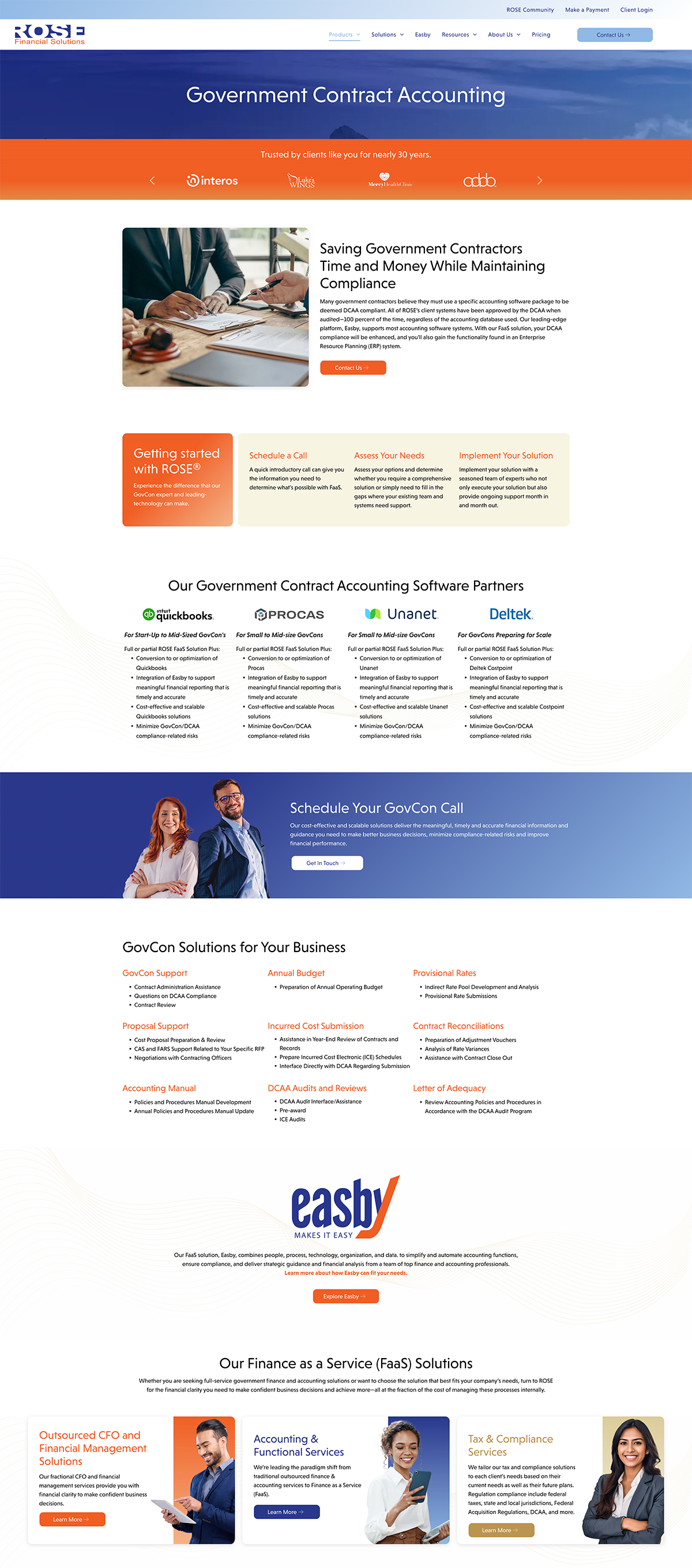
Because Rose offers scalable accounting and finance solutions to businesses of various sizes, it was important to present their brand as accessible and people focused as well as sharp and intelligent.
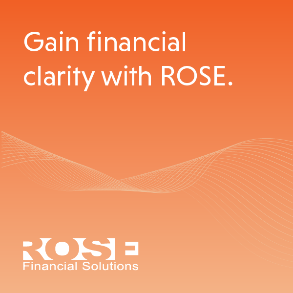
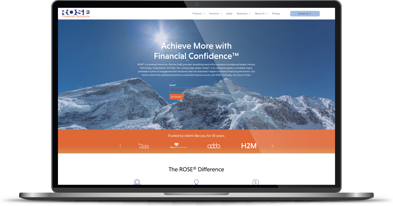
Working with an existing color palette and logo, our team refreshed the font and added vibrant imagery to accompany the vivid color scheme. Imagery was well-researched to appeal to a diverse range of clients and business sizes. At the CEO’s request, we also incorporated mountain and nature imagery to communicate the freedom and new heights clients can attain through Rose’s services.
The greatest challenge? The website needed to integrate forms, newsletters, and other items from the client’s internal system and could not be fully customized to blend with the new site. The winning resolution? Making the form as simple as possible in order to blend as seamlessly as possible with the new design.
Greatest accomplishment? Checking every box within a very tight timeframe!


The Results
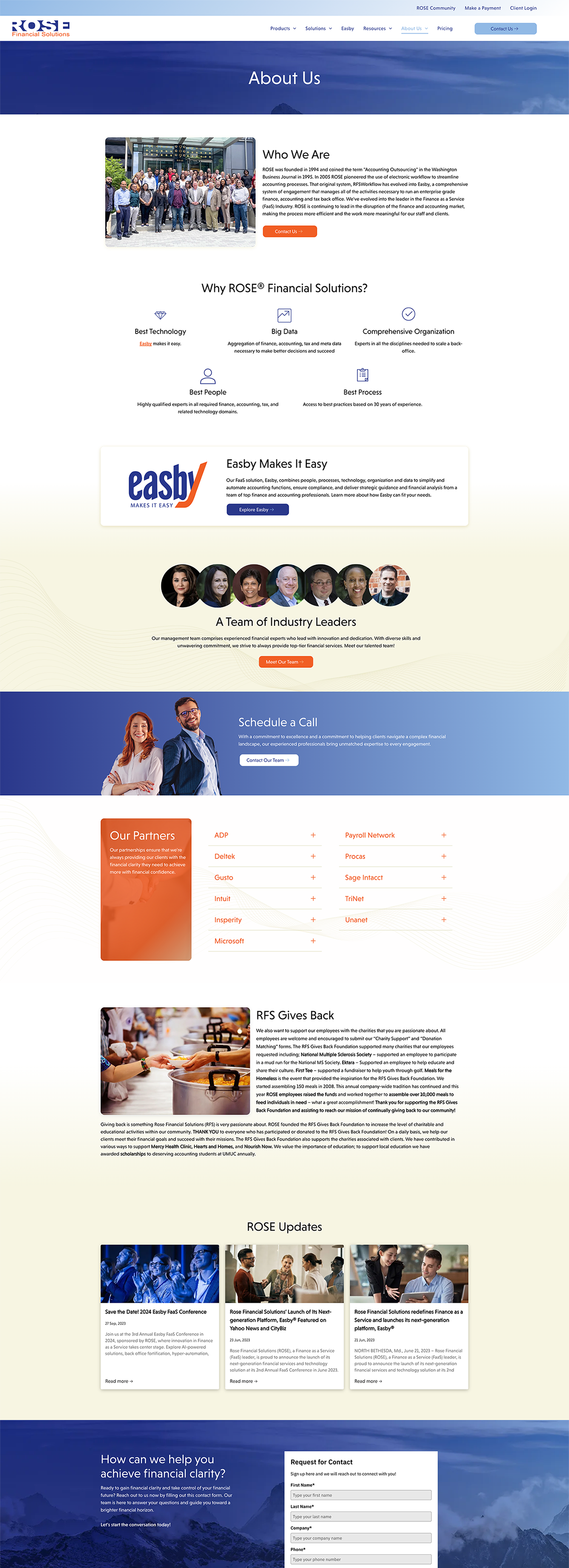
There were significant changes to the architecture on this highly strategized website, including updating the navigation in order to draw more attention to the solutions offered. Now visitors are immediately aware of all Rose offers and can quickly connect to what they need.
The success of this project can be quickly seen in the beauty of the design and its powerful expression of Rose’s brand. What you won’t see is the equally critical and successful process of streamlining the work with diligence and efficiency. Our client was extremely pleased.
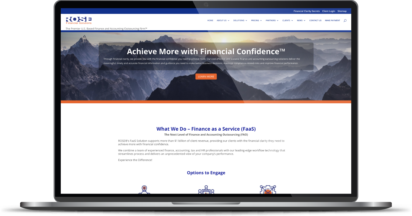
Before & After
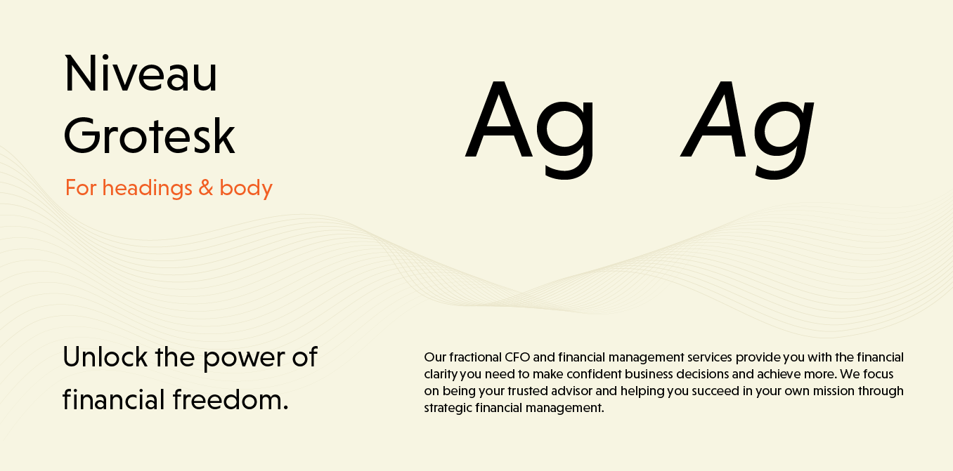
Clear, welcoming font.
After considering the client’s emphasis on approachability while standing out in a competitive industry, Niveau Grotesk was chosen as ROSE’s brand font. While this sans serif font is clear and simple, it also contains unique extended shapes on various letters and has an open, welcoming structure.
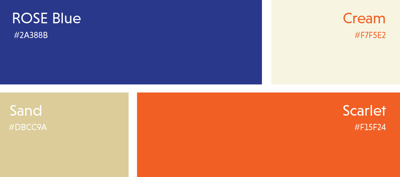
A bright, balanced, and fully branded color scheme.
The client’s brand identity makes a strong showing on the site. The use of bright scarlet and deep blue communicate devotion, reliability, and professionalism, balanced by warm and neutral shades that make the overall effect soft and approachable.
More Case Studies
We love to share our clients’ successes! A quick review shows our extensive experience across diverse industries and our talent for aligning with a multitude of styles and branding guides. The one commonality you’ll see? Our ability to bridge the gap between marketing and business growth through innovative and custom design. This is why companies come to us.