Investment News
SQX
Company leadership came to us with the need to launch a new website—and fast! SQXalts, a news source for alternative investments, was ready for an online presence that would stand out in the crowd with great, easy-to-access content and strong credibility. The tight timeline and limited branding allowed us to showcase our ability to quickly grasp the competitive marketplace, expand branding, and ensure project success.
Built & Hosted using
Straightforward, Professional, & Knowledgeable
Website Development
Our Approach
Prioritizing clarity and simplicity
Understanding our client is always foundational to a successful project. SQX has a vision to serve the financial world by being the customer-friendly, value-oriented alternative to the big market data vendors. We kept this vision in mind for SQXalts’ website, focusing on making the sharing of news attractive, easy to skim, and easy to dive into more detail.
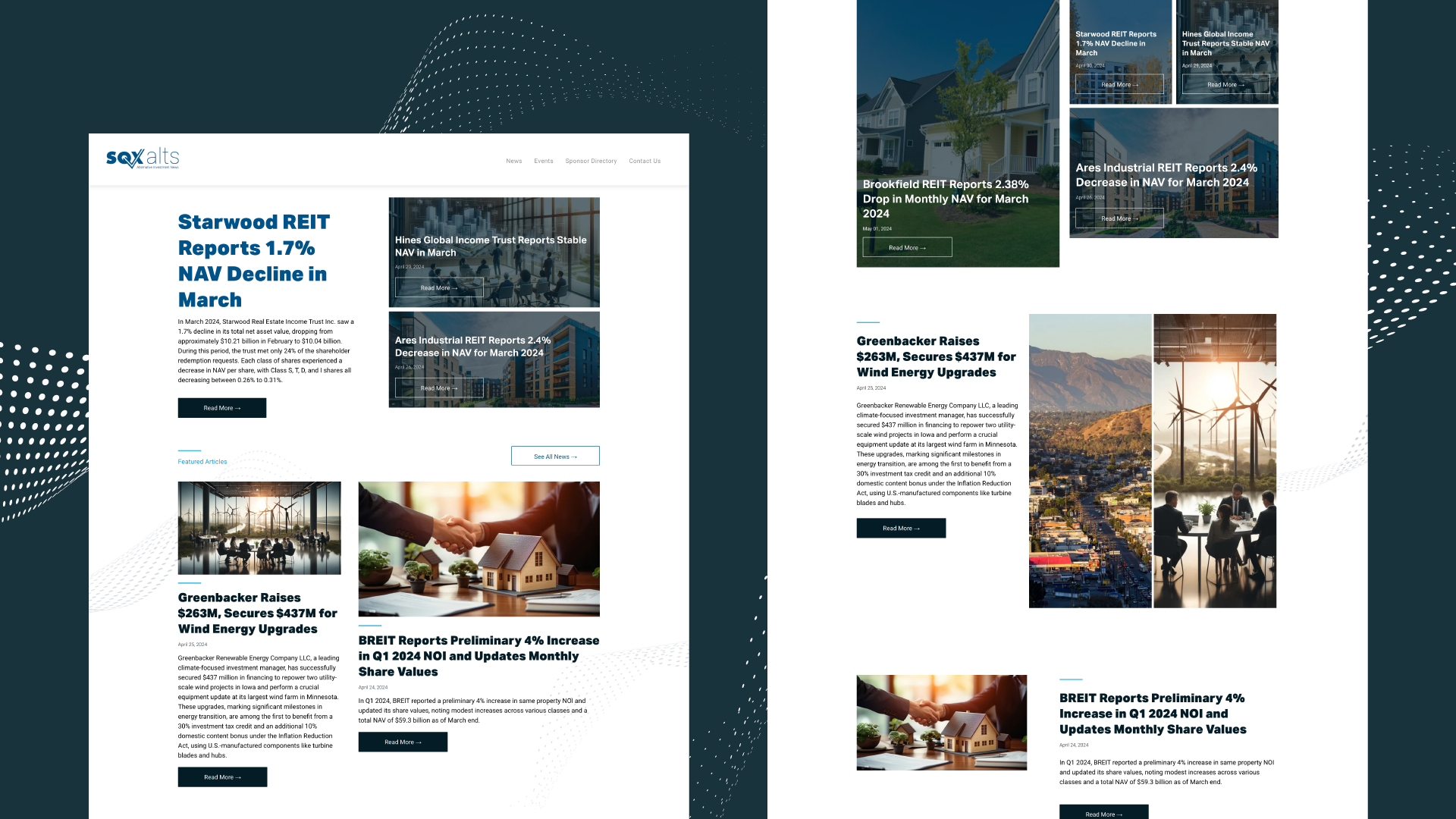
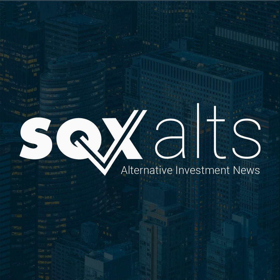
Every design choice was scrutinized to ensure it was the best choice to uphold a clean, simple, and straightforward brand presentation. From the color scheme to the minimal graphics and easily readable typography, accessing often complex investment news is made as palatable as possible.

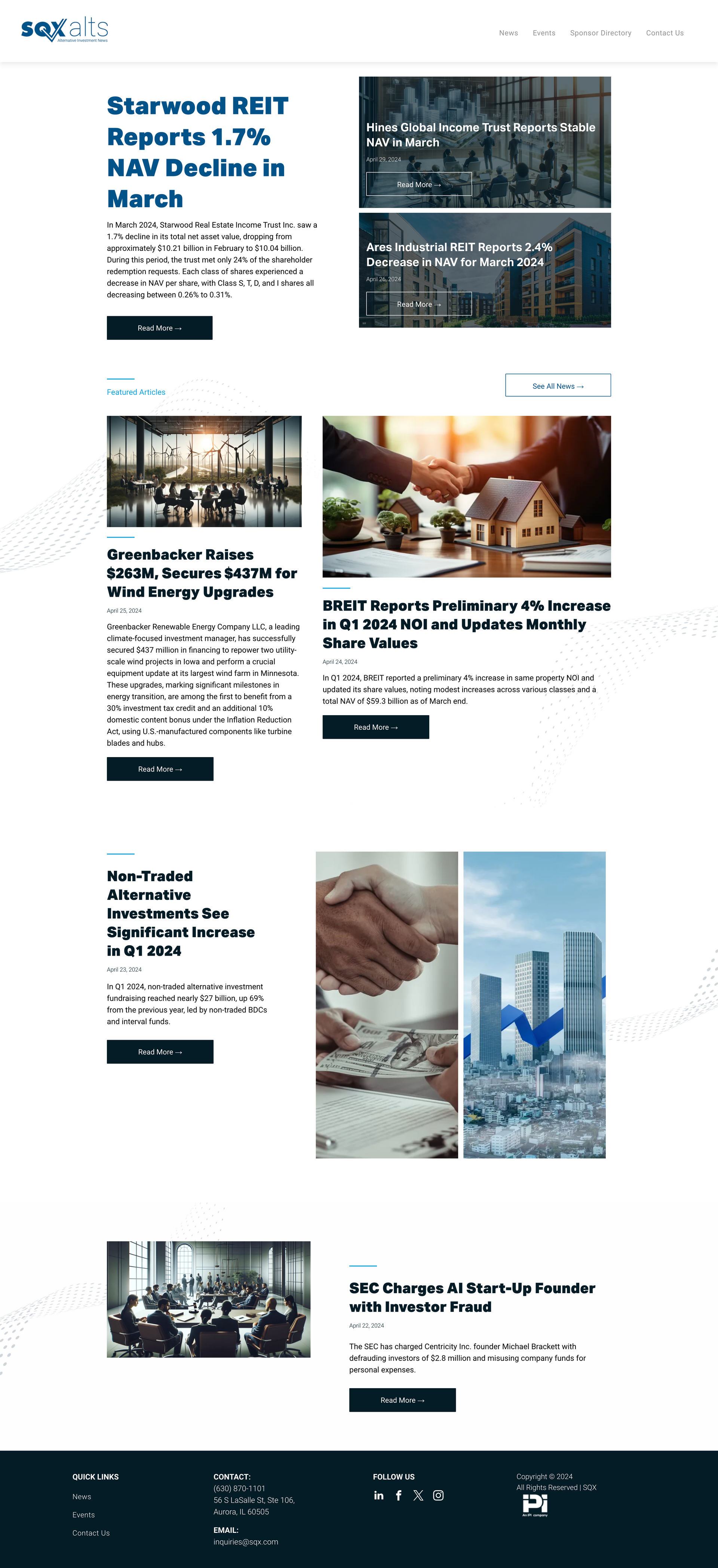
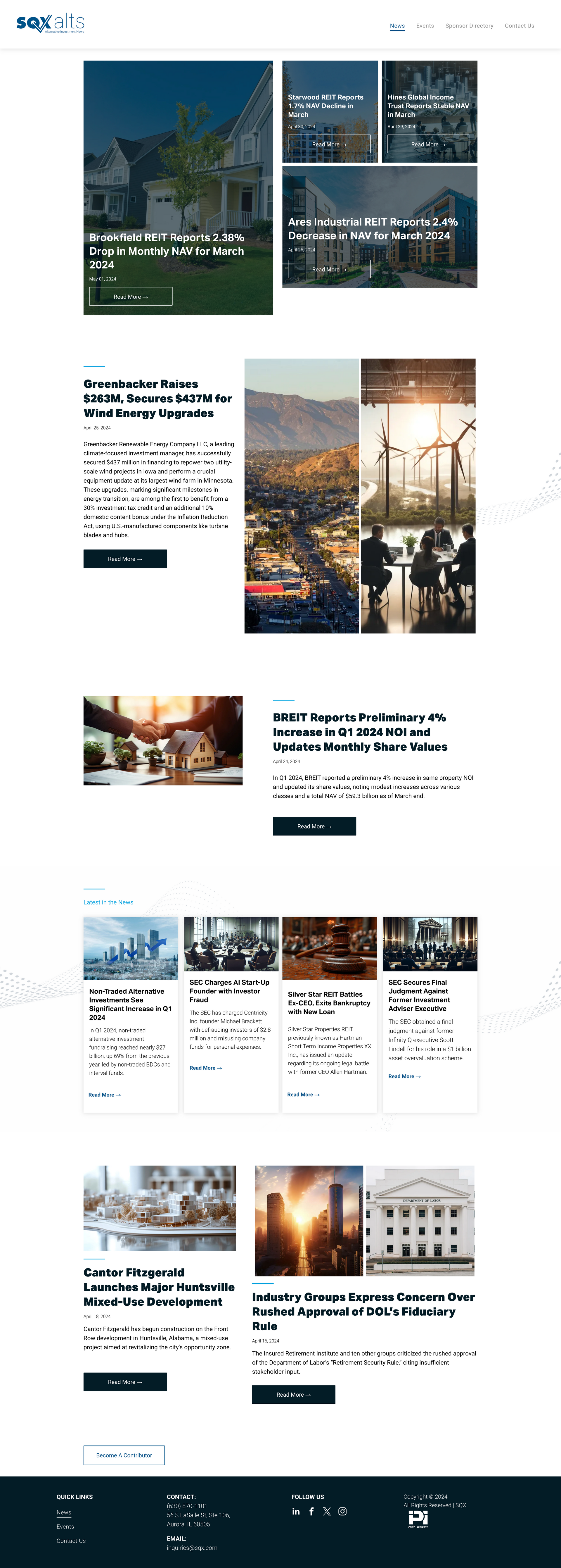
The Results
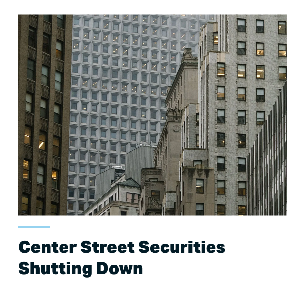
It happens within seconds: a new website visitor decides to stay or go. With SQXalts new website, visitors see a credible news resource that immediately gets down to business. Headlines draw the reader in and refined graphics deliver a quick hit of information.
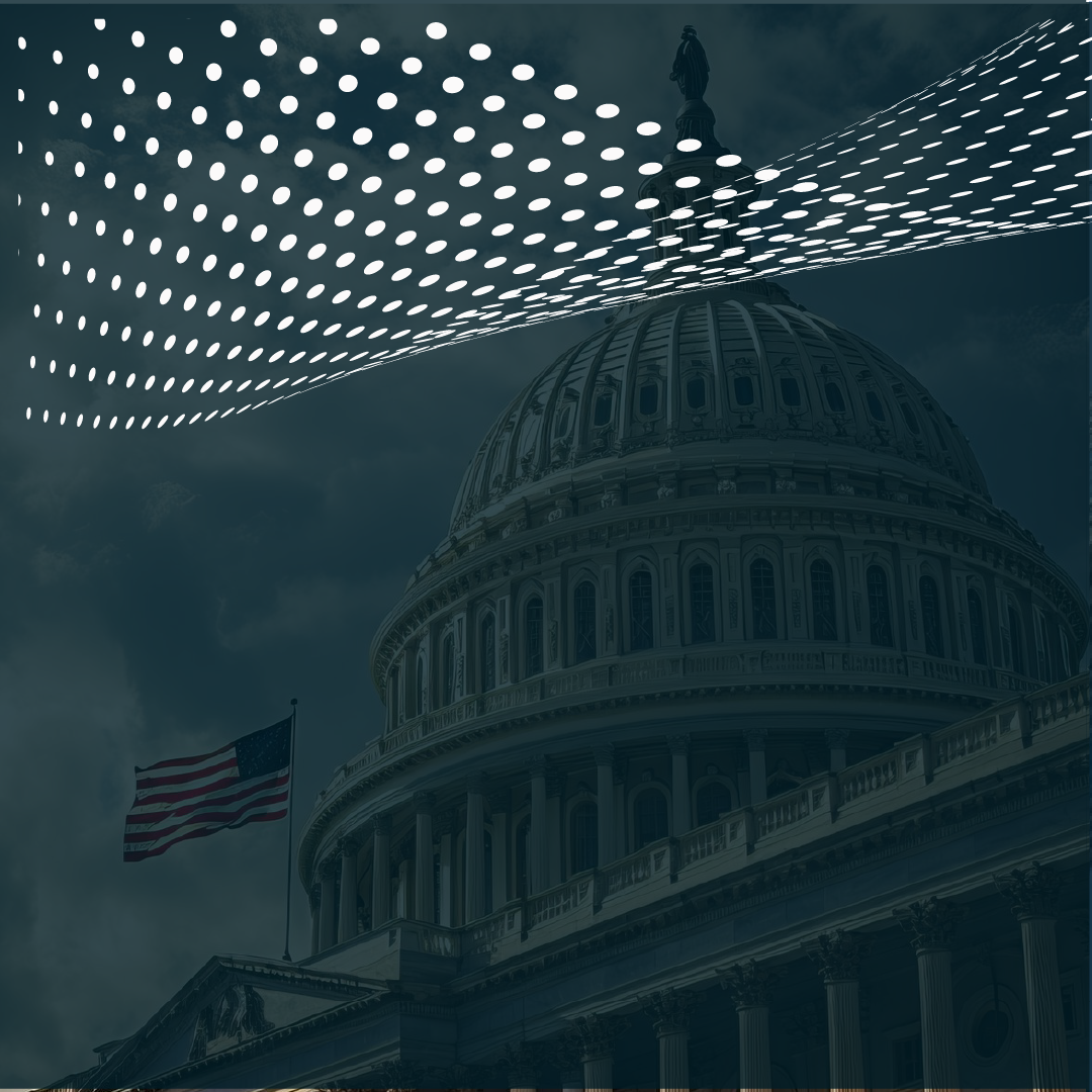
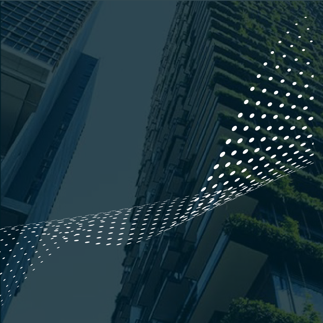
With the "X" from their logo integrated into various backgrounds, the branding of the content is strong, and the visual interest of the page is enhanced. The improved logo now has a font weight that matches the tagline and uniform height across the logo so viewers can quickly perceive the entire name clearly. And the client couldn’t be happier.
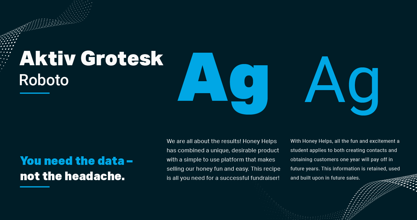
Bold, legible, and credible.
The use of both Aktiv Grotesk and Roboto fonts create a website that gives an instant impression of expertise and credibility. Given the importance of capturing users' attention in news articles, Aktiv Grotesk takes the lead for headlines and other headings. Its boldness and legibility contribute significantly to the credibility of the news articles while Roboto, carried over from SQX's main website, complements Aktiv Grotesk nicely and ensures that paragraphs remain easy to read.
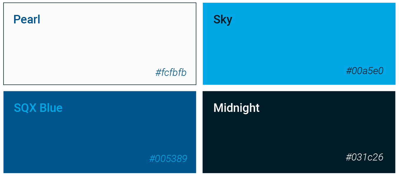
Simplistic and
clear blues.
Based on SQX’s main website, our team decided to use a monochromatic color scheme centered around their existing “SQX blue.” The color scheme includes a vibrant blue to act as an accent. The palette is simple and easy on the eyes.
More Case Studies
We love to share our clients’ successes! A quick review shows our extensive experience across diverse industries and our talent for aligning with a multitude of styles and branding guides. The one commonality you’ll see? Our ability to bridge the gap between marketing and business growth through innovative and custom design. This is why companies come to us.