Benefits/Insurance Solutions
BIS Benefits
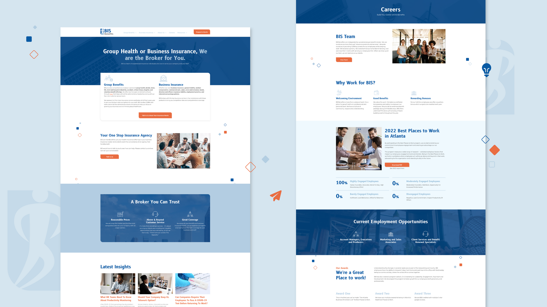
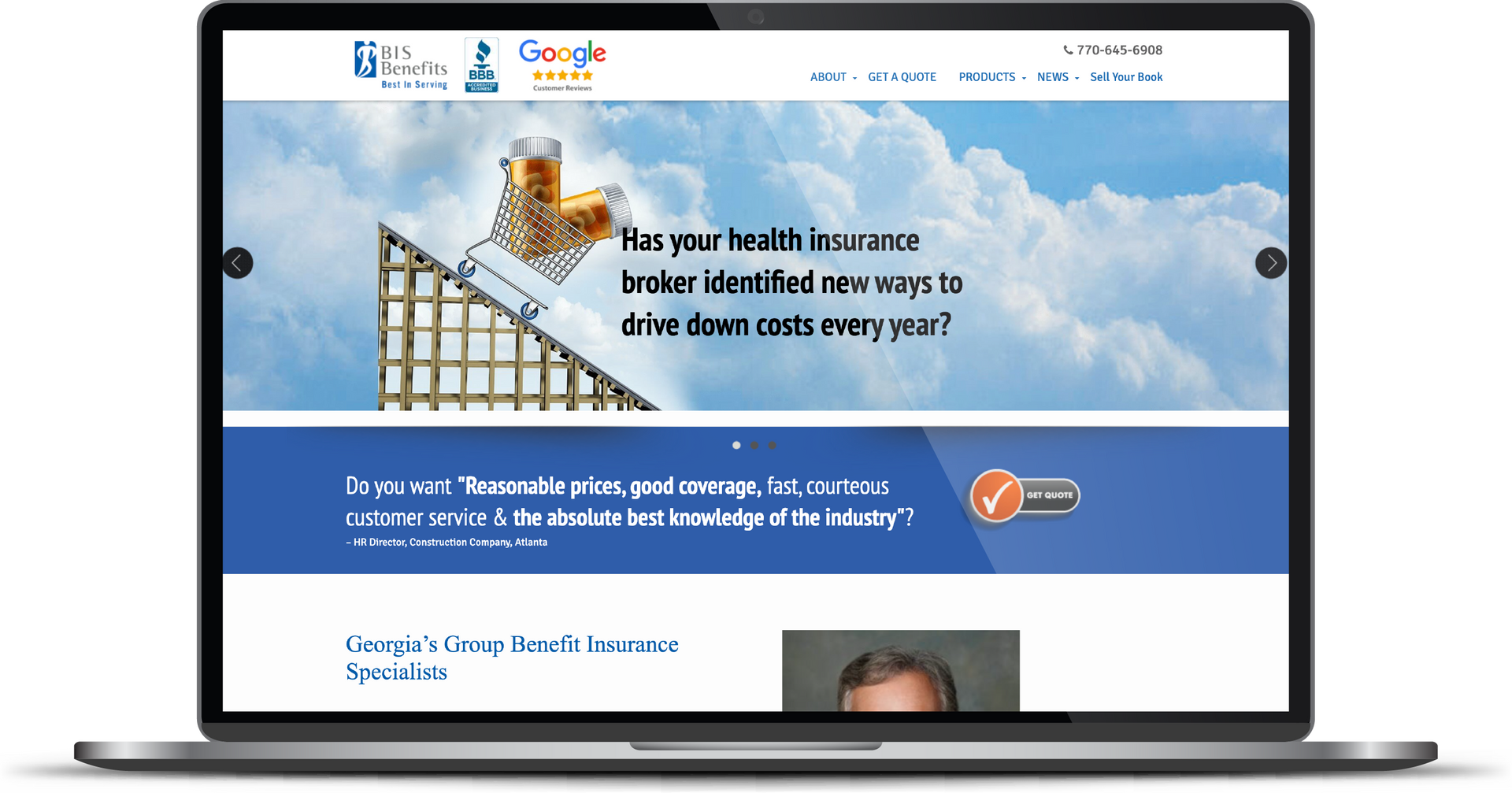
The BIS Benefits team approached RivalMind with an unusable website that misrepresented the brand. As a result, BIS struggled to earn internet rankings and gain valuable traffic. BIS Benefits needed a website overhaul to kickstart their digital marketing efforts and drive new business.
Built & Hosted using
Trustworthy, Established, Modern
Website Design / SEO
Our Approach
A new website to
kickstart
digital marketing efforts.
During our discovery meeting with the BIS Benefits team, we outlined three primary goals:
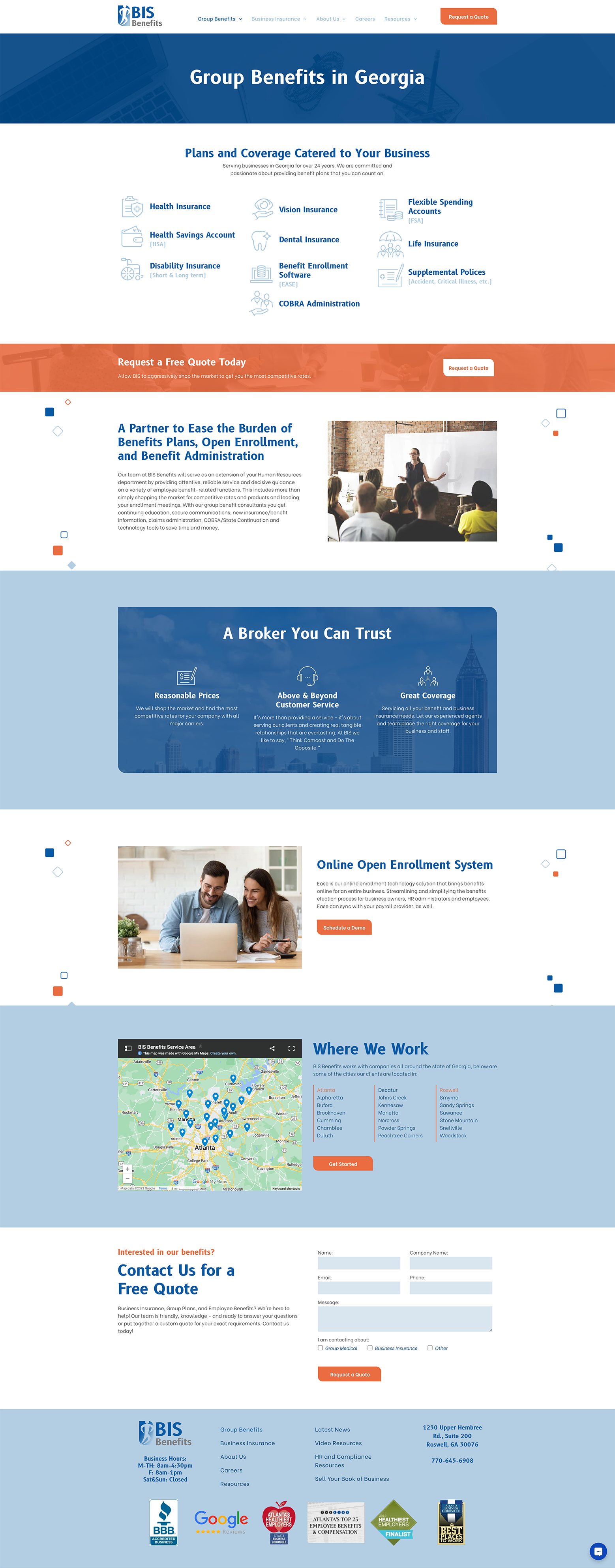
First, maintain the authenticity of their original feel while producing a modernized, refreshed feel. Build the website to reflect this. Next, emphasize their newest company branch, Business Insurance. Finally, create a robust resources section to build high-quality rankings on Google and drive targeted traffic to the BIS Benefits website.
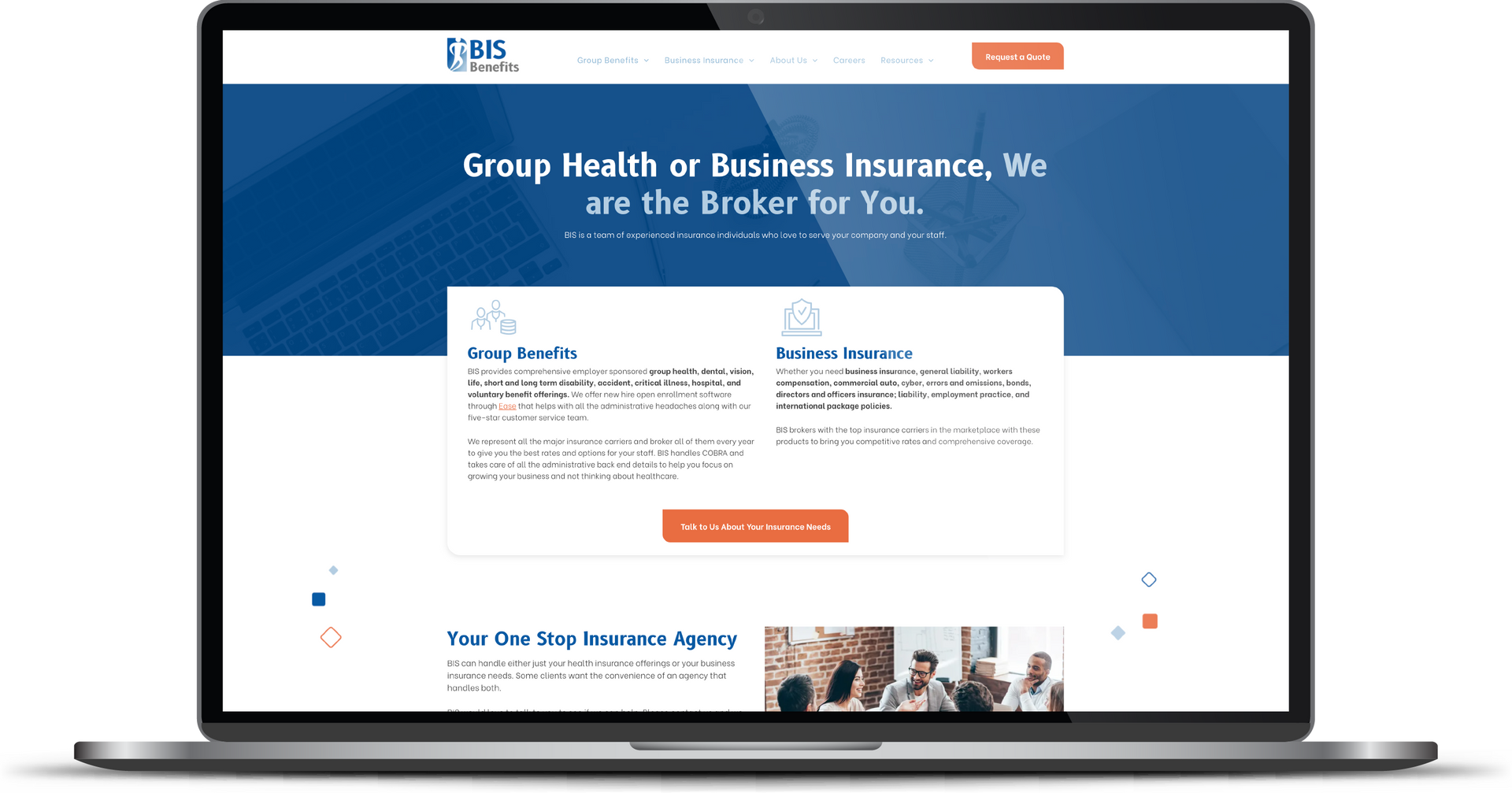
Our design team began by enhancing the current logo; we adjusted the color, added a fade, and updated the font style. These changes defined the color palette and font type for the remainder of the design.
As United Business Association (UBA) members, the BIS team requested that we adapt their UBA content into the BIS resources section – while honoring the UBA and differentiating from BIS blogs. To do this, we custom-designed the UBA blogs to feature a unique heading and include the UBA logo.
The RivalMind design team also incorporated calls to action (CTAs) at strategic points on the website, including chat functionality. These would allow users to immediately request a quote or get in touch with an advisor for a desired service.
The Results
At every point throughout
website design and development, we built from the bones for ongoing digital marketing efforts. At Launch, BIS Benefits moved into ongoing search engine optimization (SEO) with our team on a website built for success from the ground-up.
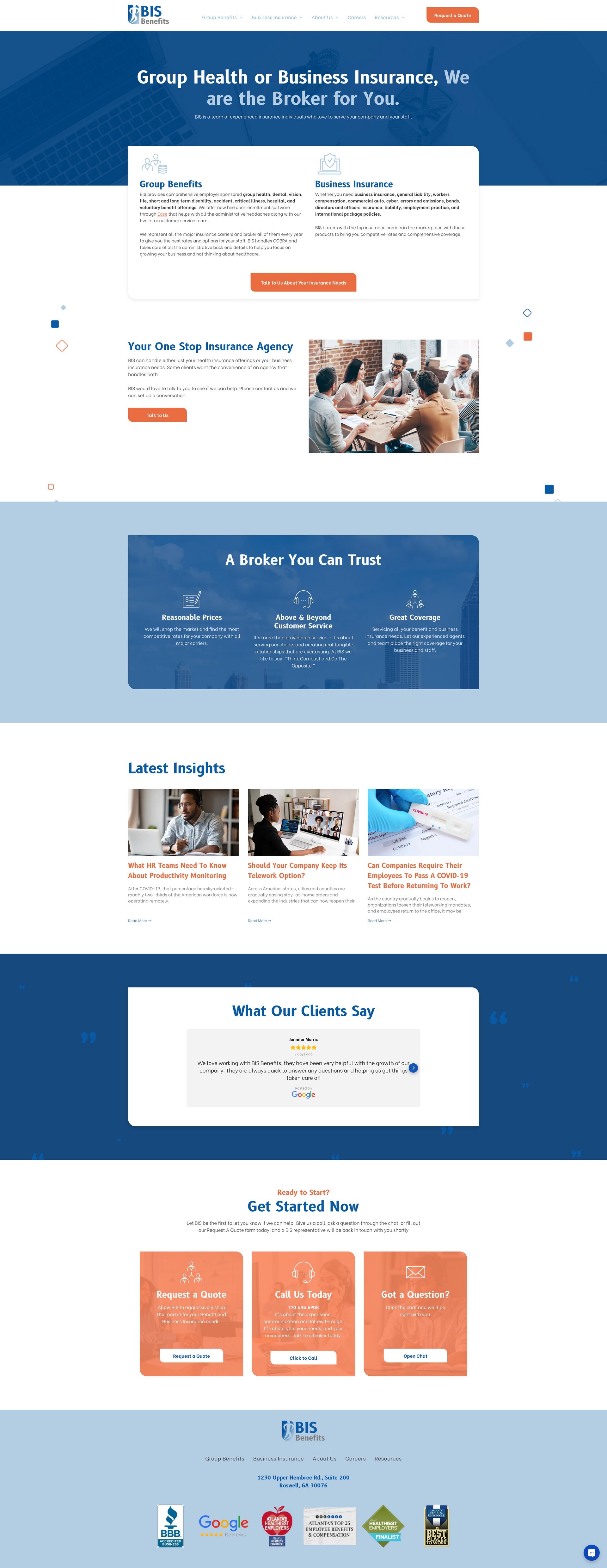
Before & After
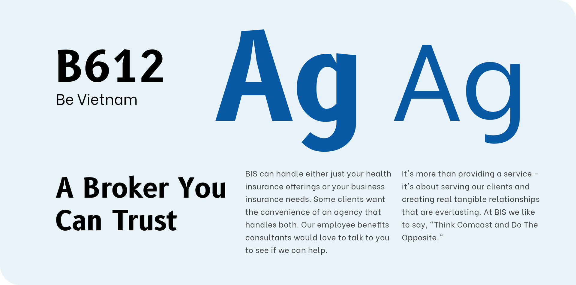
Sharp, distinct fonts
B612 is a bold, sharp sans serif font with some unique elements to add some style to the site, while keeping it modern and professional. Be Vietnam is a simple sans serif, an easily legible body font.
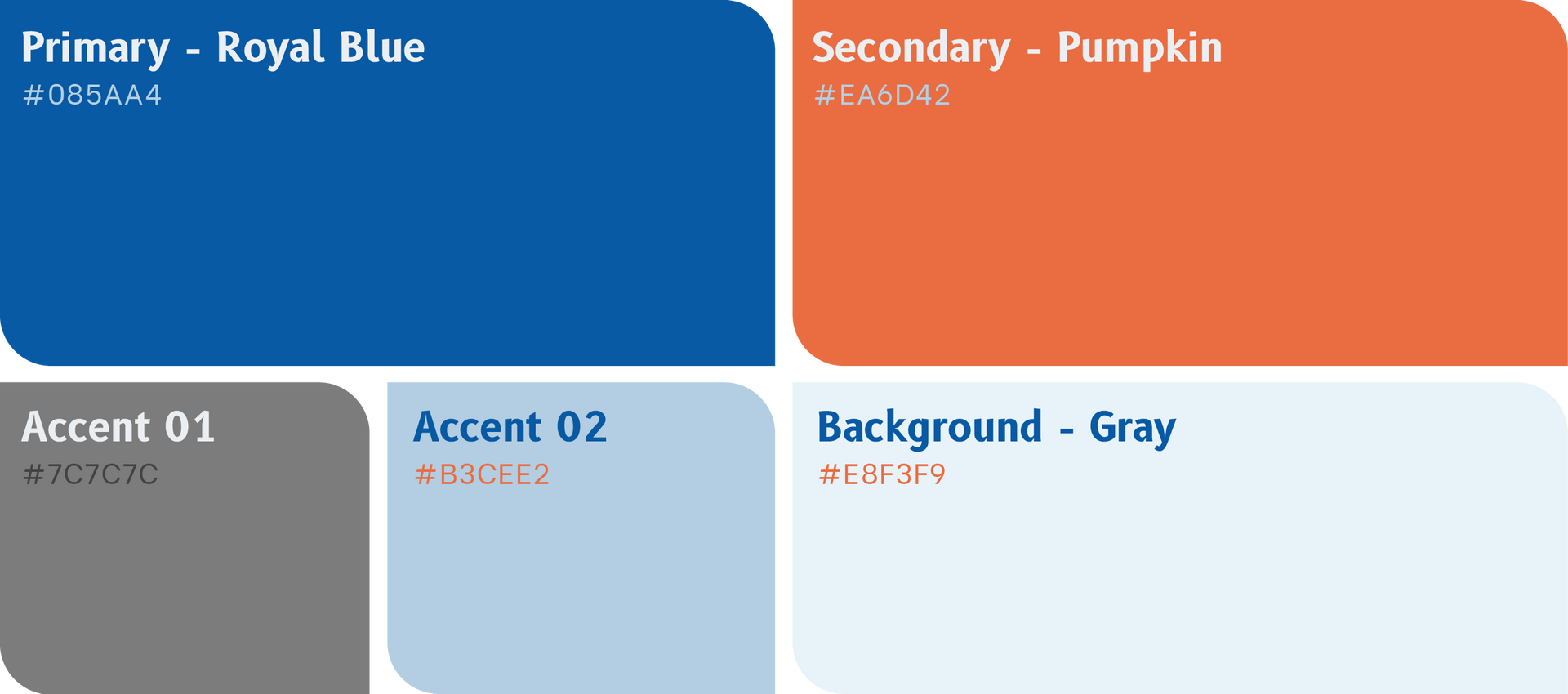
Mature and professional with an energetic orange
The primary color of blue is there to help portray a feeling of professionally as well as loyalty. The orange helps by adding a more playful, approachable color and helps break up the very blue sections.
More Case Studies
We work across an expanse of projects at RivalMind, and we love to share our clients’ successes. For each case study, our goal is the same: bridging the gap between marketing and growth through innovative and custom design. This is why companies come to us. Dive into more of our favorite web design projects below!


