Biosolvent Manufacturer
Vertec Biosolvents
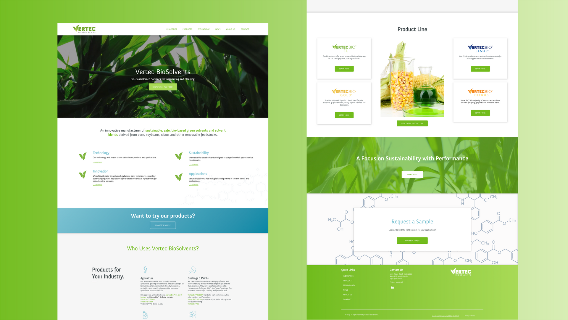
Vertec BioSolvents Inc. provides environmentally-friendly alternatives to petroleum-based solvents for industrial and agricultural markets. When Vertec leadership approached our team for assistance, their current website was tricky to navigate and lacked intuitive user paths.
Navigational challenges always hurt user experience – however, Vertec’s former UX especially harmed the business’ bottom line. The most important element on Vertec’s website is their products, so users should be able to intuitively find what they need, then contact Vertec.
Vertec’s leadership team knew something had to change on their website to enhance user experience and increase conversions.
Built & Hosted using
Organic, Clean, Innovative
Website Design
Our Approach
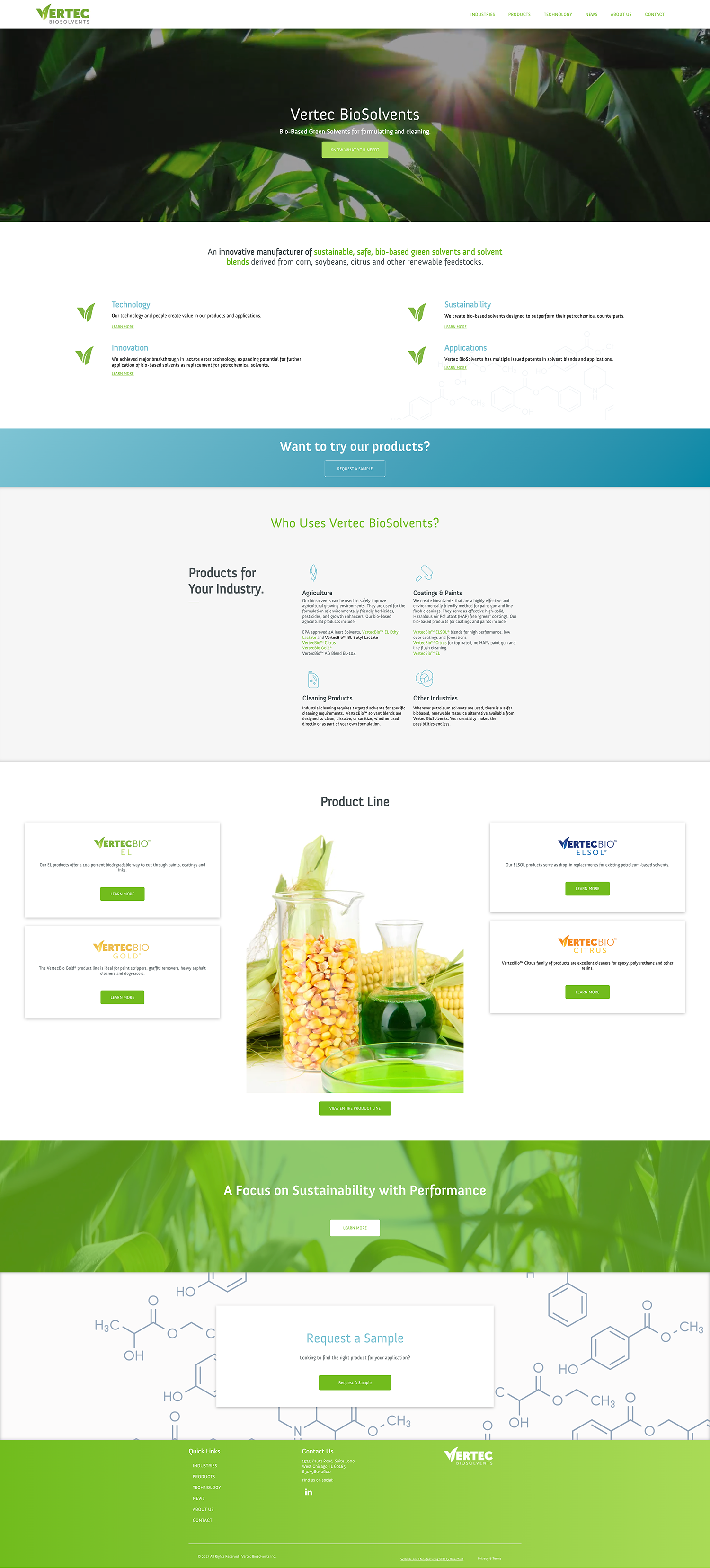
Centering the client's brand and structuring the website
From the start of the project, we prioritized information organization, with the goal of intuitively guiding the user to conversion – contacting Vertec about their desired product and receiving a sample. Often, once a prospective customer speaks to the bio-based solvent experts at Vertec, they are guided to a more fitting product and purchase the solvent in bulk.
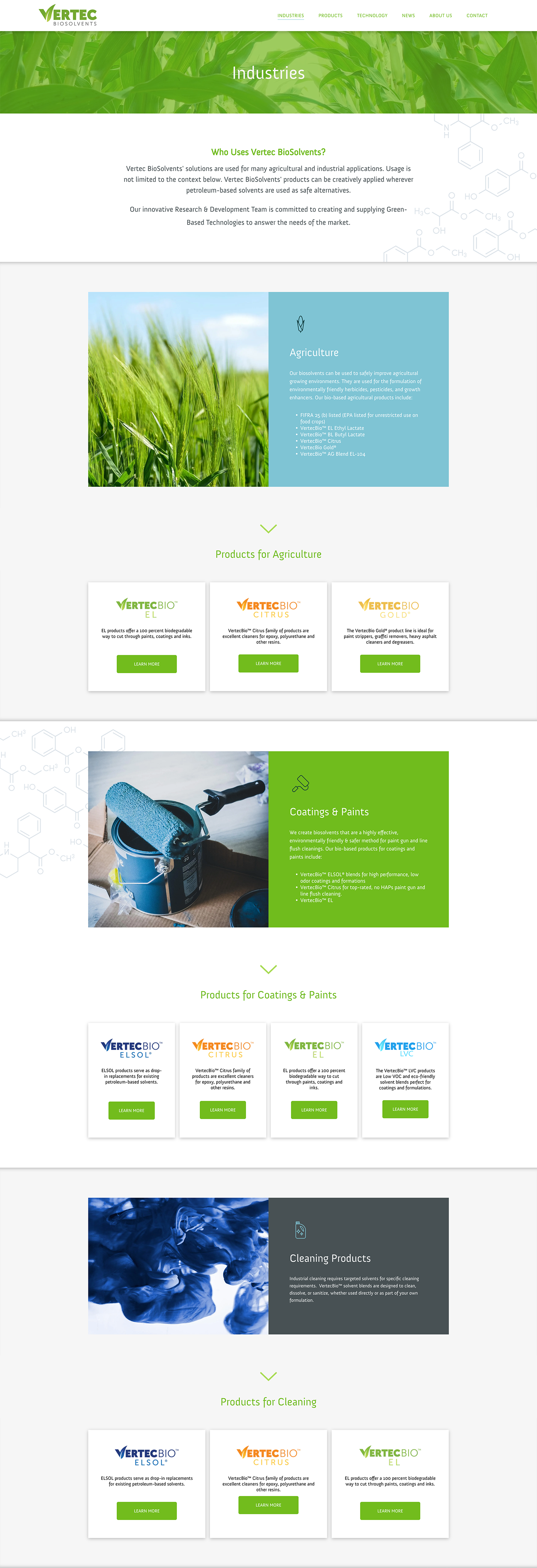
First, we created clear user pathways to product pages from anywhere on the website. When a visitor lands on Vertec’s new website, they should be able to reach their needed product by following three highlighted pathways – product use, industry, or alternative solution for a petroleum-based product.
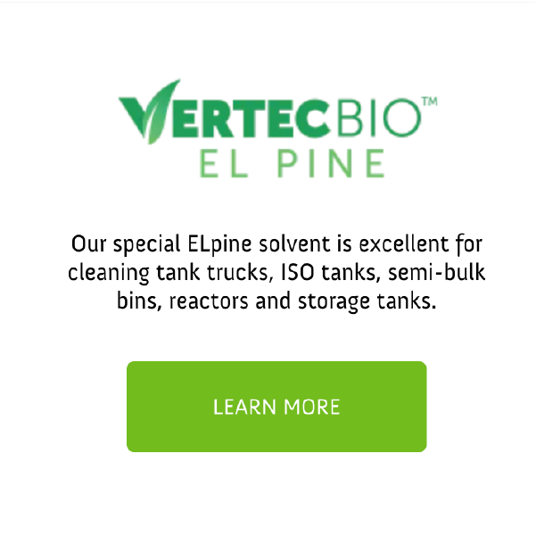
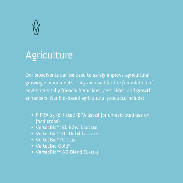
Second, we organized data on product pages. Vertec’s former website exhibited a wealth of information on product pages, and we simply reworked this data to make it consumer-friendly.
Finally, our design team revitalized Vertec’s current branding by crafting simple, captivating imagery that enhanced our organizational goal, an example of UX and UI working hand-in-hand to guide website visitors down an intuitive and visually-engaging path toward conversion.


The Results
Since website launch, Vertec has experienced increased conversions, as users navigate down intuitive paths to reach their desired product and reach out to receive a sample.
"RivalMind had a significant impact on Vertec."
- Skip Laubach, CEO of Vertec BioSolvents
Vertec BioSolvents,
located in Chicago, saw sample requests double through SEO efforts and a new optimized website, resulting in a “significant impact on the business.”
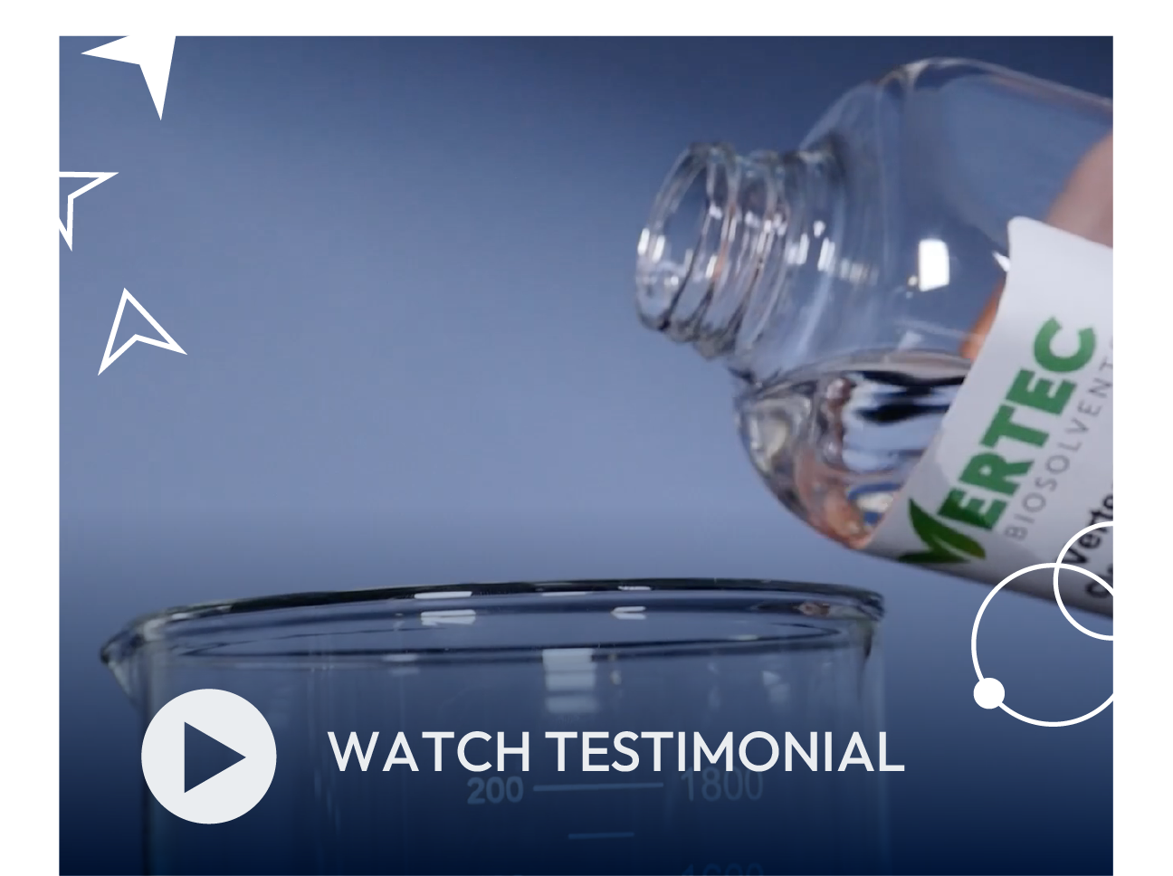
Watch the testimonial to hear more.
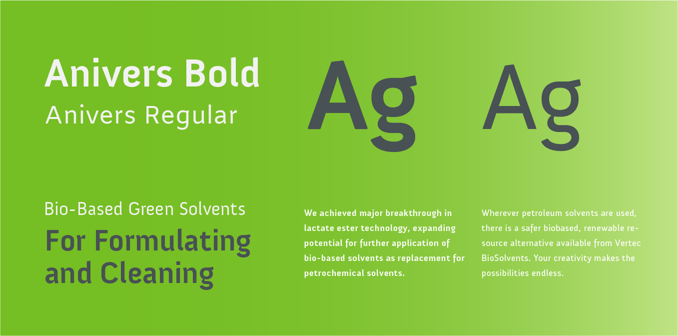
Organic, efficient font.
The cutting-edge quality of the Anivers typeface gives the website a notably clean feeling that helps to establish Vertec as a clean, organic company. Its subtle modulations create a identifiable brand.
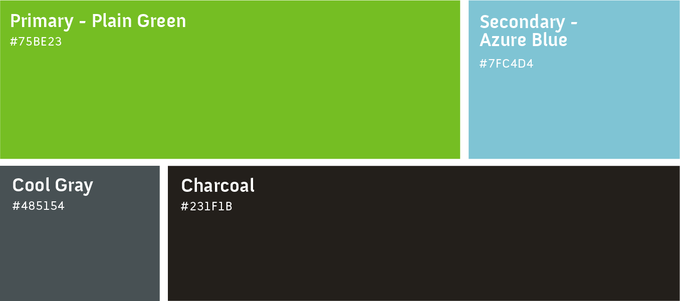
A clean green with clear sky blue accents.
The combination of the plain green and the azure blue give the Vertec website a rejuvenating and clean feel that promotes a sense of organic abundance.
"With RivalMind we have doubled the samples that go out to our customers."
Vertec BioSolvents, located in Chicago, saw sample requests double through SEO efforts and a new optimized website, resulting in a “significant impact on the business.”
More Case Studies
We work across an expanse of projects at RivalMind, and we love to share our clients’ successes. For each case study, our goal is the same: bridging the gap between marketing and growth through innovative and custom design. This is why companies come to us. Dive into more of our favorite web design projects below!